This documentation is available as Markdown for AI agents and LLMs. See the full Markdown index or append .md to any documentation URL.
DateTimePicker
与 @react-native-community/datetimepicker 兼容的日期和时间选择器。
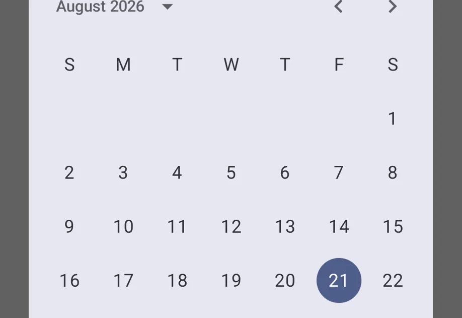
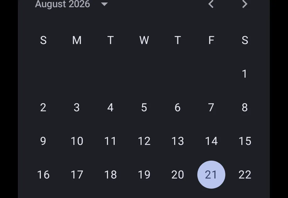
一个 API 与 @react-native-community/datetimepicker 兼容的 DateTimePicker 组件。它在 Android 上使用 Jetpack Compose,在 iOS 上使用 SwiftUI,默认提供现代的 Material 3 和 SwiftUI 外观(社区模块在 Android 上默认使用较旧的外观)。
DateTimePicker 组件完全采用声明式方式。使用 presentation 属性,可在视图层级中直接渲染 'inline' 选择器,或在 Android 上以 'dialog' 形式显示。没有 Android 命令式 API(DateTimePickerAndroid.open())。
在底层,此组件封装了平台专用的 @expo/ui 基础组件:
- Android:Jetpack Compose DateTimePicker(内嵌),DatePickerDialog/TimePickerDialog(对话框)
- iOS:SwiftUI DatePicker
如果需要更细粒度的控制(自定义修饰符、样式或布局),请直接使用这些基础组件。
安装
If you are installing this in an existing React Native app, make sure to install expo in your project.
从 @react-native-community/datetimepicker 迁移
- 将导入语句从
import DateTimePicker from '@react-native-community/datetimepicker'更新为import DateTimePicker from '@expo/ui/community/datetime-picker'。 - 没有命令式的
DateTimePickerAndroid.open()API。渲染组件,并改用presentation="dialog"。 - 不支持
minuteInterval、textColor、firstDayOfWeek、neutralButton、onNeutralButtonPress、fullscreen、title和startOnYearSelection属性。 - 使用
timeZoneName(IANA 名称)代替timeZoneOffsetInMinutes。 - 不支持
countdown模式。 - 无需使用
onError属性。
基本用法
时间选择器
设置日期限制
对话框显示方式
在 Android 上,可以使用 presentation="dialog" 将选择器显示为模态对话框。组件挂载时,对话框会打开。在响应 onValueChange 或 onDismiss 时卸载组件。在 iOS 上,此属性会被忽略,选择器始终以内嵌方式渲染。
API
import DateTimePicker from '@expo/ui/community/datetime-picker';
Component
Type: React.Element<DateTimePickerProps>
stringAccent/tint color applied to the picker.
Maps to color on Android and tint on iOS.
string • Default: 'default'Display style. Android supports 'default' | 'spinner' — 'spinner' shows a text input
rather than a scroll wheel (Material 3 does not have a wheel-style picker).
iOS supports 'default' | 'spinner' | 'compact' | 'inline'.
Acceptable values are: 'default' | 'compact' | 'inline' | 'spinner' | 'calendar' | 'clock'
string • Default: 'date'The picker mode.
Acceptable values are: 'time' | 'date' | 'datetime'
Deprecated: Use
onValueChangeandonDismissinstead.
(event: DateTimePickerEvent, date?: Date) => voidCalled when the user changes the date/time or dismisses the picker.
The event type is encoded in event.type.
If the new specific listeners are provided, they take precedence.
() => voidCalled when the picker is dismissed without selecting a value.
(event: DateTimePickerChangeEvent, date: Date) => voidCalled when the user selects a date or time.
string • Default: 'dialog'How the picker is presented.
'inline'renders the picker directly in the view hierarchy.'dialog'shows a modal dialog that opens on mount. FiresonValueChangeon confirmation,onDismisson cancel. The caller should unmount the component in response.
On iOS this prop is accepted but ignored (always inline).
On Android the default is 'dialog'.
Acceptable values are: 'dialog' | 'inline'
stringA test ID forwarded to the native view. Note: on Android dialog presentation, the test ID is not forwarded.
stringForce a specific color scheme on the picker.
Acceptable values are: 'light' | 'dark'
stringIANA time zone name (e.g. 'America/New_York') for the picker display.