This documentation is available as Markdown for AI agents and LLMs. See the full Markdown index or append .md to any documentation URL.
DateTimePicker
用于选择日期、日期范围和时间的 Jetpack Compose 组件。
Expo UI 的日期和时间选择器组件与官方 Jetpack Compose 日期选择器、日期范围选择器和时间选择器 API 相匹配。
注意: 日期变体会渲染 Material 的日历网格和输入字段,两者都会在内部进行水平滚动。父级
Host必须在水平方向上提供有限宽度,并同时使用matchContents={{ vertical: true }}和style={{ width: '100%' }}(或任何有限宽度)。详情请参阅 Host 参考中的匹配内容。
注意:
DateRangePicker也会进行垂直滚动,并填满父级提供的有限高度。请将其Host放置在有界布局中,例如使用flex: 1的布局。请勿在垂直方向上使用matchContents。
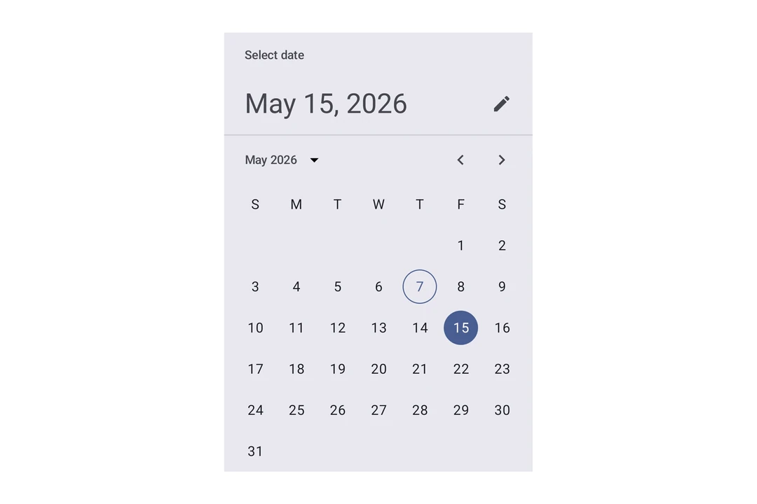
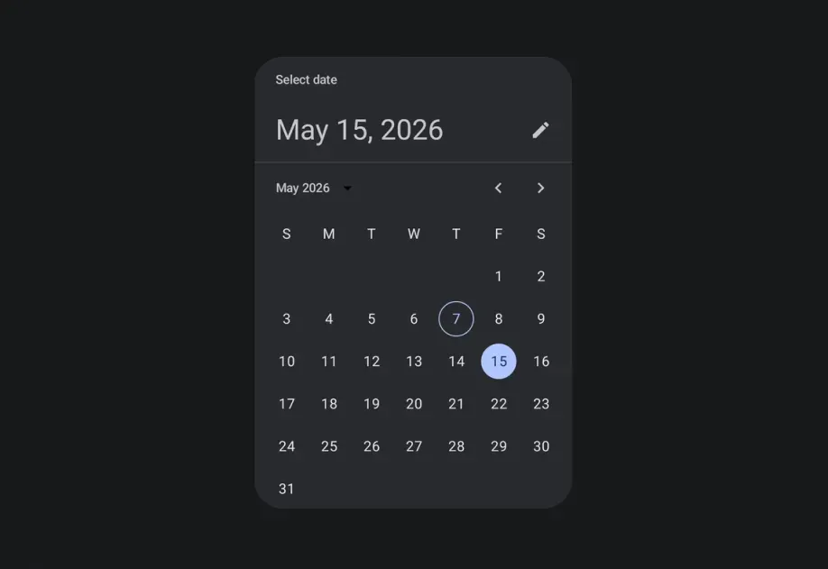
安装
If you are installing this in an existing React Native app, make sure to install expo in your project.
用法
日期选择器
时间选择器
输入变体
使用 variant="input" 可将选择器显示为文本输入字段,而不是默认的选择器 UI。
日期范围选择器
在用户完成范围选择之前,回调中的 end 值为 null。
日期范围选择器对话框
API
import {
  DateRangePicker,
  DateRangePickerDialog,
  DateTimePicker,
} from '@expo/ui/jetpack-compose';
Components
Type: React.Element<DatePickerDialogProps>
ColorValueDatePickerElementColors & TimePickerElementColorsunionThe initially selected date. When omitted, the dialog opens on the current month with no selection and the confirm button stays disabled until a date is picked.
Acceptable values are: string | null
(date: Date) => voidAndroidVariantType: React.Element<DateRangePickerProps>
Renders an inline Material 3 date range picker.
DatePickerElementColorsFine-grained color overrides for individual picker elements.
unionThe initially selected end date, as an ISO 8601 string. It must be on or after initialStartDate.
Acceptable values are: string | null
unionThe initially selected start date, as an ISO 8601 string.
Acceptable values are: string | null
(range: DateRangeSelection) => voidCalled once when the component mounts with the initial range, and again whenever the selected date range changes.
The end date is null while the user is selecting a range.
Constrains which dates can be selected. start is the earliest selectable date and end is
the latest.
boolean • Default: trueShow a button to toggle between variants on Android.
AndroidVariant • Default: 'picker'The variant of the picker, which determines its appearance and behavior.
Type: React.Element<DateRangePickerDialogProps>
Renders a modal Material 3 date range picker.
ColorValueThe tint color to use on the picker elements and dialog buttons.
stringThe label for the button that confirms the selected range. Defaults to the system "Ok" string.
stringThe label for the button that dismisses the dialog. Defaults to the system "Cancel" string.
(range: DateRangeSelection) => voidCallback function that is called when the user confirms a complete date range.
() => voidCallback function that is called when the dialog is dismissed.
Inherited props
Omit<DateRangePickerProps, 'modifiers'>
Type: React.Element<DateTimePickerProps>
Renders an inline DateTimePicker component.
ColorValueThe tint color to use on the picker elements.
When elementColors is not provided, this color is applied to a subset of
picker elements (selected day, title, headline, today border for date picker;
selector, selected time segment, clock dial for time picker).
DisplayedComponents • Default: 'date'The components that the picker should display.
On Android, you can have a picker that selects just the date or just the time.
dateAndTime is only available on iOS and will result in a date picker on Android.
On iOS, you can have a picker that selects both date and time.
DatePickerElementColors & TimePickerElementColorsFine-grained color overrides for individual picker elements.
When provided, these take precedence over the color prop.
Date picker color keys are used when displayedComponents is 'date' or 'dateAndTime'.
Time picker color keys are used when displayedComponents is 'hourAndMinute'.
Unset values fall back to Material 3 theme defaults.
unionThe initial date to display on the picker.
Acceptable values are: string | null
boolean • Default: trueDetermines what format the clock should be displayed in on Android.
(date: Date) => voidCallback function that is called when a date is selected.
Constrains which dates can be selected. Mirrors the native Compose selectableDates parameter.
start is the earliest selectable date, end is the latest.
boolean • Default: trueShow a button to toggle between variants on Android.
AndroidVariant • Default: 'picker'The variant of the picker, which determines its appearance and behavior.
Type: React.Element<TimePickerDialogProps>
ColorValueDatePickerElementColors & TimePickerElementColors(date: Date) => voidTypes
Color overrides for the Material 3 DatePicker component. All properties are optional — unset values use Material 3 theme defaults.
Literal type: string
Acceptable values are: 'date' | 'hourAndMinute' | 'dateAndTime'