This documentation is available as Markdown for AI agents and LLMs. See the full Markdown index or append .md to any documentation URL.
HorizontalFloatingToolbar
一个 Jetpack Compose HorizontalFloatingToolbar 组件,用于显示浮动操作栏。
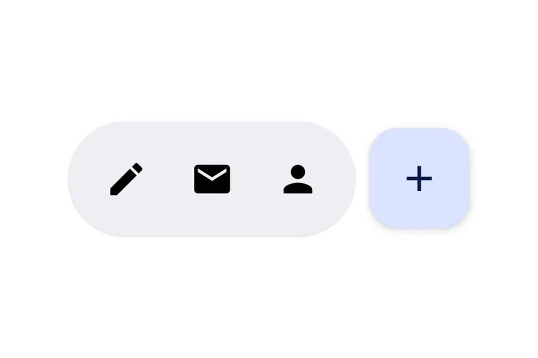
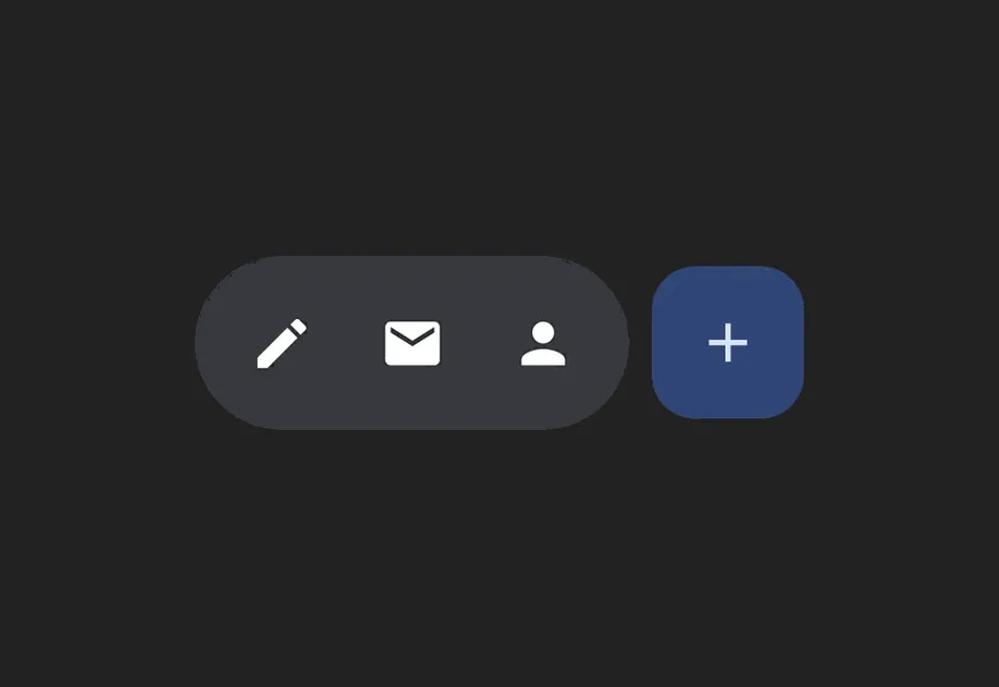
Expo UI HorizontalFloatingToolbar 封装了官方 Jetpack Compose HorizontalFloatingToolbar,用于显示悬浮在内容上方的水平工具栏,其中包含操作按钮。
注意: 如果只需要单个悬浮按钮,请改用
FloatingActionButton
安装
If you are installing this in an existing React Native app, make sure to install expo in your project.
用法
在可滚动内容上方显示悬浮工具栏
将工具栏放在带有 floatingToolbarExitAlwaysScrollBehavior 的 Box 内,即可实现由滚动驱动的隐藏/显示行为。使用 align('bottomCenter') 将工具栏定位在屏幕底部。整个布局都保留在 Compose 层中,无需使用 React Native 绝对定位。
带 FloatingActionButton 的工具栏
工具栏项使用 IconButton 作为直接子元素,主操作则使用 HorizontalFloatingToolbar.FloatingActionButton。
API
import { HorizontalFloatingToolbar } from '@expo/ui/jetpack-compose';
Components
Type: React.Element<HorizontalFloatingToolbarProps>
Renders a HorizontalFloatingToolbar component.
A horizontal toolbar that floats above content, typically used for action buttons.
HorizontalFloatingToolbarColorsPer-slot color overrides. Any field set here replaces the corresponding color from the variant default; unset fields fall back to the variant.
Type: React.Element<HorizontalFloatingToolbarFloatingActionButtonProps>
FloatingActionButton component for HorizontalFloatingToolbar. This component marks its children to be rendered in the FAB slot.