This documentation is available as Markdown for AI agents and LLMs. See the full Markdown index or append .md to any documentation URL.
卡片
一个 Jetpack Compose 卡片组件,用于在经过样式化的容器中显示内容。
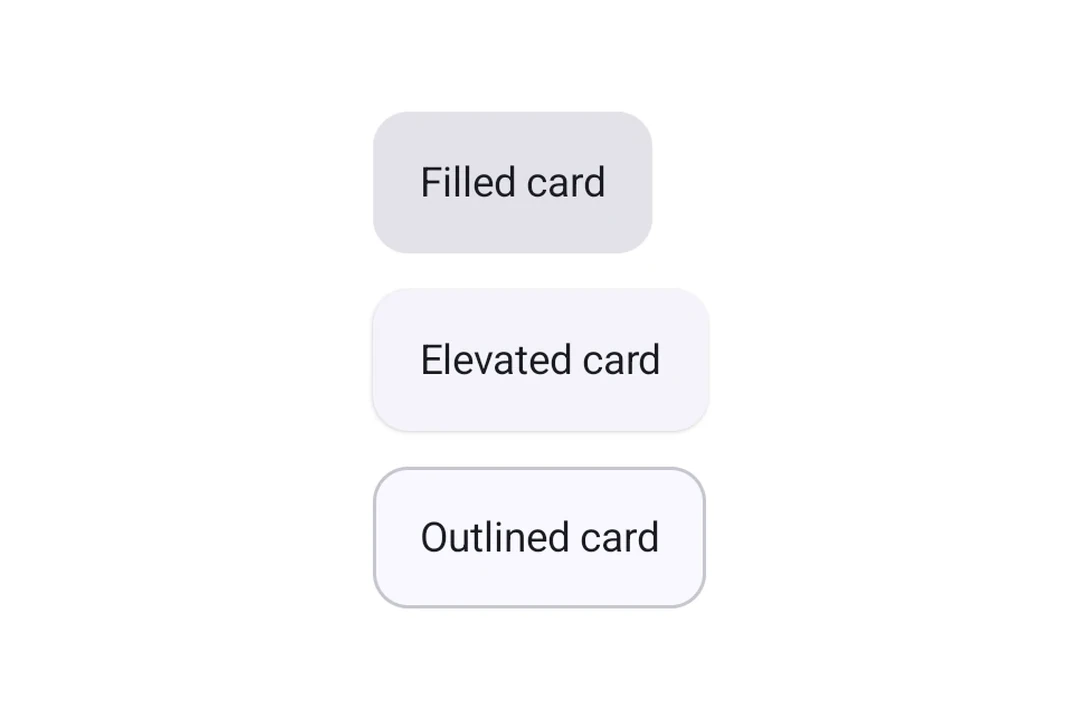
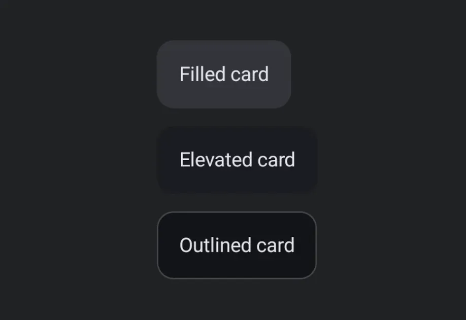
Expo UI Card 与官方 Jetpack Compose Card API 相匹配,可在带样式的表面容器中显示内容,并支持可选的阴影和描边。Card 组件会渲染填充卡片,而 ElevatedCard 和 OutlinedCard 分别提供凸起和带边框的变体。
安装
If you are installing this in an existing React Native app, make sure to install expo in your project.
用法
基本卡片
卡片类型
使用 Card(填充式)、ElevatedCard 或 OutlinedCard 来应用不同的样式。
自定义阴影
使用 elevation 属性(单位为 dp)控制阴影深度。阴影高度对 ElevatedCard 的效果最明显,因为它使用阴影高度。填充式 Card 默认使用色调阴影高度,因此调整效果可能不明显。
自定义边框
Card 和 OutlinedCard 接受 border 属性,可用于自定义描边宽度和颜色。
API
import {
  Card,
  ElevatedCard,
  OutlinedCard,
} from '@expo/ui/jetpack-compose';
Components
Type: React.Element<ComponentType<CardProps>>
A card component that renders a filled card surface for content.
Type: React.Element<ComponentType<ElevatedCardProps>>
An elevated card component that provides a raised surface for content.
Type: React.Element<ComponentType<OutlinedCardProps>>
An outlined card component that provides a bordered surface for content.