Reference version

This documentation is available as Markdown for AI agents and LLMs. See the full Markdown index or append .md to any documentation URL.

Surface

一个 Jetpack Compose Surface 组件,用于创建样式化的内容容器。

Android
Included in Expo Go
Recommended version:
~58.0.1

Expo UI Surface 与官方 Jetpack Compose Surface API 保持一致,并提供一个容器,可应用 Material Design 表面样式,包括颜色、阴影高度和内容颜色
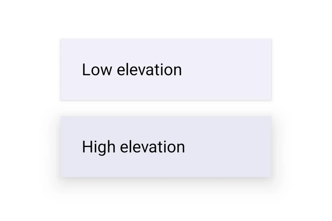
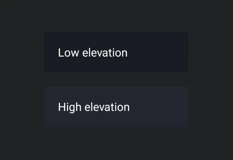
两个堆叠的 Material 3 表面,分别具有较低和较高的阴影高度两个堆叠的 Material 3 表面,分别具有较低和较高的阴影高度

安装

Terminal
- npx expo install @expo/ui
- yarn expo install @expo/ui
- pnpm expo install @expo/ui
- bun expo install @expo/ui

If you are installing this in an existing React Native app, make sure to install expo in your project.

用法

基本表面

BasicSurfaceExample.tsx
import { Host, Surface, Text } from '@expo/ui/jetpack-compose'; import { paddingAll } from '@expo/ui/jetpack-compose/modifiers'; export default function BasicSurfaceExample() { return ( <Host matchContents> <Surface> <Text modifiers={[paddingAll(16)]}> Content on a surface </Text> </Surface> </Host> ); }

带阴影高度的表面

使用 tonalElevation 和 shadowElevation 控制表面的视觉深度。

SurfaceElevationExample.tsx
import { Host, Surface, Column, Text, } from '@expo/ui/jetpack-compose'; import { paddingAll } from '@expo/ui/jetpack-compose/modifiers'; export default function SurfaceElevationExample() { return ( <Host matchContents> <Column verticalArrangement={{ spacedBy: 16 }} modifiers={[paddingAll(16)]}> <Surface tonalElevation={1} shadowElevation={2}> <Text modifiers={[paddingAll(16)]}>Low elevation</Text> </Surface> <Surface tonalElevation={4} shadowElevation={8}> <Text modifiers={[paddingAll(16)]}>High elevation</Text> </Surface> </Column> </Host> ); }

带自定义颜色的表面

使用 color 和 contentColor 属性覆盖默认的 Material 主题颜色。

SurfaceCustomColorsExample.tsx
import { Host, Surface, Text } from '@expo/ui/jetpack-compose'; import { paddingAll } from '@expo/ui/jetpack-compose/modifiers'; export default function SurfaceCustomColorsExample() { return ( <Host matchContents> <Surface color="#1E3A5F" contentColor="#FFFFFF" tonalElevation={2}> <Text color="#FFFFFF" modifiers={[paddingAll(16)]}> Custom colored surface </Text> </Surface> </Host> ); }

带形状和边框的表面

使用 shape 属性裁剪内容,并使用 border 在表面周围绘制描边。

SurfaceShapeBorderExample.tsx
import { Host, Surface, Shape, Text, } from '@expo/ui/jetpack-compose'; import { paddingAll } from '@expo/ui/jetpack-compose/modifiers'; export default function SurfaceShapeBorderExample() { return ( <Host matchContents> <Surface shape={Shape.RoundedCorner({ cornerRadii: { topStart: 16, topEnd: 16, bottomStart: 16, bottomEnd: 16, }, })} border={{ width: 2, color: '#6200EE' }}> <Text modifiers={[paddingAll(16)]}> Rounded surface with border </Text> </Surface> </Host> ); }

API

import { Surface } from '@expo/ui/jetpack-compose';

Component

Surface

Android

Type: React.Element<SurfaceProps>

A Material Design surface container. Surface is responsible for:

  • Clipping content to the shape
  • Applying background color based on tonal elevation
  • Providing content color to its children

SurfaceProps

border

Android
Optional • Type: SurfaceBorder

Border stroke drawn around the surface.

checked

Android
Optional • Type: boolean

Whether the surface is in a checked (toggled on) state. When provided together with onCheckedChange, the surface becomes a toggleable surface.

children

Android
Optional • Type: ReactNode

The content to display inside the surface.

color

Android
Optional • Type: ColorValue

The background color of the surface. Defaults to MaterialTheme.colorScheme.surface.

contentColor

Android
Optional • Type: ColorValue

The color of the content inside the surface. Defaults to contentColorFor(color).

enabled

Android
Optional • Type: boolean • Default: true

Whether the surface is enabled and responds to user interaction.

modifiers

Android
Optional • Type: ModifierConfig[]

Modifiers for the component.

onCheckedChange

Android
Optional • Type: (checked: boolean) => void

Called when the checked state of a toggleable surface changes. Providing this callback together with checked enables the toggleable variant.

onClick

Android
Optional • Type: () => void

Called when the surface is clicked. Providing this callback makes the surface clickable. When combined with selected, the surface becomes a selectable variant.

selected

Android
Optional • Type: boolean

Whether the surface is in a selected state. When provided together with onClick, the surface becomes a selectable surface that visually reflects its selection state.

shadowElevation

Android
Optional • Type: number • Default: 0

The shadow elevation of the surface. Value in dp.

shape

Android
Optional • Type: ShapeJSXElement

Shape configuration for clipping the surface.

tonalElevation

Android
Optional • Type: number • Default: 0

The tonal elevation of the surface, which affects its background color based on the color scheme. Value in dp.

Types

SurfaceBorder

Android

Border stroke configuration.

PropertyTypeDescription
color(optional)ColorValue

Border color.

Default:MaterialTheme.colorScheme.outline
width(optional)number

Border width in dp.

Default:1