Reference version

This documentation is available as Markdown for AI agents and LLMs. See the full Markdown index or append .md to any documentation URL.

RadioButton

用于单选控件的 Jetpack Compose RadioButton 组件。

Android
Included in Expo Go
Recommended version:
~58.0.1

用于从一组选项中选择单个选项的单选按钮组件。映射到官方 Jetpack Compose RadioButton API。

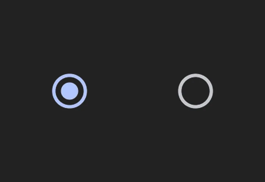
已选中和未选中的 Material 3 单选按钮已选中和未选中的 Material 3 单选按钮

安装

Terminal
- npx expo install @expo/ui
- yarn expo install @expo/ui
- pnpm expo install @expo/ui
- bun expo install @expo/ui

If you are installing this in an existing React Native app, make sure to install expo in your project.

用法

基本单选按钮

带有 onClick 处理函数的独立单选按钮。

BasicRadioButton.tsx
import { useState } from 'react'; import { Host, RadioButton } from '@expo/ui/jetpack-compose'; export default function BasicRadioButton() { const [selected, setSelected] = useState(false); return ( <Host matchContents> <RadioButton selected={selected} onClick={() => setSelected(!selected)} /> </Host> ); }

单选按钮组(推荐)

单选按钮组推荐遵循 Compose 无障碍指南:

  • 使用带有 selectableGroup() 修饰符的 Column 包裹单选按钮组,以便屏幕阅读器将这些选项视为一个组
  • 在每个 Row 上应用带有 role: 'radioButton' 的 selectable 修饰符,使整行(包括标签)都可以点击
  • 不要向 RadioButton 本身传递 onClick,由行处理交互。这样可以提供更大的触摸目标
RadioGroup.tsx
import { useState } from 'react'; import { Host, Column, Row, RadioButton, Text, useMaterialColors, } from '@expo/ui/jetpack-compose'; import { selectable, selectableGroup, fillMaxWidth, height, padding, } from '@expo/ui/jetpack-compose/modifiers'; export default function RadioGroup() { const colors = useMaterialColors(); const [selectedOption, setSelectedOption] = useState('Calls'); const options = ['Calls', 'Missed', 'Friends']; return ( <Host matchContents> <Column modifiers={[selectableGroup()]}> {options.map(label => ( <Row key={label} verticalAlignment="center" modifiers={[ fillMaxWidth(), height(56), selectable( label === selectedOption, () => setSelectedOption(label), 'radioButton' ), padding(16, 0, 16, 0), ]}> <RadioButton selected={label === selectedOption} /> <Text color={colors.onBackground} modifiers={[padding(16, 0, 0, 0)]}> {label} </Text> </Row> ))} </Column> </Host> ); }

API

import { RadioButton } from '@expo/ui/jetpack-compose';

Component

RadioButton

Android

Type: React.Element<RadioButtonProps>

A Material Design radio button.

RadioButtonProps

colors

Android
Optional • Type: RadioButtonColors

Colors for the radio button in different states.

enabled

Android
Optional • Type: boolean • Default: true

Whether the radio button is enabled.

modifiers

Android
Optional • Type: ModifierConfig[]

Modifiers for the component.

onClick

Android
Optional • Type: () => void

Callback that is called when the radio button is clicked.

selected

Android
Type: boolean

Whether the radio button is selected.

Types

RadioButtonColors

Android

Colors for the radio button in different states.

PropertyTypeDescription
disabledSelectedColor(optional)ColorValue
-
disabledUnselectedColor(optional)ColorValue
-
selectedColor(optional)ColorValue
-
unselectedColor(optional)ColorValue
-