Reference version

This documentation is available as Markdown for AI agents and LLMs. See the full Markdown index or append .md to any documentation URL.

ModalBottomSheet

一个从屏幕底部呈现内容的 Jetpack Compose ModalBottomSheet 组件

Android
Included in Expo Go
Recommended version:
~58.0.1

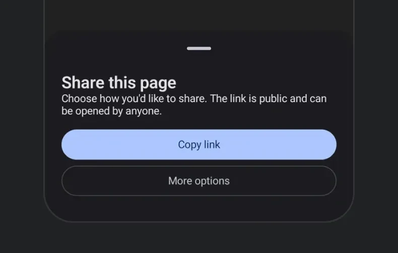
Expo UI ModalBottomSheet 匹配官方 Jetpack Compose Bottom Sheet API,并在从底部向上滑出的模态表单中显示内容。

带有标题、描述和操作按钮的模态底部表单带有标题、描述和操作按钮的模态底部表单

安装

Terminal
- npx expo install @expo/ui
- yarn expo install @expo/ui
- pnpm expo install @expo/ui
- bun expo install @expo/ui

If you are installing this in an existing React Native app, make sure to install expo in your project.

使用

基本底部表单

在卸载底部表单之前,使用 ref.hide() 以通过动画以编程方式关闭表单。

BasicBottomSheetExample.tsx
import { useRef, useState } from 'react'; import { Host, ModalBottomSheet, Button, Column, Text, } from '@expo/ui/jetpack-compose'; import type { ModalBottomSheetRef } from '@expo/ui/jetpack-compose'; import { paddingAll } from '@expo/ui/jetpack-compose/modifiers'; export default function BasicBottomSheetExample() { const [visible, setVisible] = useState(false); const sheetRef = useRef<ModalBottomSheetRef>(null); const hideSheet = async () => { await sheetRef.current?.hide(); setVisible(false); }; return ( <Host matchContents> <Button onClick={() => setVisible(true)}> <Text>Open sheet</Text> </Button> {visible && ( <ModalBottomSheet ref={sheetRef} onDismissRequest={() => setVisible(false)}> <Column verticalArrangement={{ spacedBy: 12 }} modifiers={[paddingAll(24)]}> <Text>Hello from bottom sheet!</Text> <Text>You can add more content here.</Text> <Button onClick={hideSheet}> <Text>Close</Text> </Button> </Column> </ModalBottomSheet> )} </Host> ); }

跳过部分展开状态

设置 skipPartiallyExpanded 后,表单会直接以完全展开状态打开,而不会先停留在半高位置。

SkipPartiallyExpandedExample.tsx
import { useRef, useState } from 'react'; import { Host, ModalBottomSheet, Button, Column, Text, } from '@expo/ui/jetpack-compose'; import type { ModalBottomSheetRef } from '@expo/ui/jetpack-compose'; import { paddingAll, height, } from '@expo/ui/jetpack-compose/modifiers'; export default function SkipPartiallyExpandedExample() { const [visible, setVisible] = useState(false); const sheetRef = useRef<ModalBottomSheetRef>(null); const hideSheet = async () => { await sheetRef.current?.hide(); setVisible(false); }; return ( <Host matchContents> <Button onClick={() => setVisible(true)}> <Text>Open sheet</Text> </Button> {visible && ( <ModalBottomSheet ref={sheetRef} onDismissRequest={() => setVisible(false)} skipPartiallyExpanded> <Column verticalArrangement={{ spacedBy: 12 }} modifiers={[paddingAll(24), height(600)]}> <Text> This sheet skips the partially expanded state. </Text> <Text> It opens directly in the fully expanded position. </Text> <Button onClick={hideSheet}> <Text>Close</Text> </Button> </Column> </ModalBottomSheet> )} </Host> ); }

初始完全展开状态

当 initialFullyExpanded 为 true 时,表单会在首次组合时直接以完全展开状态打开,同时保留部分展开状态。与 skipPartiallyExpanded 不同,用户仍然可以向下拖动到部分展开状态。partialExpand() 方法也会继续生效。

InitialFullyExpandedExample.tsx
import { useRef, useState } from 'react'; import { Host, ModalBottomSheet, Button, Column, Text, } from '@expo/ui/jetpack-compose'; import type { ModalBottomSheetRef } from '@expo/ui/jetpack-compose'; import { paddingAll } from '@expo/ui/jetpack-compose/modifiers'; export default function InitialFullyExpandedExample() { const [visible, setVisible] = useState(false); const sheetRef = useRef<ModalBottomSheetRef>(null); const hideSheet = async () => { await sheetRef.current?.hide(); setVisible(false); }; return ( <Host matchContents> <Button onClick={() => setVisible(true)}> <Text>Open sheet</Text> </Button> {visible && ( <ModalBottomSheet ref={sheetRef} onDismissRequest={() => setVisible(false)} initialFullyExpanded> <Column verticalArrangement={{ spacedBy: 12 }} modifiers={[paddingAll(24)]}> <Text>This sheet opened fully expanded.</Text> <Text> You can still drag it down to the partial state. </Text> <Button onClick={() => sheetRef.current?.partialExpand()}> <Text>Collapse to partial</Text> </Button> <Button onClick={hideSheet}> <Text>Close</Text> </Button> </Column> </ModalBottomSheet> )} </Host> ); }

自定义颜色

使用 containerColor、contentColor 和 scrimColor 自定义表单的外观。

CustomColorsExample.tsx
import { useRef, useState } from 'react'; import { Host, ModalBottomSheet, Button, Column, Text, } from '@expo/ui/jetpack-compose'; import type { ModalBottomSheetRef } from '@expo/ui/jetpack-compose'; import { paddingAll } from '@expo/ui/jetpack-compose/modifiers'; export default function CustomColorsExample() { const [visible, setVisible] = useState(false); const sheetRef = useRef<ModalBottomSheetRef>(null); const hideSheet = async () => { await sheetRef.current?.hide(); setVisible(false); }; return ( <Host matchContents> <Button onClick={() => setVisible(true)}> <Text>Open colored sheet</Text> </Button> {visible && ( <ModalBottomSheet ref={sheetRef} onDismissRequest={() => setVisible(false)} containerColor="#1a1a2e" contentColor="#e0e0e0" scrimColor="#6200EE80"> <Column verticalArrangement={{ spacedBy: 12 }} modifiers={[paddingAll(24)]}> <Text>Custom styled bottom sheet.</Text> <Text>Dark container with a purple scrim overlay.</Text> <Button onClick={hideSheet}> <Text>Close</Text> </Button> </Column> </ModalBottomSheet> )} </Host> ); }

自定义拖动手柄

使用 ModalBottomSheet.DragHandle 插槽提供自定义拖动手柄,或设置 showDragHandle={false} 将其完全隐藏。

CustomDragHandleExample.tsx
import { useRef, useState } from 'react'; import { Host, ModalBottomSheet, Button, Column, Box, Text, } from '@expo/ui/jetpack-compose'; import type { ModalBottomSheetRef } from '@expo/ui/jetpack-compose'; import { background, clip, fillMaxWidth, height, padding, Shapes, width, } from '@expo/ui/jetpack-compose/modifiers'; export default function CustomDragHandleExample() { const [visible, setVisible] = useState(false); const sheetRef = useRef<ModalBottomSheetRef>(null); const hideSheet = async () => { await sheetRef.current?.hide(); setVisible(false); }; return ( <Host matchContents> <Button onClick={() => setVisible(true)}> <Text>Open custom handle sheet</Text> </Button> {visible && ( <ModalBottomSheet ref={sheetRef} onDismissRequest={() => setVisible(false)}> <ModalBottomSheet.DragHandle> <Column horizontalAlignment="center" modifiers={[fillMaxWidth(), padding(0, 12, 0, 8)]}> <Box modifiers={[ width(60), height(6), clip(Shapes.Circle), background('#6200EE'), ]} /> </Column> </ModalBottomSheet.DragHandle> <Column verticalArrangement={{ spacedBy: 12 }} modifiers={[padding(16, 16, 16, 16)]}> <Button onClick={hideSheet}> <Text>Close</Text> </Button> </Column> </ModalBottomSheet> )} </Host> ); }

底部表单中的 React Native 内容

使用 RNHostView 在 Compose 底部表单中嵌入交互式 React Native 视图。这样可以将 Compose 布局与 Pressable 和 Text 等 RN 组件混合使用。

RNContentBottomSheetExample.tsx
import { useRef, useState } from 'react'; import { Host, ModalBottomSheet, Button, Column, RNHostView, Text, useMaterialColors, } from '@expo/ui/jetpack-compose'; import type { ModalBottomSheetRef } from '@expo/ui/jetpack-compose'; import { padding } from '@expo/ui/jetpack-compose/modifiers'; import { Pressable, Text as RNText, View } from 'react-native'; export default function RNContentBottomSheetExample() { const colors = useMaterialColors(); const [visible, setVisible] = useState(false); const sheetRef = useRef<ModalBottomSheetRef>(null); const hideSheet = async () => { await sheetRef.current?.hide(); setVisible(false); }; return ( <Host matchContents> <Button onClick={() => setVisible(true)}> <Text>Open RN content sheet</Text> </Button> {visible && ( <ModalBottomSheet ref={sheetRef} onDismissRequest={() => setVisible(false)} skipPartiallyExpanded={false}> <Column verticalArrangement={{ spacedBy: 16 }} modifiers={[padding(16, 16, 16, 16)]}> <Text>Mixing Compose + RN in a Bottom Sheet</Text> <RNHostView> <View> <RNText style={{ fontSize: 18, fontWeight: 'bold', marginBottom: 8, color: colors.onSurface, }}> React Native Content </RNText> <Pressable style={{ backgroundColor: '#007AFF', padding: 12, borderRadius: 8, alignItems: 'center', }} onPress={hideSheet}> <RNText style={{ color: 'white', fontWeight: '600' }}> Close </RNText> </Pressable> </View> </RNHostView> </Column> </ModalBottomSheet> )} </Host> ); }

带 flex 的 React Native 内容

使用不带 matchContents 的 RNHostView,让 RN 视图填充表单中的剩余空间。结合父级 Column 上的固定 height 修饰符来控制表单大小。

FlexRNContentExample.tsx
import { useRef, useState } from 'react'; import { Host, ModalBottomSheet, Button, Column, RNHostView, Text, } from '@expo/ui/jetpack-compose'; import type { ModalBottomSheetRef } from '@expo/ui/jetpack-compose'; import { height, padding, } from '@expo/ui/jetpack-compose/modifiers'; import { Text as RNText, View } from 'react-native'; export default function FlexRNContentExample() { const [visible, setVisible] = useState(false); const sheetRef = useRef<ModalBottomSheetRef>(null); const hideSheet = async () => { await sheetRef.current?.hide(); setVisible(false); }; return ( <Host matchContents> <Button onClick={() => setVisible(true)}> <Text>Open flex content sheet</Text> </Button> {visible && ( <ModalBottomSheet ref={sheetRef} onDismissRequest={() => setVisible(false)} skipPartiallyExpanded> <Column modifiers={[height(400), padding(16, 16, 16, 16)]}> <Text>RN View with flex: 1</Text> <RNHostView> <View style={{ flex: 1, backgroundColor: '#9B59B6', borderRadius: 10, }}> <RNText style={{ color: 'white', fontSize: 18, fontWeight: 'bold', padding: 16, }}> React Native Content (flex: 1) </RNText> </View> </RNHostView> </Column> </ModalBottomSheet> )} </Host> ); }

可滚动的 React Native 内容

使用 RNHostView 在表单中嵌套可滚动的 React Native 列表,例如 FlatList、ScrollView,或 FlashList、Legend List 等高性能列表。在可滚动组件上设置 nestedScrollEnabled,使其先滚动自身内容。到达顶部边缘后,剩余的拖动操作会移动表单。如果没有 nestedScrollEnabled,列表会消耗手势,表单将保持不动。

ScrollableContentBottomSheetExample.tsx
import { useState } from 'react'; import { Host, ModalBottomSheet, Button, Column, RNHostView, Text, useMaterialColors, } from '@expo/ui/jetpack-compose'; import { fillMaxHeight, padding, } from '@expo/ui/jetpack-compose/modifiers'; import { FlatList, Text as RNText } from 'react-native'; const DATA = Array.from({ length: 50 }, (_, i) => `Item ${i + 1}`); export default function ScrollableContentBottomSheetExample() { const colors = useMaterialColors(); const [visible, setVisible] = useState(false); return ( <Host matchContents> <Button onClick={() => setVisible(true)}> <Text>Open scrollable sheet</Text> </Button> {visible && ( <ModalBottomSheet onDismissRequest={() => setVisible(false)}> <Column modifiers={[fillMaxHeight(), padding(16, 16, 16, 16)]}> <RNHostView> <FlatList nestedScrollEnabled style={{ flex: 1 }} data={DATA} keyExtractor={item => item} renderItem={({ item }) => ( <RNText style={{ paddingVertical: 16, color: colors.onSurface, }}> {item} </RNText> )} /> </RNHostView> </Column> </ModalBottomSheet> )} </Host> ); }

不可关闭的表单

组合使用 properties 和 sheetGesturesEnabled,创建一个只能通过编程方式关闭的表单。

NonDismissibleExample.tsx
import { useRef, useState } from 'react'; import { Host, ModalBottomSheet, Button, Column, Text, } from '@expo/ui/jetpack-compose'; import type { ModalBottomSheetRef } from '@expo/ui/jetpack-compose'; import { paddingAll } from '@expo/ui/jetpack-compose/modifiers'; export default function NonDismissibleExample() { const [visible, setVisible] = useState(false); const sheetRef = useRef<ModalBottomSheetRef>(null); const hideSheet = async () => { await sheetRef.current?.hide(); setVisible(false); }; return ( <Host matchContents> <Button onClick={() => setVisible(true)}> <Text>Open Non-Dismissible Sheet</Text> </Button> {visible && ( <ModalBottomSheet ref={sheetRef} onDismissRequest={() => setVisible(false)} sheetGesturesEnabled={false} properties={{ shouldDismissOnBackPress: false, shouldDismissOnClickOutside: false, }}> <Column verticalArrangement={{ spacedBy: 12 }} modifiers={[paddingAll(24)]}> <Text> This sheet cannot be dismissed by swiping, back press, or tapping outside. </Text> <Text>Only the button below will close it.</Text> <Button onClick={hideSheet}> <Text>Close</Text> </Button> </Column> </ModalBottomSheet> )} </Host> ); }

API

import { ModalBottomSheet } from '@expo/ui/jetpack-compose';

Constants

BottomSheet.ModalBottomSheet

Android

Type: ModalBottomSheetComponent

Props

children

Android
Type: ReactNode

The children of the ModalBottomSheet component. Can include a ModalBottomSheet.DragHandle slot for a custom drag handle.

containerColor

Android
Optional • Type: ColorValue

The background color of the bottom sheet.

contentColor

Android
Optional • Type: ColorValue

The preferred color of the content inside the bottom sheet.

initialFullyExpanded

Android
Optional • Type: boolean • Default: false

Opens the sheet fully expanded on first composition. Ignored when skipPartiallyExpanded is true.

modifiers

Android
Optional • Type: ModifierConfig[]

Modifiers for the component.

onDismissRequest

Android
Type: () => void

Callback function that is called when the user dismisses the bottom sheet (via swipe, back press, or tapping outside the scrim).

properties

Android
Optional • Type: ModalBottomSheetProperties

Properties for the modal window behavior.

ref

Android
Optional • Type: Ref<ModalBottomSheetRef>

Can be used to imperatively hide the bottom sheet with an animation.

scrimColor

Android
Optional • Type: ColorValue

The color of the scrim overlay behind the bottom sheet.

sheetGesturesEnabled

Android
Optional • Type: boolean • Default: true

Whether gestures (swipe to dismiss) are enabled on the bottom sheet.

showDragHandle

Android
Optional • Type: boolean • Default: true

Whether to show the default drag handle at the top of the bottom sheet. Ignored if a custom ModalBottomSheet.DragHandle slot is provided.

skipPartiallyExpanded

Android
Optional • Type: boolean • Default: false

Immediately opens the bottom sheet in full screen.

Types

ModalBottomSheetProperties

Android
PropertyTypeDescription
shouldDismissOnBackPress(optional)boolean

Whether the bottom sheet can be dismissed by pressing the back button.

Default:true
shouldDismissOnClickOutside(optional)boolean

Whether the bottom sheet can be dismissed by clicking outside (on the scrim).

Default:true

ModalBottomSheetRef

Android
PropertyTypeDescription
expand() => Promise<void>

Programmatically expands the bottom sheet to full height with an animation.

hide() => Promise<void>

Programmatically hides the bottom sheet with an animation. The returned promise resolves after the dismiss animation completes.

partialExpand() => Promise<void>

Programmatically collapses the bottom sheet to partially expanded (~50%) state. Only works when skipPartiallyExpanded is false.