Reference version

This documentation is available as Markdown for AI agents and LLMs. See the full Markdown index or append .md to any documentation URL.

DropdownMenu

用于显示下拉菜单的 Jetpack Compose DropdownMenu 组件。

Android
Included in Expo Go
Recommended version:
~58.0.1

Expo UI DropdownMenu 与官方 Jetpack Compose Menu API 相匹配,并会在按下触发元素时显示下拉菜单。
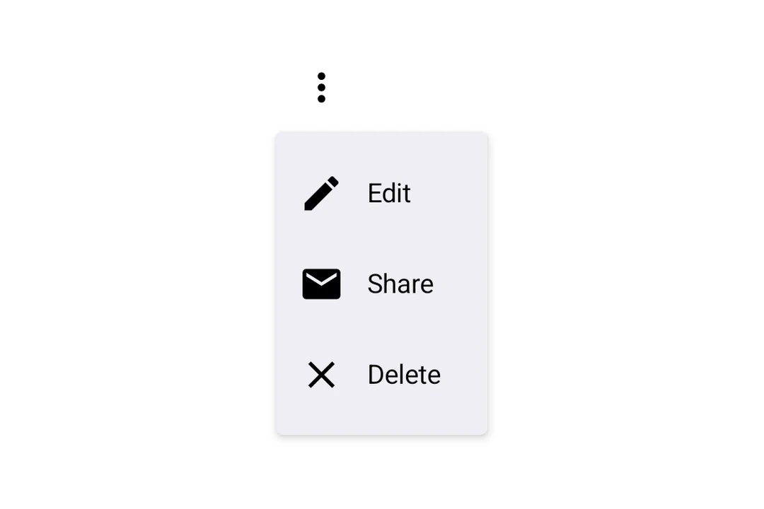
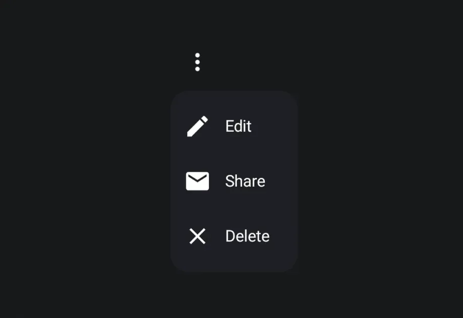
打开的三点更多菜单,显示带有前置图标的 Edit、Share 和 Delete 选项打开的三点更多菜单,显示带有前置图标的 Edit、Share 和 Delete 选项

安装

Terminal
- npx expo install @expo/ui
- yarn expo install @expo/ui
- pnpm expo install @expo/ui
- bun expo install @expo/ui

If you are installing this in an existing React Native app, make sure to install expo in your project.

用法

基本下拉菜单

BasicDropdownMenuExample.tsx
import { Host, DropdownMenu, DropdownMenuItem, OutlinedButton, Text, Icon, } from '@expo/ui/jetpack-compose'; import { useState } from 'react'; const homeIcon = require('./assets/home.xml'); export default function BasicDropdownMenuExample() { const [isExpanded, setIsExpanded] = useState(false); return ( <Host matchContents> <DropdownMenu expanded={isExpanded} onDismissRequest={() => setIsExpanded(false)}> <DropdownMenu.Trigger> <OutlinedButton onClick={() => setIsExpanded(true)}> <Text>Show menu</Text> </OutlinedButton> </DropdownMenu.Trigger> <DropdownMenu.Items> <DropdownMenuItem onClick={() => { setIsExpanded(false); console.log('Home pressed'); }}> <DropdownMenuItem.Text> <Text>Home</Text> </DropdownMenuItem.Text> <DropdownMenuItem.LeadingIcon> <Icon source={homeIcon} size={24} /> </DropdownMenuItem.LeadingIcon> </DropdownMenuItem> </DropdownMenu.Items> </DropdownMenu> </Host> ); }

将 React Native 组件用作触发元素

你可以将 React Native 视图(例如 Pressable)包裹在 RNHostView 中,作为下拉菜单的触发元素。

RNTriggerDropdownMenuExample.tsx
import { Host, DropdownMenu, DropdownMenuItem, Text as ComposeText, RNHostView, } from '@expo/ui/jetpack-compose'; import { useState } from 'react'; import { Pressable, Text } from 'react-native'; export default function RNTriggerDropdownMenuExample() { const [isExpanded, setIsExpanded] = useState(false); return ( <Host matchContents> <DropdownMenu expanded={isExpanded} onDismissRequest={() => setIsExpanded(false)}> <DropdownMenu.Trigger> <RNHostView matchContents> <Pressable onPress={() => setIsExpanded(true)} style={{ alignSelf: 'flex-start', paddingHorizontal: 16, paddingVertical: 10, borderRadius: 8, backgroundColor: '#9B59B6', }}> <Text style={{ color: 'white', fontWeight: '600' }}> RN Pressable Trigger </Text> </Pressable> </RNHostView> </DropdownMenu.Trigger> <DropdownMenu.Items> <DropdownMenuItem onClick={() => setIsExpanded(false)}> <DropdownMenuItem.Text> <ComposeText>Item 1</ComposeText> </DropdownMenuItem.Text> </DropdownMenuItem> <DropdownMenuItem onClick={() => setIsExpanded(false)}> <DropdownMenuItem.Text> <ComposeText>Item 2</ComposeText> </DropdownMenuItem.Text> </DropdownMenuItem> </DropdownMenu.Items> </DropdownMenu> </Host> ); }

长按触发

Jetpack Compose 没有专用的长按菜单原语——你可以在触发视图上使用 combinedClickable 修饰符,并配合现有的受控 DropdownMenu 来组合实现。菜单会自动锚定到触发元素。

LongPressDropdownMenuExample.tsx
import { Host, DropdownMenu, DropdownMenuItem, Text, } from '@expo/ui/jetpack-compose'; import { background, combinedClickable, } from '@expo/ui/jetpack-compose/modifiers'; import { useState } from 'react'; export default function LongPressDropdownMenuExample() { const [isExpanded, setIsExpanded] = useState(false); return ( <Host matchContents> <DropdownMenu expanded={isExpanded} onDismissRequest={() => setIsExpanded(false)}> <DropdownMenu.Trigger> <Text modifiers={[ background('#e0e0e0'), combinedClickable({ onClick: () => console.log('Short tap'), onLongClick: () => setIsExpanded(true), }), ]}> Long-press me </Text> </DropdownMenu.Trigger> <DropdownMenu.Items> <DropdownMenuItem onClick={() => setIsExpanded(false)}> <DropdownMenuItem.Text> <Text>Copy</Text> </DropdownMenuItem.Text> </DropdownMenuItem> <DropdownMenuItem elementColors={{ textColor: '#B3261E' }} onClick={() => setIsExpanded(false)}> <DropdownMenuItem.Text> <Text>Delete</Text> </DropdownMenuItem.Text> </DropdownMenuItem> </DropdownMenu.Items> </DropdownMenu> </Host> ); }

圆角

使用 cornerRadius 自定义圆角半径(单位为 dp),以覆盖默认的 Material3 菜单形状。

RoundedDropdownMenuExample.tsx
import { Host, DropdownMenu, DropdownMenuItem, OutlinedButton, Text, } from '@expo/ui/jetpack-compose'; import { useState } from 'react'; export default function RoundedDropdownMenuExample() { const [isExpanded, setIsExpanded] = useState(false); return ( <Host matchContents> <DropdownMenu expanded={isExpanded} onDismissRequest={() => setIsExpanded(false)} cornerRadius={16}> <DropdownMenu.Trigger> <OutlinedButton onClick={() => setIsExpanded(true)}> <Text>Show menu</Text> </OutlinedButton> </DropdownMenu.Trigger> <DropdownMenu.Items> <DropdownMenuItem onClick={() => setIsExpanded(false)}> <DropdownMenuItem.Text> <Text>Item 1</Text> </DropdownMenuItem.Text> </DropdownMenuItem> </DropdownMenu.Items> </DropdownMenu> </Host> ); }

阴影高度

使用 shadowElevation 设置弹出菜单的阴影高度,单位为 dp。将其设为 0 可移除阴影;省略该属性则使用 Material 3 的默认值。应用于 DropdownMenu 的修饰符会作用于触发元素容器,因此阴影修饰符不会改变弹出菜单的阴影。

ShadowDropdownMenuExample.tsx
import { Host, DropdownMenu, DropdownMenuItem, OutlinedButton, Text, } from '@expo/ui/jetpack-compose'; import { useState } from 'react'; export default function ShadowDropdownMenuExample() { const [isExpanded, setIsExpanded] = useState(false); return ( <Host matchContents> <DropdownMenu expanded={isExpanded} onDismissRequest={() => setIsExpanded(false)} shadowElevation={1}> <DropdownMenu.Trigger> <OutlinedButton onClick={() => setIsExpanded(true)}> <Text>Show menu</Text> </OutlinedButton> </DropdownMenu.Trigger> <DropdownMenu.Items> <DropdownMenuItem onClick={() => setIsExpanded(false)}> <DropdownMenuItem.Text> <Text>Item 1</Text> </DropdownMenuItem.Text> </DropdownMenuItem> </DropdownMenu.Items> </DropdownMenu> </Host> ); }

API

import { DropdownMenu } from '@expo/ui/jetpack-compose';

Components

Android

Type: React.Element<DropdownMenuProps>

Props of the DropdownMenu component.

DropdownMenuProps

children

Android
Type: ReactNode

The contents of the submenu are used as an anchor for the dropdown menu. The children will be wrapped in a pressable element, which triggers opening of the dropdown menu.

color

Android
Optional • Type: ColorValue

The color of the container holding the dropdown menu items.

cornerRadius

Android
Optional • Type: number

Corner radius in dp for the dropdown menu container. Defaults to the Material3 MenuDefaults.shape corner radius.

expanded

Android
Optional • Type: boolean

Whether the dropdown menu is expanded (visible).

modifiers

Android
Optional • Type: ModifierConfig[]

Modifiers for the component.

onDismissRequest

Android
Optional • Type: () => void

Callback fired when the menu requests to be dismissed (e.g. tapping outside). Must be provided when expanded is true to allow the menu to close.

shadowElevation

Android
Optional • Type: number

Shadow elevation of the dropdown menu popup in dp. Set to 0 to remove the shadow. Defaults to Material3's MenuDefaults.ShadowElevation.

style

Android
Optional • Type: StyleProp<ViewStyle>

Optional styles to apply to the DropdownMenu.

Android

Type: React.Element<DropdownMenuItemProps>

A dropdown menu item component that wraps Compose's DropdownMenuItem. Should be used inside DropdownMenu.Items or ExposedDropdownMenu.

Items

Android

Type: React.Element<{ children: ReactNode }>

Container for items displayed in the dropdown menu. Children should be DropdownMenuItem components or other native views.

Preview

Android

Type: React.Element<{ children: ReactNode }>

Preview content shown during long press (iOS only).

Trigger

Android

Type: React.Element<{ children: ReactNode }>

Container for the trigger element that opens the dropdown menu.