This documentation is available as Markdown for AI agents and LLMs. See the full Markdown index or append .md to any documentation URL.
This is documentation for the next SDK version. For up-to-date documentation, see the latest version (SDK 57).
文本
一个用于显示样式化文本的 Jetpack Compose Text 组件。
有关跨平台用法,请参阅通用的
Text— 它会根据平台渲染相应的原生组件。
Expo UI Text 与官方 Jetpack Compose 文本样式 API 相匹配,并使用 Material 3 排版样式、自定义字体和文本格式选项来显示文本。
安装
If you are installing this in an existing React Native app, make sure to install expo in your project.
用法
基本文本
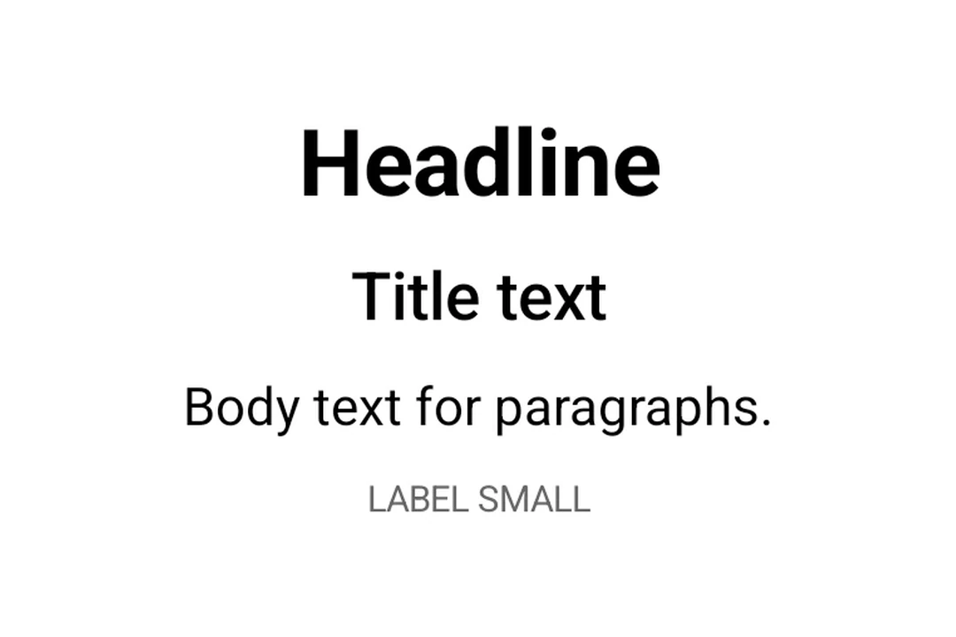
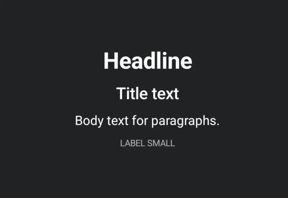
排版样式
使用带有 typography 的 style 属性来应用 Material 3 排版预设。
带有 maxLines 和 overflow 的文本
使用 maxLines 和 overflow 控制文本截断。
设置文本样式
应用自定义文本样式,包括字重、样式、大小和装饰。
嵌套文本
嵌套 <Text> 组件,以便对句子中的部分内容应用行内样式。子 span 会继承其父级样式。例如,粗体父级配合斜体子级时,子级会同时呈现粗体和斜体。
自定义字体
通过将字体族名称传递给 style.fontFamily,使用通过 expo-font 加载的字体。
API
import { Text } from '@expo/ui/jetpack-compose';
Component
Type: React.Element<TextProps>
Renders a Text component using Jetpack Compose.
ReactNodeThe text content to display. Can be a string, number, or nested Text components
for inline styled spans.
numberAn optional maximum number of lines for the text to span, wrapping if necessary. If the text exceeds the given number of lines, it will be truncated according to overflow.
numberThe minimum height in terms of minimum number of visible lines.
booleanWhether the text should break at soft line breaks. If false, the glyphs in the text will be positioned as if there was unlimited horizontal space.
TextStyleStyle configuration for the text. Corresponds to Jetpack Compose's TextStyle parameter.
Types
Literal type: string
Text alignment options.
Acceptable values are: 'left' | 'right' | 'center' | 'justify' | 'start' | 'end'
Literal type: string
Text decoration options.
Acceptable values are: 'none' | 'underline' | 'lineThrough'
Literal type: string
Font family for text styling. Built-in system families: 'default', 'sansSerif', 'serif', 'monospace', 'cursive'. Custom font families loaded via expo-font can be referenced by name (for example, 'Inter-Bold').
Acceptable values are: 'default' | 'sansSerif' | 'serif' | 'monospace' | 'cursive'
Literal type: string
Font style options for text styling.
Acceptable values are: 'normal' | 'italic'
Literal type: string
Font weight options for text styling.
Acceptable values are: 'normal' | 'bold' | '100' | '200' | '300' | '400' | '500' | '600' | '700' | '800' | '900'
Literal type: string
Line break strategy options.
- 'simple': Basic line breaking.
- 'heading': Optimized for short text like headings.
- 'paragraph': Produces more balanced line lengths for body text.
Acceptable values are: 'simple' | 'heading' | 'paragraph'
Literal type: string
Text overflow behavior options.
- 'clip': Clips the overflowing text to fit its container
- 'ellipsis': Uses an ellipsis to indicate that the text has overflowed
- 'visible': Renders overflow text outside its container
Acceptable values are: 'clip' | 'ellipsis' | 'visible'
Shared span-level style properties used by both TextStyle and TextSpanRecord.
Adding a property here ensures it's available on both parent text and nested spans.
Text style properties that can be applied to text.
Corresponds to Jetpack Compose's TextStyle.
Type: TextSpanStyleBase extended by:
Literal type: string
Material 3 Typography scale styles. Corresponds to MaterialTheme.typography in Jetpack Compose.
Acceptable values are: 'displayLarge' | 'displayMedium' | 'displaySmall' | 'headlineLarge' | 'headlineMedium' | 'headlineSmall' | 'titleLarge' | 'titleMedium' | 'titleSmall' | 'bodyLarge' | 'bodyMedium' | 'bodySmall' | 'labelLarge' | 'labelMedium' | 'labelSmall'