This is documentation for the next SDK version. For up-to-date documentation, see the latest version (SDK 56).
徽标
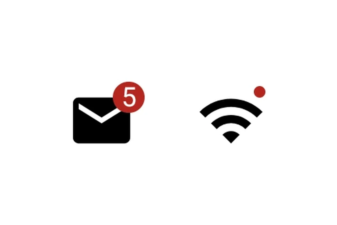
一个用于显示状态指示和计数的 Jetpack Compose 徽标组件。
Android
Included in Expo Go
For the complete documentation index, see llms.txt. Use this file to discover all available pages.
Expo UI Badge 与官方 Jetpack Compose Badge API 保持一致。它会渲染为一个小的彩色指示点,或者显示内容,例如计数数字。
安装
Terminal
- npx expo install @expo/uiIf you are installing this in an existing React Native app, make sure to install expo in your project.
用法
指示点
没有子元素的 badge 会渲染为一个小圆点指示器。
BadgeDot.tsx
import { Host, Badge } from '@expo/ui/jetpack-compose';

export default function BadgeDot() {
  return (
    <Host matchContents>
      <Badge />
    </Host>
  );
}
带计数的 badge
传入一个 Text 子元素以显示数字或标签。
BadgeCount.tsx
import { Host, Badge, Text } from '@expo/ui/jetpack-compose';

export default function BadgeCount() {
  return (
    <Host matchContents>
      <Badge containerColor="#EF5350" contentColor="#FFFFFF">
        <Text>3</Text>
      </Badge>
    </Host>
  );
}
API
import { Badge } from '@expo/ui/jetpack-compose';
Component
Type: React.Element<BadgeProps>
A badge component matching Compose's Badge.
Renders as a small colored indicator dot, or with content (for example, a count).
Optional • Type:
React.ReactNodeOptional content inside the badge (for example, a Text with a count).
When omitted, renders as a small indicator dot.
Optional • Type:
ColorValue • Default: BadgeDefaults.containerColorBackground color of the badge.
Optional • Type:
ColorValue • Default: BadgeDefaults.contentColorContent color inside the badge (text/icon tint).