This is documentation for the next SDK version. For up-to-date documentation, see the latest version (SDK 56).
带徽标的盒子
一个用于在内容上叠加徽标的 Jetpack Compose BadgedBox 组件。
Android
Included in Expo Go
For the complete documentation index, see llms.txt. Use this file to discover all available pages.
Expo UI BadgedBox 与官方 Jetpack Compose BadgedBox API 保持一致。它会在图标等内容上方叠加一个徽标。
安装
Terminal
- npx expo install @expo/uiIf you are installing this in an existing React Native app, make sure to install expo in your project.
用法
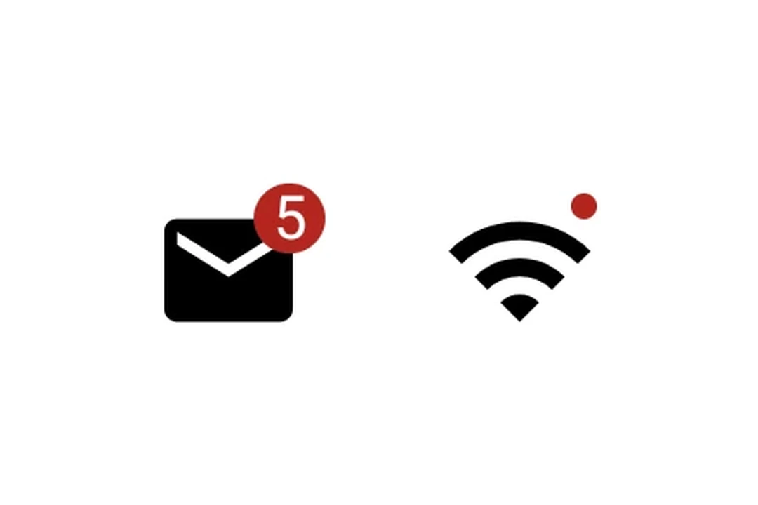
带徽标数量的图标
IconWithBadge.tsx
import { Host, Badge, BadgedBox, Icon, Text } from '@expo/ui/jetpack-compose';

// 替换为你自己的矢量 drawable 资源
const mailIcon = require('./assets/mail.xml');

export default function IconWithBadge() {
  return (
    <Host matchContents>
      <BadgedBox>
        <BadgedBox.Badge>
          <Badge>
            <Text>5</Text>
          </Badge>
        </BadgedBox.Badge>
        <Icon source={mailIcon} size={24} />
      </BadgedBox>
    </Host>
  );
}
交互式计数器
InteractiveBadge.tsx
import { useState } from 'react';
import { Host, Badge, BadgedBox, Icon, Button, Text, Column } from '@expo/ui/jetpack-compose';

// 替换为你自己的矢量 drawable 资源
const cartIcon = require('./assets/cart.xml');

export default function InteractiveBadge() {
  const [count, setCount] = useState(0);

  return (
    <Host matchContents>
      <Column>
        <BadgedBox>
          <BadgedBox.Badge>
            {count > 0 ? (
              <Badge>
                <Text>{String(count)}</Text>
              </Badge>
            ) : null}
          </BadgedBox.Badge>
          <Icon source={cartIcon} size={24} />
        </BadgedBox>
        <Button onClick={() => setCount(c => c + 1)}>
          <Text>添加项目</Text>
        </Button>
      </Column>
    </Host>
  );
}
API
import { BadgedBox } from '@expo/ui/jetpack-compose';
Component
Type: React.Element<BadgedBoxProps>
A badged box matching Compose's BadgedBox.
Overlays a badge on top of content (for example, an icon).