This is documentation for the next SDK version. For up-to-date documentation, see the latest version (SDK 56).
FloatingActionButton
遵循 Material Design 3 的 Jetpack Compose FloatingActionButton 组件。
For the complete documentation index, see llms.txt. Use this file to discover all available pages.
Expo UI 提供四种 FloatingActionButton 变体,与 Material Design 3 FloatingActionButton API 对应:
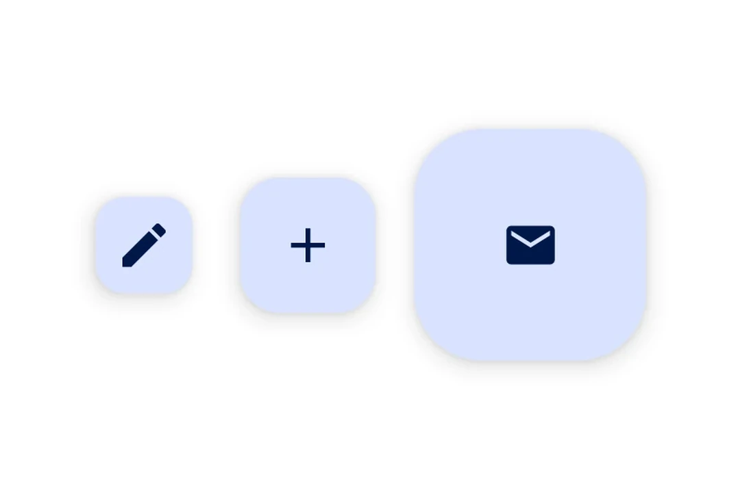
SmallFloatingActionButton— 紧凑型 FABFloatingActionButton— 标准 FAB(默认尺寸)LargeFloatingActionButton— 更大的 FABExtendedFloatingActionButton— 带有图标和文本标签的 FAB,支持动画展开/折叠
每个组件都使用基于插槽的子组件(.Icon,以及对于 ExtendedFloatingActionButton 的 .Text)来组合内容。
注意: 如果你需要在悬浮工具栏中使用多个操作按钮,请改用
HorizontalFloatingToolbar。
安装
- npx expo install @expo/uiIf you are installing this in an existing React Native app, make sure to install expo in your project.
用法
标准 FloatingActionButton
import { FloatingActionButton, Host, Icon } from '@expo/ui/jetpack-compose';

export default function StandardFABExample() {
  return (
    <Host matchContents>
      <FloatingActionButton onClick={() => console.log('FAB 按下')}>
        <FloatingActionButton.Icon>
          <Icon source={require('./assets/add.xml')} />
        </FloatingActionButton.Icon>
      </FloatingActionButton>
    </Host>
  );
}
FAB 变体
import {
  FloatingActionButton,
  Host,
  Icon,
  LargeFloatingActionButton,
  SmallFloatingActionButton,
} from '@expo/ui/jetpack-compose';
import { View } from 'react-native';

export default function FABVariantsExample() {
  return (
    <View style={{ flexDirection: 'row', gap: 16 }}>
      <Host matchContents>
        <SmallFloatingActionButton onClick={() => {}}>
          <SmallFloatingActionButton.Icon>
            <Icon source={require('./assets/add.xml')} />
          </SmallFloatingActionButton.Icon>
        </SmallFloatingActionButton>
      </Host>
      <Host matchContents>
        <FloatingActionButton onClick={() => {}}>
          <FloatingActionButton.Icon>
            <Icon source={require('./assets/add.xml')} />
          </FloatingActionButton.Icon>
        </FloatingActionButton>
      </Host>
      <Host matchContents>
        <LargeFloatingActionButton onClick={() => {}}>
          <LargeFloatingActionButton.Icon>
            <Icon source={require('./assets/add.xml')} />
          </LargeFloatingActionButton.Icon>
        </LargeFloatingActionButton>
      </Host>
    </View>
  );
}
ExtendedFloatingActionButton
import { ExtendedFloatingActionButton, Host, Icon, Text } from '@expo/ui/jetpack-compose';
import { useState } from 'react';

export default function ExtendedFABExample() {
  const [expanded, setExpanded] = useState(true);

  return (
    <Host matchContents>
      <ExtendedFloatingActionButton expanded={expanded} onClick={() => setExpanded(v => !v)}>
        <ExtendedFloatingActionButton.Icon>
          <Icon source={require('./assets/edit.xml')} />
        </ExtendedFloatingActionButton.Icon>
        <ExtendedFloatingActionButton.Text>
          <Text>编辑</Text>
        </ExtendedFloatingActionButton.Text>
      </ExtendedFloatingActionButton>
    </Host>
  );
}
悬浮于内容之上
使用带有 align('bottomEnd') 的 Compose Box,即可将 FAB 定位在可滚动内容之上,并且完全位于 Compose 层内。
import {
  Box,
  FloatingActionButton,
  Host,
  Icon,
  LazyColumn,
  ListItem,
} from '@expo/ui/jetpack-compose';
import { align, fillMaxSize, fillMaxWidth, offset } from '@expo/ui/jetpack-compose/modifiers';

export default function FloatingFABExample() {
  return (
    <Host style={{ flex: 1 }}>
      <Box modifiers={[fillMaxSize()]}>
        <LazyColumn modifiers={[fillMaxSize()]}>{/* ...列表项... */}</LazyColumn>

        <FloatingActionButton
          modifiers={[align('bottomEnd'), offset(-16, -16)]}
          onClick={() => console.log('按下')}>
          <FloatingActionButton.Icon>
            <Icon source={require('./assets/add.xml')} />
          </FloatingActionButton.Icon>
        </FloatingActionButton>
      </Box>
    </Host>
  );
}
自定义颜色
import { ExtendedFloatingActionButton, Host, Icon, Text } from '@expo/ui/jetpack-compose';

export default function FABCustomColorExample() {
  return (
    <Host matchContents>
      <ExtendedFloatingActionButton containerColor="#E8DEF8" onClick={() => console.log('按下')}>
        <ExtendedFloatingActionButton.Icon>
          <Icon source={require('./assets/add.xml')} />
        </ExtendedFloatingActionButton.Icon>
        <ExtendedFloatingActionButton.Text>
          <Text>新建项目</Text>
        </ExtendedFloatingActionButton.Text>
      </ExtendedFloatingActionButton>
    </Host>
  );
}
API
import {
  SmallFloatingActionButton,
  FloatingActionButton,
  LargeFloatingActionButton,
  ExtendedFloatingActionButton,
} from '@expo/ui/jetpack-compose';
Components
Type: React.Element<ExtendedFloatingActionButtonProps>
Renders a Material Design 3 ExtendedFloatingActionButton with animated label expansion.
Wraps ExtendedFloatingActionButton.
Example
import { ExtendedFloatingActionButton, Host, Icon, Text } from '@expo/ui/jetpack-compose';

<Host matchContents>
  <ExtendedFloatingActionButton expanded={true} onClick={() => console.log('pressed')}>
    <ExtendedFloatingActionButton.Icon>
      <Icon source={require('./assets/edit.xml')} />
    </ExtendedFloatingActionButton.Icon>
    <ExtendedFloatingActionButton.Text>
      <Text>Edit</Text>
    </ExtendedFloatingActionButton.Text>
  </ExtendedFloatingActionButton>
</Host>
Type: React.Element<FloatingActionButtonProps>
Renders a Material Design 3 standard FloatingActionButton.
Wraps FloatingActionButton.
Example
import { FloatingActionButton, Host, Icon } from '@expo/ui/jetpack-compose';

<Host matchContents>
  <FloatingActionButton onClick={() => console.log('pressed')}>
    <FloatingActionButton.Icon>
      <Icon source={require('./assets/add.xml')} />
    </FloatingActionButton.Icon>
  </FloatingActionButton>
</Host>
ColorValueThe background color of the button container.
Defaults to FloatingActionButtonDefaults.containerColor (primary container).
Type: React.Element<FloatingActionButtonProps>
Renders a Material Design 3 large FloatingActionButton.
Wraps LargeFloatingActionButton.
Example
import { LargeFloatingActionButton, Host, Icon } from '@expo/ui/jetpack-compose';

<Host matchContents>
  <LargeFloatingActionButton onClick={() => console.log('pressed')}>
    <LargeFloatingActionButton.Icon>
      <Icon source={require('./assets/add.xml')} />
    </LargeFloatingActionButton.Icon>
  </LargeFloatingActionButton>
</Host>
Type: React.Element<FloatingActionButtonProps>
Renders a Material Design 3 small FloatingActionButton.
Wraps SmallFloatingActionButton.
Example
import { SmallFloatingActionButton, Host, Icon } from '@expo/ui/jetpack-compose';

<Host matchContents>
  <SmallFloatingActionButton onClick={() => console.log('pressed')}>
    <SmallFloatingActionButton.Icon>
      <Icon source={require('./assets/add.xml')} />
    </SmallFloatingActionButton.Icon>
  </SmallFloatingActionButton>
</Host>