This is documentation for the next SDK version. For up-to-date documentation, see the latest version (SDK 56).
下拉菜单
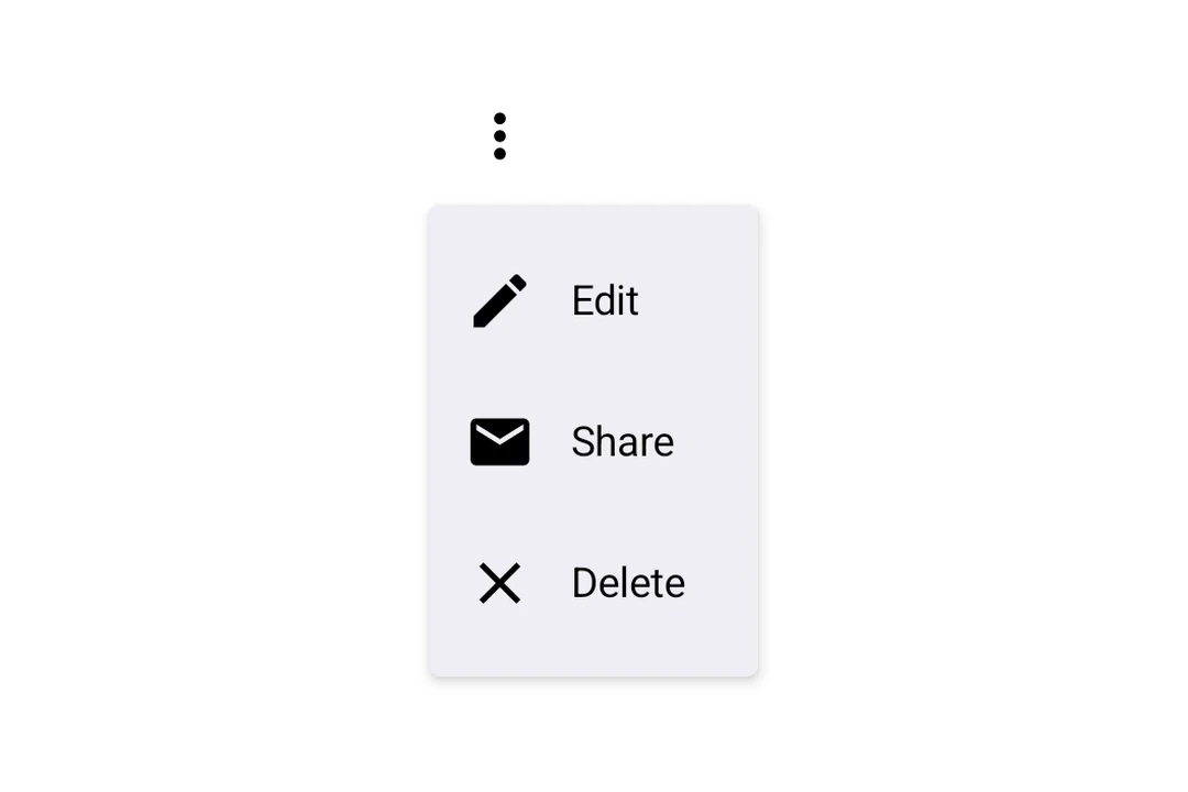
一个用于显示下拉菜单的 Jetpack Compose DropdownMenu 组件。
For the complete documentation index, see llms.txt. Use this file to discover all available pages.
Expo UI DropdownMenu 与官方 Jetpack Compose 菜单 API 保持一致,并在触发元素被按下时显示下拉菜单。
安装
- npx expo install @expo/uiIf you are installing this in an existing React Native app, make sure to install expo in your project.
用法
基础下拉菜单
import { Host, DropdownMenu, DropdownMenuItem, Button, Text, Icon } from '@expo/ui/jetpack-compose';
import { useState } from 'react';

export default function BasicDropdownMenuExample() {
  const [isExpanded, setIsExpanded] = useState(false);
  return (
    <Host matchContents>
      <DropdownMenu expanded={isExpanded} onDismissRequest={() => setIsExpanded(false)}>
        <DropdownMenu.Trigger>
          <Button variant="bordered" onClick={() => setIsExpanded(true)}>
            显示菜单
          </Button>
        </DropdownMenu.Trigger>
        <DropdownMenu.Items>
          <DropdownMenuItem
            onClick={() => {
              setIsExpanded(false);
              console.log('主页被按下');
            }}>
            <DropdownMenuItem.Text>
              <Text>主页</Text>
            </DropdownMenuItem.Text>
            <DropdownMenuItem.LeadingIcon>
              <Icon source={homeIcon} size={24} />
            </DropdownMenuItem.LeadingIcon>
          </DropdownMenuItem>
        </DropdownMenu.Items>
      </DropdownMenu>
    </Host>
  );
}
将 React Native 组件作为触发器
你可以将 React Native 视图(例如 Pressable)包装在 RNHostView 中,作为下拉菜单的触发器。
import {
  Host,
  DropdownMenu,
  DropdownMenuItem,
  Text as ComposeText,
  RNHostView,
} from '@expo/ui/jetpack-compose';
import { useState } from 'react';
import { Pressable, Text } from 'react-native';

export default function RNTriggerDropdownMenuExample() {
  const [isExpanded, setIsExpanded] = useState(false);
  return (
    <Host matchContents>
      <DropdownMenu expanded={isExpanded} onDismissRequest={() => setIsExpanded(false)}>
        <DropdownMenu.Trigger>
          <RNHostView matchContents>
            <Pressable
              onPress={() => setIsExpanded(true)}
              style={{
                alignSelf: 'flex-start',
                paddingHorizontal: 16,
                paddingVertical: 10,
                borderRadius: 8,
                backgroundColor: '#9B59B6',
              }}>
              <Text style={{ color: 'white', fontWeight: '600' }}>RN Pressable 触发器</Text>
            </Pressable>
          </RNHostView>
        </DropdownMenu.Trigger>
        <DropdownMenu.Items>
          <DropdownMenuItem onClick={() => setIsExpanded(false)}>
            <DropdownMenuItem.Text>
              <ComposeText>项 1</ComposeText>
            </DropdownMenuItem.Text>
          </DropdownMenuItem>
          <DropdownMenuItem onClick={() => setIsExpanded(false)}>
            <DropdownMenuItem.Text>
              <ComposeText>项 2</ComposeText>
            </DropdownMenuItem.Text>
          </DropdownMenuItem>
        </DropdownMenu.Items>
      </DropdownMenu>
    </Host>
  );
}
长按触发器
Jetpack Compose 没有专门的长按菜单原语——你可以通过触发视图上的 combinedClickable 修饰符,再配合现有的受控 DropdownMenu 来组合实现。菜单会自动锚定到触发器。
import { Host, DropdownMenu, DropdownMenuItem, Text } from '@expo/ui/jetpack-compose';
import { background, combinedClickable } from '@expo/ui/jetpack-compose/modifiers';
import { useState } from 'react';

export default function LongPressDropdownMenuExample() {
  const [isExpanded, setIsExpanded] = useState(false);
  return (
    <Host matchContents>
      <DropdownMenu expanded={isExpanded} onDismissRequest={() => setIsExpanded(false)}>
        <DropdownMenu.Trigger>
          <Text
            modifiers={[
              background('#e0e0e0'),
              combinedClickable({
                onClick: () => console.log('短按'),
                onLongClick: () => setIsExpanded(true),
              }),
            ]}>
            长按我
          </Text>
        </DropdownMenu.Trigger>
        <DropdownMenu.Items>
          <DropdownMenuItem onClick={() => setIsExpanded(false)}>
            <DropdownMenuItem.Text>
              <Text>复制</Text>
            </DropdownMenuItem.Text>
          </DropdownMenuItem>
          <DropdownMenuItem
            elementColors={{ textColor: '#B3261E' }}
            onClick={() => setIsExpanded(false)}>
            <DropdownMenuItem.Text>
              <Text>删除</Text>
            </DropdownMenuItem.Text>
          </DropdownMenuItem>
        </DropdownMenu.Items>
      </DropdownMenu>
    </Host>
  );
}
API
import { DropdownMenu } from '@expo/ui/jetpack-compose';
Components
Type: React.Element<DropdownMenuProps>
Props of the DropdownMenu component.
ReactNodeThe contents of the submenu are used as an anchor for the dropdown menu. The children will be wrapped in a pressable element, which triggers opening of the dropdown menu.
() => voidCallback fired when the menu requests to be dismissed (e.g. tapping outside).
Must be provided when expanded is true to allow the menu to close.
Type: React.Element<DropdownMenuItemProps>
A dropdown menu item component that wraps Compose's DropdownMenuItem.
Should be used inside DropdownMenu.Items or ExposedDropdownMenu.
Type: React.Element<{
children: ReactNode
}>
Container for items displayed in the dropdown menu.
Children should be DropdownMenuItem components or other native views.