This is documentation for the next SDK version. For up-to-date documentation, see the latest version (SDK 56).
NavigationBar
一个适用于 Material 3 底部导航的 Jetpack Compose NavigationBar 组件。
For the complete documentation index, see llms.txt. Use this file to discover all available pages.
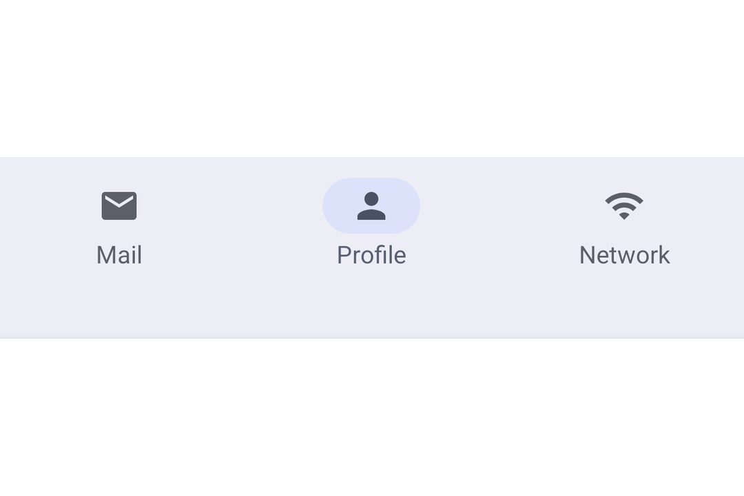
Expo UI NavigationBar 与官方 Jetpack Compose NavigationBar API 匹配。它显示一排目的地,用于在应用顶级部分之间切换。
安装
- npx expo install @expo/uiIf you are installing this in an existing React Native app, make sure to install expo in your project.
用法
基础导航栏
在 React state 中管理选中的项,并将 selected 传递给每个 NavigationBarItem。
import { useState } from 'react';
import { Host, Icon, NavigationBar, NavigationBarItem, Text } from '@expo/ui/jetpack-compose';

const HOME_ICON = require('./assets/home.xml');
const SEARCH_ICON = require('./assets/search.xml');
const SETTINGS_ICON = require('./assets/settings.xml');

export default function BasicNavigationBar() {
  const [selectedTab, setSelectedTab] = useState('home');

  return (
    <Host matchContents>
      <NavigationBar>
        <NavigationBarItem selected={selectedTab === 'home'} onClick={() => setSelectedTab('home')}>
          <NavigationBarItem.Icon>
            <Icon source={HOME_ICON} />
          </NavigationBarItem.Icon>
          <NavigationBarItem.Label>
            <Text>首页</Text>
          </NavigationBarItem.Label>
        </NavigationBarItem>

        <NavigationBarItem
          selected={selectedTab === 'search'}
          onClick={() => setSelectedTab('search')}>
          <NavigationBarItem.Icon>
            <Icon source={SEARCH_ICON} />
          </NavigationBarItem.Icon>
          <NavigationBarItem.Label>
            <Text>搜索</Text>
          </NavigationBarItem.Label>
        </NavigationBarItem>

        <NavigationBarItem
          selected={selectedTab === 'settings'}
          onClick={() => setSelectedTab('settings')}>
          <NavigationBarItem.Icon>
            <Icon source={SETTINGS_ICON} />
          </NavigationBarItem.Icon>
          <NavigationBarItem.Label>
            <Text>设置</Text>
          </NavigationBarItem.Label>
        </NavigationBarItem>
      </NavigationBar>
    </Host>
  );
}
API
import { NavigationBar, NavigationBarItem } from '@expo/ui/jetpack-compose';
Components
Type: React.Element<NavigationBarProps>
A Material Design 3 navigation bar.
ColorValue • Default: NavigationBarDefaults.containerColorBackground color of the navigation bar.
ColorValue • Default: contentColorFor(containerColor)Preferred content color inside the navigation bar.
Type: React.Element<NavigationBarItemProps>
A Material Design 3 navigation bar item. Must be used inside NavigationBar.
React.ReactNodeChildren containing Icon, SelectedIcon, and Label slots.
Types
Colors for navigation bar items in different states.
| Property | Type | Description |
|---|---|---|
| disabledIconColor(optional) | ColorValue | - |
| disabledTextColor(optional) | ColorValue | - |
| selectedIconColor(optional) | ColorValue | - |
| selectedIndicatorColor(optional) | ColorValue | - |
| selectedTextColor(optional) | ColorValue | - |
| unselectedIconColor(optional) | ColorValue | - |
| unselectedTextColor(optional) | ColorValue | - |