This documentation is available as Markdown for AI agents and LLMs. See the full Markdown index or append .md to any documentation URL.
This is documentation for the next SDK version. For up-to-date documentation, see the latest version (SDK 57).
列表项
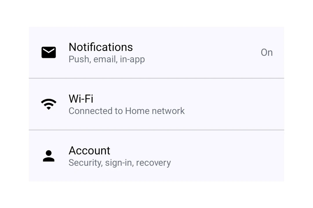
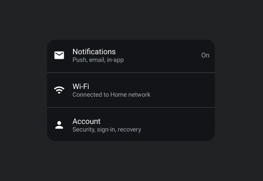
用于显示结构化列表项的 Jetpack Compose ListItem 组件。
Android
Included in Expo Go
Expo UI ListItem 与官方 Jetpack Compose ListItem API 一致,用于具有标题、辅助内容、上方内容、前导内容和尾随内容槽位的结构化列表项。
安装
Terminal
If you are installing this in an existing React Native app, make sure to install expo in your project.
用法
基本列表项
BasicListItem.tsx
使用复合组件
在每个位置使用复合组件来呈现更丰富的内容。
ListItemWithCompoundComponent.tsx
可点击的列表项
使用 clickable 修饰符来处理点击交互。
ClickableListItem.tsx
自定义标题内容
使用 ListItem.HeadlineContent 来呈现可组合的标题内容,例如带图标的行。
ListItemCustomHeadline.tsx
API
import { ListItem } from '@expo/ui/jetpack-compose';
Component
Type: React.Element<ListItemProps>
A list item matching Compose's ListItem.
Optional • Type:
number • Default: ListItemDefaults.ElevationShadow elevation in dp.