This is documentation for the next SDK version. For up-to-date documentation, see the latest version (SDK 56).
间隔器
一个用于在元素之间添加灵活空白的 Jetpack Compose Spacer 组件。
Android
Included in Expo Go
For the complete documentation index, see llms.txt. Use this file to discover all available pages.
如需跨平台使用,请参阅通用的Spacer— 它会根据平台渲染相应的原生组件。
Expo UI Spacer 与官方 Jetpack Compose Spacer API 保持一致,用于在布局中的元素之间添加可伸缩或固定大小的间距。
安装
Terminal
- npx expo install @expo/uiIf you are installing this in an existing React Native app, make sure to install expo in your project.
用法
带权重的 Spacer
使用 weight() 修饰符让 spacer 在 Row 或 Column 中按比例填充可用空间。
SpacerWeightExample.tsx
import { Host, Row, Spacer, Text } from '@expo/ui/jetpack-compose';
import { fillMaxWidth, weight } from '@expo/ui/jetpack-compose/modifiers';

export default function SpacerWeightExample() {
  return (
    <Host matchContents>
      <Row modifiers={[fillMaxWidth()]}>
        <Text>左侧</Text>
        <Spacer modifiers={[weight(1)]} />
        <Text>右侧</Text>
      </Row>
    </Host>
  );
}
固定大小的 Spacer
使用 height 或 width 修饰符创建一个具有固定尺寸的 spacer。
SpacerFixedSizeExample.tsx
import { Host, Column, Spacer, Text } from '@expo/ui/jetpack-compose';
import { height } from '@expo/ui/jetpack-compose/modifiers';

export default function SpacerFixedSizeExample() {
  return (
    <Host matchContents>
      <Column>
        <Text>上方</Text>
        <Spacer modifiers={[height(24)]} />
        <Text>下方(24dp 间距)</Text>
      </Column>
    </Host>
  );
}
API
import { Spacer } from '@expo/ui/jetpack-compose';
Component
Type: React.Element<SpacerProps>
A spacer component that fills available space.
Use with the weight() modifier to create flexible spacing in Row or Column layouts.
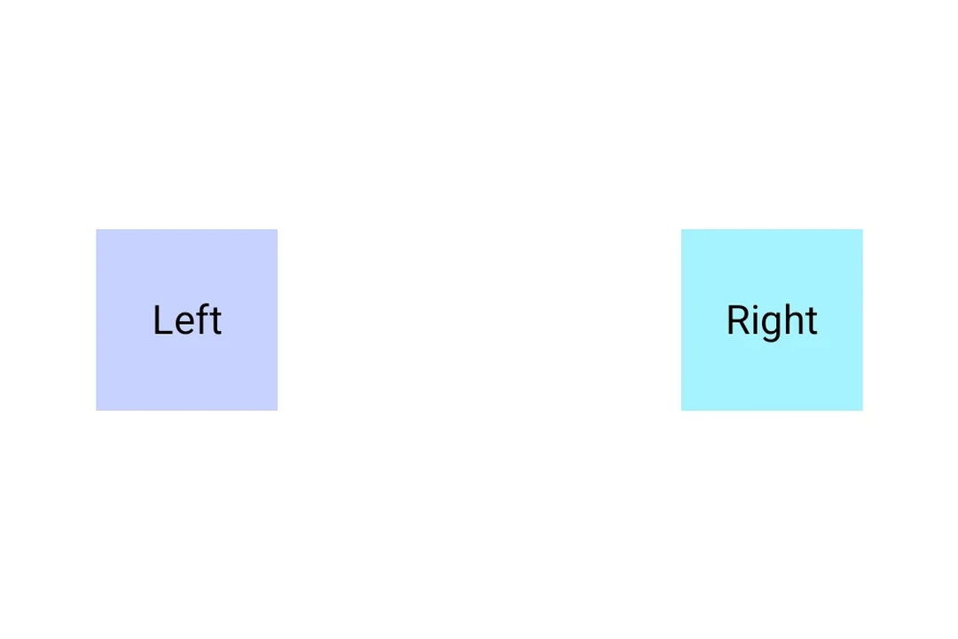
Example
<Row>
  <Text>Left</Text>
  <Spacer modifiers={[weight(1)]} />
  <Text>Right</Text>
</Row>
Optional • Type:
ExpoModifier[]Modifiers for the component. Use weight() modifier to make the spacer flexible.