This is documentation for the next SDK version. For up-to-date documentation, see the latest version (SDK 56).
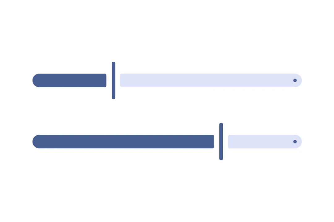
滑块
一个用于从范围中选择值的 Jetpack Compose 滑块组件。
For the complete documentation index, see llms.txt. Use this file to discover all available pages.
信息 有关跨平台用法,请参见通用的
Slider—— 它会根据平台渲染相应的原生组件。
Expo UI Slider 与官方的 Jetpack Compose Slider API 保持一致,并允许从有界范围中选择数值。
安装
- npx expo install @expo/uiIf you are installing this in an existing React Native app, make sure to install expo in your project.
用法
基础滑块
import { useState } from 'react';
import { Host, Slider } from '@expo/ui/jetpack-compose';

export default function BasicSliderExample() {
  const [value, setValue] = useState(0.5);

  return (
    <Host matchContents>
      <Slider value={value} onValueChange={setValue} />
    </Host>
  );
}
带自定义范围的滑块
使用 min 和 max 属性来定义滑块的数值范围。
import { useState } from 'react';
import { Host, Slider } from '@expo/ui/jetpack-compose';

export default function CustomRangeSliderExample() {
  const [value, setValue] = useState(50);

  return (
    <Host matchContents>
      <Slider value={value} min={0} max={100} onValueChange={setValue} />
    </Host>
  );
}
带步进的滑块
使用 steps 属性来定义离散增量。将 steps 设为 0 可表示连续值。
import { useState } from 'react';
import { Host, Slider } from '@expo/ui/jetpack-compose';

export default function SteppedSliderExample() {
  const [value, setValue] = useState(0);

  return (
    <Host matchContents>
      <Slider value={value} min={0} max={100} steps={10} onValueChange={setValue} />
    </Host>
  );
}
自定义颜色
使用 colors 属性覆盖滑块拇指、轨道和刻度标记的默认 Material3 颜色。
import { useState } from 'react';
import { Host, Slider } from '@expo/ui/jetpack-compose';

export default function CustomColorsSliderExample() {
  const [value, setValue] = useState(0.5);

  return (
    <Host matchContents>
      <Slider
        value={value}
        colors={{
          thumbColor: '#6200EE',
          activeTrackColor: '#6200EE',
          inactiveTrackColor: '#E0E0E0',
        }}
        onValueChange={setValue}
      />
    </Host>
  );
}
自定义拇指和轨道
同时使用 Slider.Thumb 和 Slider.Track 插槽即可实现完全自定义的滑块外观。
import { useState } from 'react';
import { Host, Slider, Shape, Row, Box } from '@expo/ui/jetpack-compose';
import {
  fillMaxWidth,
  height,
  weight,
  size,
  clip,
  background,
  Shapes,
} from '@expo/ui/jetpack-compose/modifiers';

export default function FullyCustomSliderExample() {
  const [value, setValue] = useState(0.5);

  return (
    <Host matchContents>
      <Slider value={value} onValueChange={setValue}>
        <Slider.Thumb>
          <Box modifiers={[size(24, 24), clip(Shapes.Circle), background('#6200EE')]} />
        </Slider.Thumb>
        <Slider.Track>
          <Row modifiers={[fillMaxWidth(), height(8)]}>
            <Shape.RoundedCorner
              color="#6200EE"
              cornerRadii={{ topStart: 4, bottomStart: 4 }}
              modifiers={[weight(Math.max(value, 0.01)), height(8)]}
            />
            <Shape.RoundedCorner
              color="#BDBDBD"
              cornerRadii={{ topEnd: 4, bottomEnd: 4 }}
              modifiers={[weight(Math.max(1 - value, 0.01)), height(8)]}
            />
          </Row>
        </Slider.Track>
      </Slider>
    </Host>
  );
}
API
import { Slider } from '@expo/ui/jetpack-compose';
Component
Type: React.Element<SliderProps>
A slider component that wraps Material3's Slider.
SliderColorsColors for slider elements. Maps to Material3's SliderDefaults.colors().
boolean • Default: trueWhether the slider is enabled for user interaction.
numberLower limit the user can drag the thumb to. The visible track still
spans min..max, but the thumb stops at lowerLimit during drag.
number • Default: 1The maximum value of the slider. Updating this value does not trigger callbacks if the current value is above max.
number • Default: 0The minimum value of the slider. Updating this value does not trigger callbacks if the current value is below min.
(value: number) => voidCallback triggered on dragging along the slider.
() => voidCallback triggered when the user finishes changing the value (for example, lifts a finger).
Maps to Material3's onValueChangeFinished.
number • Default: 0The number of steps between the minimum and maximum values, 0 signifies infinite steps.
numberUpper limit the user can drag the thumb to. The visible track still
spans min..max, but the thumb stops at upperLimit during drag.
Types
Colors for slider elements. Maps directly to Material3's SliderDefaults.colors().
| Property | Type | Description |
|---|---|---|
| activeTickColor(optional) | ColorValue | - |
| activeTrackColor(optional) | ColorValue | - |
| inactiveTickColor(optional) | ColorValue | - |
| inactiveTrackColor(optional) | ColorValue | - |
| thumbColor(optional) | ColorValue | - |