This is documentation for the next SDK version. For up-to-date documentation, see the latest version (SDK 56).
分区
一个用于在列表和表单中对内容进行分组的 SwiftUI Section 组件。
For the complete documentation index, see llms.txt. Use this file to discover all available pages.
Expo UI Section 与官方 SwiftUI Section API 保持一致,用于在 List、Form 或 Picker 组件中分组相关内容。
安装
- npx expo install @expo/uiIf you are installing this in an existing React Native app, make sure to install expo in your project.
用法
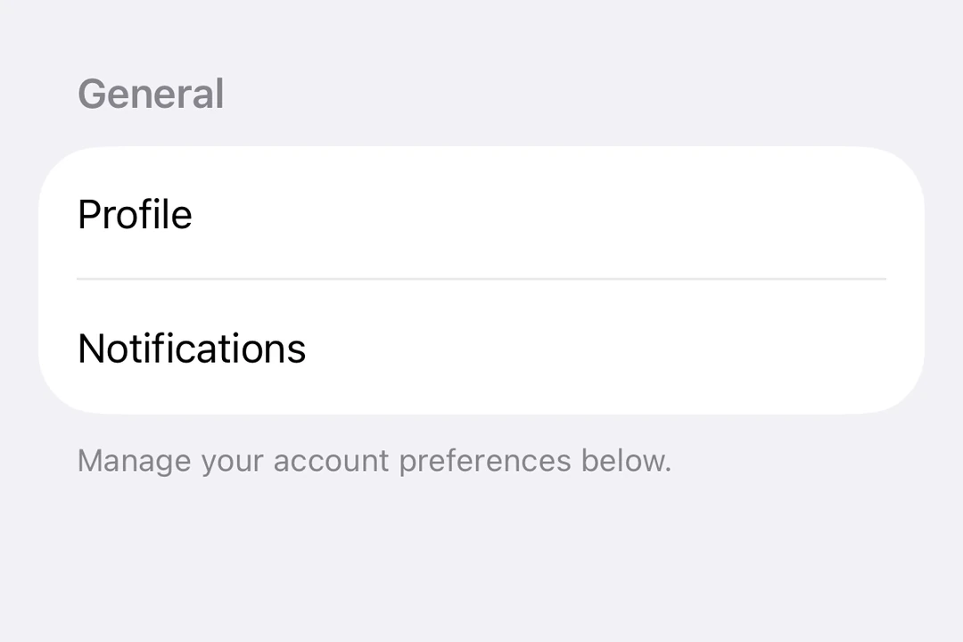
带标题的基础分区
对简单分区使用 title 属性作为带文本标题的分区。
import { Host, List, Section, Text } from '@expo/ui/swift-ui';

export default function BasicSectionExample() {
  return (
    <Host style={{ flex: 1 }}>
      <List>
        <Section title="设置">
          <Text>通用</Text>
          <Text>隐私</Text>
          <Text>通知</Text>
        </Section>
      </List>
    </Host>
  );
}
带自定义页眉和页脚的分区
对自定义视图使用 header 和 footer 属性。仅在未提供 title 时使用这些属性。
import { Host, List, Section, Toggle, Text, HStack, Image } from '@expo/ui/swift-ui';
import { useState } from 'react';

export default function CustomHeaderFooterExample() {
  const [locationEnabled, setLocationEnabled] = useState(false);

  return (
    <Host style={{ flex: 1 }}>
      <List>
        <Section
          header={
            <HStack>
              <Image systemName="location.fill" color="blue" size={16} />
              <Text>位置服务</Text>
            </HStack>
          }
          footer={
            <Text>
              启用位置服务可让应用提供个性化推荐。
            </Text>
          }>
          <Toggle
            label="启用位置"
            isOn={locationEnabled}
            onIsOnChange={setLocationEnabled}
          />
        </Section>
      </List>
    </Host>
  );
}
可折叠分区
使用 isExpanded 属性控制分区是展开还是折叠。提供该属性时,分区将变为可折叠。使用 onIsExpandedChange 处理状态变化。
注意: 可折叠分区需要 iOS 17+ 和 tvOS 17+,并且列表必须使用
sidebar样式。可折叠分区不支持页脚。
import { useState } from 'react';
import { Host, List, Section, Text } from '@expo/ui/swift-ui';

export default function CollapsibleSectionExample() {
  const [favoritesExpanded, setFavoritesExpanded] = useState(false);
  const [recentsExpanded, setRecentsExpanded] = useState(false);

  return (
    <Host style={{ flex: 1 }}>
      <List listStyle="sidebar">
        <Section
          title="收藏"
          isExpanded={favoritesExpanded}
          onIsExpandedChange={setFavoritesExpanded}>
          <Text>主页</Text>
          <Text>工作</Text>
          <Text>健身房</Text>
        </Section>
        <Section
          title="最近使用"
          isExpanded={recentsExpanded}
          onIsExpandedChange={setRecentsExpanded}>
          <Text>咖啡店</Text>
          <Text>图书馆</Text>
          <Text>公园</Text>
        </Section>
      </List>
    </Host>
  );
}
表单中的多个分区
分区可用于 Form 组件中,将表单控件组织为逻辑组。
import { useState } from 'react';
import { Host, Form, Section, Toggle, Picker, Text, Button } from '@expo/ui/swift-ui';
import { pickerStyle, tag } from '@expo/ui/swift-ui/modifiers';

export default function FormSectionsExample() {
  const [darkMode, setDarkMode] = useState(false);
  const [notifications, setNotifications] = useState(true);
  const [language, setLanguage] = useState(0);
  const languages = ['英语', '西班牙语', '法语', '德语'];

  return (
    <Host style={{ flex: 1 }}>
      <Form>
        <Section title="外观">
          <Toggle label="深色模式" isOn={darkMode} onIsOnChange={setDarkMode} />
          <Picker
            label="语言"
            selection={language}
            onSelectionChange={setLanguage}
            modifiers={[pickerStyle('menu')]}>
            {languages.map((lang, index) => (
              <Text key={index} modifiers={[tag(index)]}>
                {lang}
              </Text>
            ))}
          </Picker>
        </Section>
        <Section title="通知">
          <Toggle label="推送通知" isOn={notifications} onIsOnChange={setNotifications} />
        </Section>
        <Section title="账户">
          <Button label="退出登录" role="destructive" onPress={() => alert('已退出登录')} />
        </Section>
      </Form>
    </Host>
  );
}
API
import { Section } from '@expo/ui/swift-ui';
Component
Type: React.Element<SectionProps>
Section component uses the native Section component.
booleanControls whether the section is expanded or collapsed. When provided, the section becomes collapsible.
Note: Available only when the list style is set to
sidebar.
(isExpanded: boolean) => voidCallback triggered when the section's expanded state changes.