This is documentation for the next SDK version. For up-to-date documentation, see the latest version (SDK 56).
颜色选择器
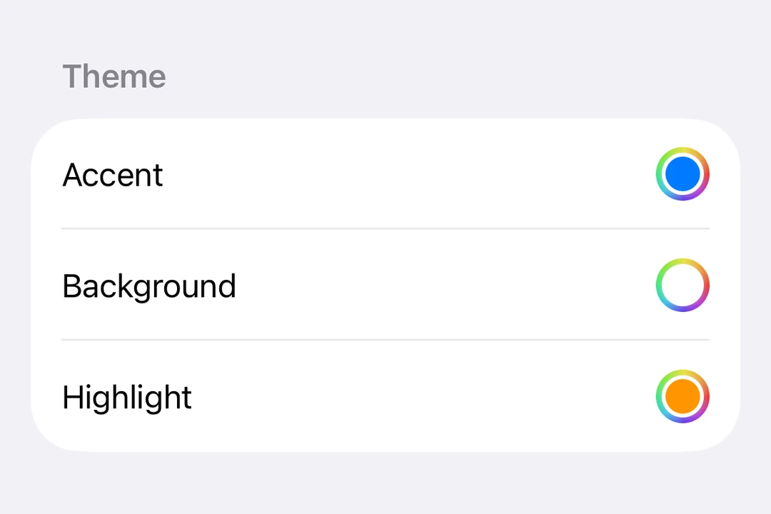
一个用于选择颜色的 SwiftUI ColorPicker 组件。
iOS
Included in Expo Go
For the complete documentation index, see llms.txt. Use this file to discover all available pages.
Expo UI ColorPicker 与官方 SwiftUI ColorPicker API 保持一致,并允许应用用户从调色板中选择颜色。
安装
Terminal
- npx expo install @expo/uiIf you are installing this in an existing React Native app, make sure to install expo in your project.
用法
基本颜色选择器
ColorPickerExample.tsx
import { useState } from 'react';
import { Host, ColorPicker } from '@expo/ui/swift-ui';

export default function ColorPickerExample() {
  const [color, setColor] = useState('#FF6347');

  return (
    <Host matchContents>
      <ColorPicker label="选择颜色" selection={color} onSelectionChange={setColor} />
    </Host>
  );
}
支持不透明度的颜色选择器
使用 supportsOpacity 属性可让用户选择带有 alpha 透明度的颜色。
ColorPickerOpacityExample.tsx
import { useState } from 'react';
import { Host, ColorPicker } from '@expo/ui/swift-ui';

export default function ColorPickerOpacityExample() {
  const [color, setColor] = useState('#FF634780');

  return (
    <Host matchContents>
      <ColorPicker
        label="选择带不透明度的颜色"
        selection={color}
        onSelectionChange={setColor}
        supportsOpacity
      />
    </Host>
  );
}
API
import { ColorPicker } from '@expo/ui/swift-ui';
Component
Type: React.Element<ColorPickerProps>
Renders a ColorPicker component using SwiftUI.