This is documentation for the next SDK version. For up-to-date documentation, see the latest version (SDK 56).
文本字段
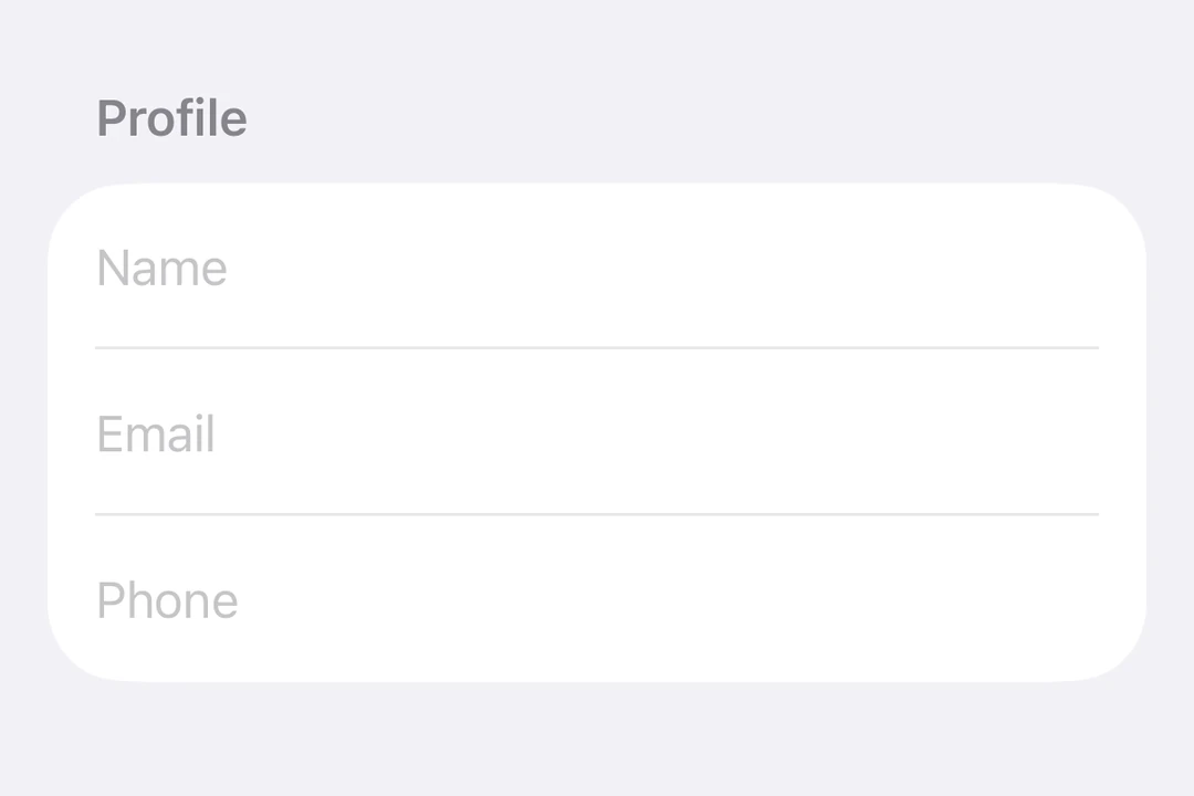
一个用于文本输入的 SwiftUI TextField 组件。
For the complete documentation index, see llms.txt. Use this file to discover all available pages.
信息 有关跨平台用法,请参见通用的
TextInput—— 它会针对每个平台渲染相应的原生组件。
Expo UI TextField 与官方 SwiftUI TextField API 保持一致,支持单行和多行输入、键盘配置、提交处理,以及用于程序化控制的命令式 ref。
安装
- npx expo install @expo/uiIf you are installing this in an existing React Native app, make sure to install expo in your project.
用法
非受控文本框
将一个 useNativeState 可观察对象绑定到 text。文本框会自行跟踪用户输入,你可以从 textState.value 读取当前值。
import { Host, TextField, useNativeState } from '@expo/ui/swift-ui';

export default function BasicTextFieldExample() {
  const textState = useNativeState('');

  return (
    <Host matchContents>
      <TextField placeholder="Username" text={textState} />
    </Host>
  );
}
受控文本框
传入一个 onTextChange worklet,用于转换或校验输入,并将结果写回 useNativeState 可观察状态。下面的示例会在输入时将文本转换为大写。
注意: Worklet 需要安装
react-native-reanimated和react-native-worklets。
import { Host, TextField, useNativeState } from '@expo/ui/swift-ui';
import { useCallback } from 'react';

export default function ControlledTextFieldExample() {
  const text = useNativeState('');

  const handleTextChange = useCallback(
    (value: string) => {
      'worklet';
      text.value = value.toUpperCase();
    },
    [text]
  );

  return (
    <Host matchContents>
      <TextField placeholder="Name" text={text} onTextChange={handleTextChange} />
    </Host>
  );
}
多行文本框
设置 axis="vertical" 以允许文本框在垂直方向扩展。使用 lineLimit 修饰器来控制可见行数。使用 Host matchContents 时,添加 fixedSize({ horizontal: false, vertical: true }),这样文本框在采用理想高度的同时,会接受父容器的宽度。
import { Host, TextField, useNativeState } from '@expo/ui/swift-ui';
import { lineLimit, fixedSize } from '@expo/ui/swift-ui/modifiers';

export default function MultilineTextFieldExample() {
  const textState = useNativeState('');

  return (
    <Host matchContents>
      <TextField
        axis="vertical"
        text={textState}
        placeholder="Tell us about yourself..."
        modifiers={[lineLimit(5), fixedSize({ horizontal: false, vertical: true })]}
      />
    </Host>
  );
}
键盘类型
使用 keyboardType 修饰器来显示特定的键盘布局。
import { Host, TextField, useNativeState } from '@expo/ui/swift-ui';
import { keyboardType, autocorrectionDisabled } from '@expo/ui/swift-ui/modifiers';

export default function KeyboardTypeExample() {
  const textState = useNativeState('');

  return (
    <Host matchContents>
      <TextField
        placeholder="Email"
        text={textState}
        modifiers={[keyboardType('email-address'), autocorrectionDisabled()]}
      />
    </Host>
  );
}
提交处理
使用 submitLabel 修饰器来自定义回车键,使用 onSubmit 来处理提交动作。
import { Host, TextField, useNativeState } from '@expo/ui/swift-ui';
import { submitLabel, onSubmit } from '@expo/ui/swift-ui/modifiers';

export default function SubmitHandlingExample() {
  const textState = useNativeState('');

  return (
    <Host matchContents>
      <TextField
        placeholder="Search..."
        text={textState}
        modifiers={[
          submitLabel('search'),
          onSubmit(() => console.log('Submitted:', textState.value)),
        ]}
      />
    </Host>
  );
}
命令式 ref
使用 ref 可以以命令式方式设置文本、聚焦、失焦或选中文本。
注意:
setSelection需要 iOS 18.0+ / tvOS 18.0+。其他 ref 方法可在所有受支持的版本上工作。
import { useRef } from 'react';
import {
  Host,
  TextField,
  TextFieldRef,
  Button,
  HStack,
  VStack,
  useNativeState,
} from '@expo/ui/swift-ui';
import { buttonStyle } from '@expo/ui/swift-ui/modifiers';

export default function ImperativeRefExample() {
  const ref = useRef<TextFieldRef>(null);
  const textState = useNativeState('Select me!');

  return (
    <Host matchContents>
      <VStack>
        <TextField ref={ref} text={textState} placeholder="Imperative field" />
        <HStack spacing={12}>
          <Button
            modifiers={[buttonStyle('bordered')]}
            onPress={() => ref.current?.focus()}
            label="聚焦"
          />
          <Button
            modifiers={[buttonStyle('bordered')]}
            onPress={() => ref.current?.blur()}
            label="失焦"
          />
          <Button
            modifiers={[buttonStyle('bordered')]}
            onPress={() => ref.current?.setText('SwiftUI 很棒!')}
            label="设置文本"
          />
          <Button
            modifiers={[buttonStyle('bordered')]}
            onPress={() => ref.current?.clear()}
            label="清除"
          />
          <Button
            modifiers={[buttonStyle('bordered')]}
            onPress={() => ref.current?.setSelection(0, 7)}
            label="选择"
          />
        </HStack>
      </VStack>
    </Host>
  );
}
Worklet 文本遮罩
当 onTextChange 使用 'worklet' 指令标记时,它会在 UI 线程上同步运行,因此在回调中对 useNativeState 可观察对象的写入会在下一帧之前生效。输入文本和遮罩后的文本之间不会出现闪烁。下面的示例会在用户输入时对电话号码进行遮罩,并从 worklet 中同时写入 text 和 selection,以保持光标位于格式化值的末尾。
注意: Worklet 需要安装
react-native-reanimated和react-native-worklets。selection属性需要 iOS 18.0+ / tvOS 18.0+。在较旧版本上,worklet 仍然可以更新文本,但无法进行光标定位。
import { Host, TextField, useNativeState } from '@expo/ui/swift-ui';
import { keyboardType } from '@expo/ui/swift-ui/modifiers';
import { useCallback } from 'react';

export default function WorkletPhoneMaskExample() {
  const phone = useNativeState('');
  const selection = useNativeState({ start: 0, end: 0 });

  const handleTextChange = useCallback(
    (v: string) => {
      'worklet';
      const digits = v.replace(/\D/g, '').slice(0, 10);
      let formatted = digits;
      if (digits.length > 6) {
        formatted = `(${digits.slice(0, 3)}) ${digits.slice(3, 6)}-${digits.slice(6)}`;
      } else if (digits.length > 3) {
        formatted = `(${digits.slice(0, 3)}) ${digits.slice(3)}`;
      }
      if (formatted !== v) {
        phone.value = formatted;
        // 演示中将光标吸附到末尾。真正的遮罩需要更智能的光标处理。
        selection.value = { start: formatted.length, end: formatted.length };
      }
    },
    [phone, selection]
  );

  return (
    <Host matchContents>
      <TextField
        text={phone}
        selection={selection}
        placeholder="(555) 123-4567"
        modifiers={[keyboardType('phone-pad')]}
        onTextChange={handleTextChange}
      />
    </Host>
  );
}
API
import { TextField } from '@expo/ui/swift-ui';
Component
Type: React.Element<TextFieldProps>
Renders a SwiftUI TextField.
boolean • Default: falseIf true, the text field will be focused automatically when mounted.
string • Default: 'horizontal'The axis along which the text field grows when content exceeds a single line.
'horizontal'— single line (default).'vertical'— expands vertically for multiline content. UselineLimitmodifier to cap visible lines.
Acceptable values are: 'horizontal' | 'vertical'
React.ReactNodeSlot children — supports <TextField.Placeholder> with a <Text> child
(any text-styling modifiers on that Text are preserved as the
placeholder's styling).
numberMaximum number of characters allowed. Truncates natively as the user types.
(focused: boolean) => voidA callback triggered when the field gains or loses focus.
(selection: {
  end: number,
  start: number
}) => void
A callback triggered when the text selection range changes.
(text: string) => voidA callback triggered when the text value changes.
If the callback is marked with the 'worklet' directive, it runs synchronously
on the UI thread; otherwise it is delivered asynchronously as a regular JS event.
Ref<TextFieldRef>ObservableState<TextFieldSelection>Observable state the field writes the current selection to.
Create with useNativeState<TextFieldSelection>({ start: 0, end: 0 }).
Use ref.setSelection(start, end) to set programmatically.
ObservableState<string>An observable state that holds the current text.
Create one with useNativeState('') or useNativeState('initial value').
If omitted, the field manages its own internal state.
Types
Observable state shared between JavaScript and native views (Jetpack Compose on Android and SwiftUI on iOS).
Type: SharedObject extended by:
| Property | Type | Description |
|---|---|---|
| onChange | [listener] | null | A single listener invoked on the native UI runtime whenever the value changes
(after iOS The callback must be a worklet so it can run synchronously on the UI thread.
Attach it inside Example
|
| value | T | The current value. Writes from a UI worklet are synchronous and immediately readable. Writes from the JS thread are scheduled to the UI thread asynchronously, the new value is not readable until the update has been applied. Prefer writing from a worklet when you need synchronous updates |
Can be used for imperatively focusing and setting text/selection on the TextField component.