This documentation is available as Markdown for AI agents and LLMs. See the full Markdown index or append .md to any documentation URL.
This is documentation for the next SDK version. For up-to-date documentation, see the
latest version (SDK 57).
菜单 一个用于显示下拉菜单的 SwiftUI Menu 组件。
Expo UI Menu 与官方 SwiftUI Menu API 保持一致,并支持通过 buttonStyleContextMenu
注意: 在 tvOS 上,Menu 需要 tvOS 17.0 或更高版本。
安装
- npx expo install @expo/ui
- yarn expo install @expo/ui
- pnpm expo install @expo/ui
- bun expo install @expo/ui
If you are installing this in an existing React Native app , make sure to install expo in your project.
用法
简单文本标签
import { Host , Menu , Button } from '@expo/ui/swift-ui' ;
export default function SimpleMenuExample ( ) {
return (
< Host style = { { flex: 1 } } >
< Menu label = " Options" >
< Button label = " Option 1" onPress = { ( ) => console . log ( 'Option 1' ) } />
< Button label = " Option 2" onPress = { ( ) => console . log ( 'Option 2' ) } />
< Button label = " Option 3" onPress = { ( ) => console . log ( 'Option 3' ) } />
</ Menu >
</ Host > ) ;
}
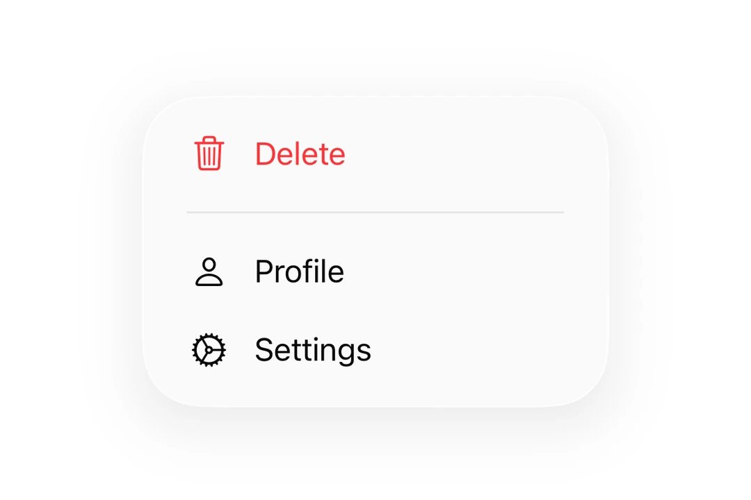
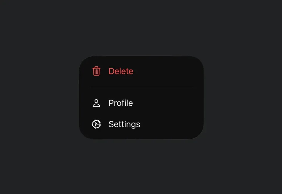
带 SF Symbol 的文本标签
import { Host , Menu , Button , Divider } from '@expo/ui/swift-ui' ;
export default function MenuWithIconExample ( ) {
return (
< Host style = { { flex: 1 } } >
< Menu label = " More" systemImage = " ellipsis.circle" >
< Button label = " Settings" systemImage = " gear" onPress = { ( ) => console . log ( 'Settings' ) } />
< Button label = " Profile" systemImage = " person" onPress = { ( ) => console . log ( 'Profile' ) } />
< Divider />
< Button label = " 删除" role = " destructive" systemImage = " trash" onPress = { ( ) => console . log ( '删除' ) } />
</ Menu >
</ Host > ) ;
}
自定义标签
你可以将 React 节点作为标签传入,以实现自定义样式。
CustomLabelMenuExample.tsx import { Host , Menu , Button , Text } from '@expo/ui/swift-ui' ;
import { foregroundStyle } from '@expo/ui/swift-ui/modifiers' ;
export default function CustomLabelMenuExample ( ) {
return (
< Host style = { { flex: 1 } } >
< Menu label = {
< Text modifiers = { [ foregroundStyle ( 'accentColor' ) ] } >
Custom Label
</ Text > } >
< Button label = " Action 1" onPress = { ( ) => console . log ( 'Action 1' ) } />
< Button label = " Action 2" onPress = { ( ) => console . log ( 'Action 2' ) } />
</ Menu >
</ Host > ) ;
}
将 React Native 组件用作标签
你可以通过将 React Native 视图(例如 Pressable)包装在 RNHostView
import { Host , Menu , Button , RNHostView } from '@expo/ui/swift-ui' ;
import { Pressable , Text } from 'react-native' ;
export default function RNLabelMenuExample ( ) {
return (
< Host style = { { flex: 1 } } >
< Menu label = {
< RNHostView matchContents >
< Pressable onPress = { ( ) => console . log ( 'RN 触发器被按下' ) } style = { {
alignSelf: 'flex-start' ,
paddingHorizontal: 16 ,
paddingVertical: 10 ,
borderRadius: 8 ,
backgroundColor: '#9B59B6' ,
} } >
< Text style = { { color: 'white' , fontWeight: '600' } } >
RN Pressable Trigger
</ Text >
</ Pressable >
</ RNHostView > } >
< Button label = " Item 1" onPress = { ( ) => console . log ( 'Item 1' ) } />
< Button label = " Item 2" onPress = { ( ) => console . log ( 'Item 2' ) } />
</ Menu >
</ Host > ) ;
}
嵌套菜单
菜单可以嵌套以创建子菜单。
import { Host , Menu , Button } from '@expo/ui/swift-ui' ;
export default function NestedMenuExample ( ) {
return (
< Host style = { { flex: 1 } } >
< Menu label = " Main Menu" >
< Button label = " Item 1" onPress = { ( ) => console . log ( 'Item 1' ) } />
< Menu label = " Submenu" >
< Button label = " Sub Item 1" onPress = { ( ) => console . log ( 'Sub Item 1' ) } />
< Button label = " Sub Item 2" onPress = { ( ) => console . log ( 'Sub Item 2' ) } />
</ Menu >
< Button label = " Item 2" onPress = { ( ) => console . log ( 'Item 2' ) } />
</ Menu >
</ Host > ) ;
}
带主操作
提供 onPrimaryAction 后,单击会触发主操作,而长按会显示菜单。
PrimaryActionMenuExample.tsx import { Host , Menu , Button } from '@expo/ui/swift-ui' ;
export default function PrimaryActionMenuExample ( ) {
return (
< Host style = { { flex: 1 } } >
< Menu label = " 点击或长按" systemImage = " play.circle" onPrimaryAction = { ( ) =>
console . log ( 'Primary action triggered!' )
} >
< Button label = " Menu Item 1" onPress = { ( ) => console . log ( 'Menu Item 1' ) } />
< Button label = " Menu Item 2" onPress = { ( ) => console . log ( 'Menu Item 2' ) } />
< Button label = " Menu Item 3" onPress = { ( ) => console . log ( 'Menu Item 3' ) } />
</ Menu >
</ Host > ) ;
}
使用修饰符设置样式
你可以使用 buttonStyle 修饰符更改菜单触发器的外观。
import { Host , Menu , Button } from '@expo/ui/swift-ui' ;
import { buttonStyle } from '@expo/ui/swift-ui/modifiers' ;
export default function StyledMenuExample ( ) {
return (
< Host style = { { flex: 1 } } >
< Menu label = " Styled Menu" modifiers = { [ buttonStyle ( 'borderedProminent' ) ] } >
< Button label = " Styled Action 1" onPress = { ( ) => console . log ( 'Styled 1' ) } />
< Button label = " Styled Action 2" onPress = { ( ) => console . log ( 'Styled 2' ) } />
</ Menu >
</ Host > ) ;
}
Mac Catalyst 上的纯样式触发器
在使用 Mac idiom(Xcode 的 为 Mac 优化界面 )的 Mac Catalyst 构建中,SwiftUI 会将 Menu 渲染为 AppKit 下拉按钮:带边框的外观和展开箭头会替代自定义 label,而下拉菜单自身的尺寸会使触发器变宽。结合使用 menuStyle('button')、buttonStyle('plain') 和 menuIndicator('hidden'),可使标签成为整个触发器。
PlainTriggerMenuExample.tsx import { Host , Menu , Button , Text } from '@expo/ui/swift-ui' ;
import {
buttonStyle,
menuIndicator,
menuStyle,
} from '@expo/ui/swift-ui/modifiers' ;
export default function PlainTriggerMenuExample ( ) {
return (
< Host matchContents >
< Menu label = { < Text > Custom Label </ Text > } modifiers = { [
menuStyle ( 'button' ) ,
buttonStyle ( 'plain' ) ,
menuIndicator ( 'hidden' ) ,
] } >
< Button label = " Action 1" onPress = { ( ) => console . log ( 'Action 1' ) } />
< Button label = " Action 2" onPress = { ( ) => console . log ( 'Action 2' ) } />
</ Menu >
</ Host > ) ;
}
玻璃菜单
要创建具有 iOS Liquid Glass 外观的菜单,请在 Menu 组件上使用 buttonStyle('glass') 或 buttonStyle('glassProminent')。
重要: 不要将 glassEffect() 修饰符应用到 Menu 的标签视图上来实现玻璃效果。这会导致一个视觉异常:菜单关闭时,触发器后方会短暂出现一个矩形光晕。请始终使用 buttonStyle,它能与 Menu 的关闭动画正确集成。
import { Host , Menu , Button } from '@expo/ui/swift-ui' ;
import { buttonStyle } from '@expo/ui/swift-ui/modifiers' ;
export default function GlassMenuExample ( ) {
return (
< Host style = { { flex: 1 } } >
< Menu label = " Glass Menu" systemImage = " ellipsis.circle" modifiers = { [ buttonStyle ( 'glass' ) ] } >
< Button label = " Action 1" onPress = { ( ) => console . log ( 'Action 1' ) } />
< Button label = " Action 2" onPress = { ( ) => console . log ( 'Action 2' ) } />
</ Menu >
</ Host > ) ;
}
如需更显著的玻璃效果,请使用 glassProminent:
GlassProminentMenuExample.tsx import { Host , Menu , Button } from '@expo/ui/swift-ui' ;
import { buttonStyle } from '@expo/ui/swift-ui/modifiers' ;
export default function GlassProminentMenuExample ( ) {
return (
< Host style = { { flex: 1 } } >
< Menu label = " 显著玻璃菜单" systemImage = " slider.horizontal.3" modifiers = { [ buttonStyle ( 'glassProminent' ) ] } >
< Button label = " Settings" systemImage = " gear" onPress = { ( ) => console . log ( 'Settings' ) } />
< Button label = " 筛选" systemImage = " line.3.horizontal.decrease" onPress = { ( ) => console . log ( '筛选' ) } />
</ Menu >
</ Host > ) ;
}
搭配 ControlGroup 使用
在菜单中使用 ControlGroup
MenuWithControlGroupExample.tsx import {
Host ,
Menu ,
ControlGroup ,
Button ,
Section ,
Divider ,
} from '@expo/ui/swift-ui' ;
export default function MenuWithControlGroupExample ( ) {
return (
< Host style = { { flex: 1 } } >
< Menu label = " Song Options" systemImage = " ellipsis.circle" >
< ControlGroup >
< Button systemImage = " plus" label = " Add" onPress = { ( ) => console . log ( 'Add' ) } />
< Button systemImage = " star" label = " Favorite" onPress = { ( ) => console . log ( 'Favorite' ) } />
< Button systemImage = " square.and.arrow.up" label = " 分享" onPress = { ( ) => console . log ( '分享' ) } />
</ ControlGroup >
< Section >
< Button systemImage = " text.badge.plus" label = " 添加到播放列表" onPress = { ( ) => console . log ( '添加到播放列表' ) } />
< Button systemImage = " antenna.radiowaves.left.and.right" label = " 创建电台" onPress = { ( ) => console . log ( '创建电台' ) } />
</ Section >
< Divider />
< Button systemImage = " hand.thumbsdown" label = " 减少此类推荐" onPress = { ( ) => console . log ( '减少此类推荐' ) } />
</ Menu >
</ Host > ) ;
}
禁用菜单项
在菜单 Button 上使用 disabled(true)onPress。
DisabledMenuItemExample.tsx import { Host , Menu , Button } from '@expo/ui/swift-ui' ;
import { disabled } from '@expo/ui/swift-ui/modifiers' ;
export default function DisabledMenuItemExample ( ) {
return (
< Host style = { { flex: 1 } } >
< Menu label = " Options" >
< Button label = " Available" onPress = { ( ) => console . log ( 'Available' ) } />
< Button label = " 已锁定" systemImage = " lock" modifiers = { [ disabled ( true ) ] } onPress = { ( ) => console . log ( '此操作不会触发' ) } />
</ Menu >
</ Host > ) ;
}
可选择的菜单项(勾选标记)
放置在 Menu 中的 SwiftUI TogglesystemImage,该行会显示对应的 SF Symbol。当 isOn 为 true 时,符号前还会显示勾选标记。请使用此模式,而不是自行创建自定义勾选项。
CheckmarkMenuItemExample.tsx import { Host , Menu , Button , Toggle } from '@expo/ui/swift-ui' ;
import { useState } from 'react' ;
export default function CheckmarkMenuItemExample ( ) {
const [ showCompleted, setShowCompleted] = useState ( true ) ;
const [ showArchived, setShowArchived] = useState ( false ) ;
return (
< Host style = { { flex: 1 } } >
< Menu label = " Filter" systemImage = " line.3.horizontal.decrease.circle" >
< Toggle isOn = { showCompleted} label = " 显示已完成" systemImage = " checkmark.circle" onIsOnChange = { setShowCompleted} />
< Toggle isOn = { showArchived} label = " 显示已归档" systemImage = " archivebox" onIsOnChange = { setShowArchived} />
< Button label = " Clear filters" onPress = { ( ) => console . log ( 'Clear' ) } />
</ Menu >
</ Host > ) ;
}
仅图标菜单按钮
使用 labelStyle('iconOnly') 修饰符,仅显示图标而不显示标签文本。出于可访问性考虑,仍应提供 label 属性。
import { Host , Menu , Button } from '@expo/ui/swift-ui' ;
import { labelStyle } from '@expo/ui/swift-ui/modifiers' ;
export default function IconOnlyMenuExample ( ) {
return (
< Host style = { { flex: 1 } } >
< Menu label = " More options" systemImage = " ellipsis.circle" modifiers = { [ labelStyle ( 'iconOnly' ) ] } >
< Button label = " Menu Item 1" onPress = { ( ) => console . log ( 'Menu Item 1' ) } />
< Button label = " Menu Item 2" onPress = { ( ) => console . log ( 'Menu Item 2' ) } />
< Button label = " Menu Item 3" onPress = { ( ) => console . log ( 'Menu Item 3' ) } />
</ Menu >
</ Host > ) ;
}
API
import { Menu } from '@expo/ui/swift-ui' ;
Component Type: React.Element < MenuProps >
Displays a dropdown menu when tapped.
Props for the Menu component.
The menu's content items, which are shown when the menu is opened.
Can contain Button, Toggle, Picker, Section, Divider or nested Menu components.
The label for the menu trigger. Can be a string for simple text labels,
or a ReactNode for custom label content.
Optional • Type: ( ) => void
A callback that is invoked when the user taps the menu label.
When provided, a single tap triggers this action, while a long-press shows the menu.
When not provided, a single tap shows the menu.
Optional • Type: string
An SF Symbol name to display alongside the label.
Only used when label is a string.