分区
一个用于在列表和表单中对内容进行分组的 SwiftUI Section 组件。
For the complete documentation index, see llms.txt. Use this file to discover all available pages.
Expo UI 的 Section 与官方 SwiftUI Section API 保持一致,用于在 List、Form 或 Picker 组件中对相关内容进行分组。
安装
- npx expo install @expo/uiIf you are installing this in an existing React Native app, make sure to install expo in your project.
用法
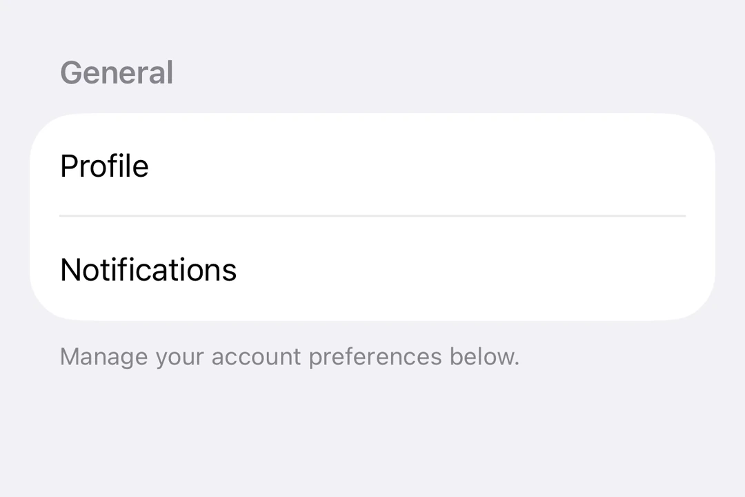
带标题的基础 Section
对简单的、带文本标题的 Section 使用 title 属性。
import { Host, List, Section, Text } from '@expo/ui/swift-ui';

export default function BasicSectionExample() {
  return (
    <Host style={{ flex: 1 }}>
      <List>
        <Section title="设置">
          <Text>常规</Text>
          <Text>隐私</Text>
          <Text>通知</Text>
        </Section>
      </List>
    </Host>
  );
}
带自定义页眉和页脚的 Section
对自定义视图使用 header 和 footer 属性。只有在未提供 title 时才会使用这些属性。
import { Host, List, Section, Toggle, Text, HStack, Image } from '@expo/ui/swift-ui';
import { useState } from 'react';

export default function CustomHeaderFooterExample() {
  const [locationEnabled, setLocationEnabled] = useState(false);

  return (
    <Host style={{ flex: 1 }}>
      <List>
        <Section
          header={
            <HStack>
              <Image systemName="location.fill" color="blue" size={16} />
              <Text>位置服务</Text>
            </HStack>
          }
          footer={
            <Text>
              启用位置服务可让应用提供个性化推荐。
            </Text>
          }>
          <Toggle
            label="启用位置"
            isOn={locationEnabled}
            onIsOnChange={setLocationEnabled}
          />
        </Section>
      </List>
    </Host>
  );
}
可折叠 Section
使用 isExpanded 属性来控制 Section 是展开还是折叠。提供该属性后,Section 就会变成可折叠的。使用 onIsExpandedChange 处理状态变化。
注意: 可折叠 Section 需要 iOS 17+ 和 tvOS 17+,且列表必须使用
sidebar样式。可折叠 Section 不支持 footer。
import { useState } from 'react';
import { Host, List, Section, Text } from '@expo/ui/swift-ui';

export default function CollapsibleSectionExample() {
  const [favoritesExpanded, setFavoritesExpanded] = useState(false);
  const [recentsExpanded, setRecentsExpanded] = useState(false);

  return (
    <Host style={{ flex: 1 }}>
      <List listStyle="sidebar">
        <Section
          title="收藏"
          isExpanded={favoritesExpanded}
          onIsExpandedChange={setFavoritesExpanded}>
          <Text>主页</Text>
          <Text>工作</Text>
          <Text>健身房</Text>
        </Section>
        <Section
          title="最近"
          isExpanded={recentsExpanded}
          onIsExpandedChange={setRecentsExpanded}>
          <Text>咖啡店</Text>
          <Text>图书馆</Text>
          <Text>公园</Text>
        </Section>
      </List>
    </Host>
  );
}
Form 中的多个 Section
Section 可用于 Form 组件中,将表单控件组织为逻辑分组。
import { useState } from 'react';
import { Host, Form, Section, Toggle, Picker, Text, Button } from '@expo/ui/swift-ui';
import { pickerStyle, tag } from '@expo/ui/swift-ui/modifiers';

export default function FormSectionsExample() {
  const [darkMode, setDarkMode] = useState(false);
  const [notifications, setNotifications] = useState(true);
  const [language, setLanguage] = useState(0);
  const languages = ['English', 'Spanish', 'French', 'German'];

  return (
    <Host style={{ flex: 1 }}>
      <Form>
        <Section title="外观">
          <Toggle label="深色模式" isOn={darkMode} onIsOnChange={setDarkMode} />
          <Picker
            label="语言"
            selection={language}
            onSelectionChange={setLanguage}
            modifiers={[pickerStyle('menu')]}>
            {languages.map((lang, index) => (
              <Text key={index} modifiers={[tag(index)]}>
                {lang}
              </Text>
            ))}
          </Picker>
        </Section>
        <Section title="通知">
          <Toggle label="推送通知" isOn={notifications} onIsOnChange={setNotifications} />
        </Section>
        <Section title="账户">
          <Button label="退出登录" role="destructive" onPress={() => alert('已退出登录')} />
        </Section>
      </Form>
    </Host>
  );
}
API
import { Section } from '@expo/ui/swift-ui';
Component
Type: React.Element<SectionProps>
Section component uses the native Section component.
booleanControls whether the section is expanded or collapsed. When provided, the section becomes collapsible.
Note: Available only when the list style is set to
sidebar.
(isExpanded: boolean) => voidCallback triggered when the section's expanded state changes.