This documentation is available as Markdown for AI agents and LLMs. See the full Markdown index or append .md to any documentation URL.
ProgressView
用于显示进度指示器的 SwiftUI ProgressView 组件。
Expo UI ProgressView 与官方 SwiftUI ProgressView API 保持一致,并支持通过 progressViewStyle 修饰器进行样式设置。
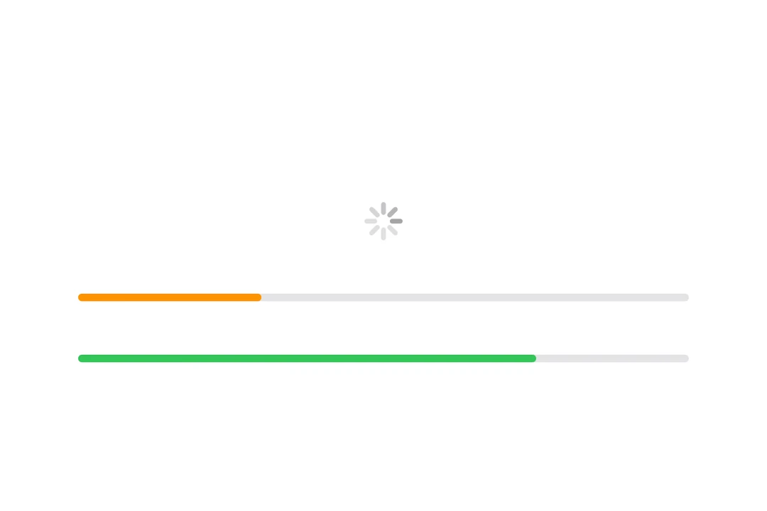
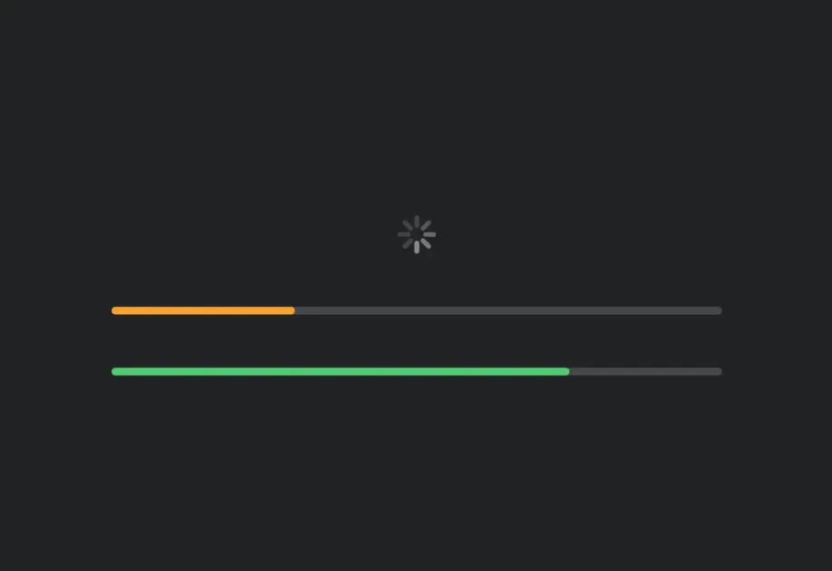
安装
- npx expo install @expo/uiIf you are installing this in an existing React Native app, make sure to install expo in your project.
用法
注意: 当使用
linear样式(这是确定性进度的默认样式)时,ProgressView是一个可变宽度组件,它会扩展以填充可用的水平空间。当在Host上使用matchContents时,你应该在ProgressView上应用frame修饰符,为其指定明确的宽度。或者,也可以使用style为Host指定明确的尺寸(例如,style={{ width: 300 }}或style={{ flex: 1 }})。circular样式和不确定性加载指示器具有固定尺寸,并且可以与matchContents配合使用。
不确定性进度
当未提供 value 时,进度视图会显示一个不确定性指示器(加载旋转器)。
import { Host, ProgressView } from '@expo/ui/swift-ui'; export default function IndeterminateExample() { return ( <Host matchContents> <ProgressView /> </Host> ); }
确定性进度
提供一个介于 0 和 1 之间的 value 来显示确定性进度。
import { Host, ProgressView } from '@expo/ui/swift-ui'; export default function DeterminateExample() { return ( <Host style={{ flex: 1 }}> <ProgressView value={0.5} /> </Host> ); }
进度视图样式
使用 progressViewStyle 修饰符来更改进度视图的外观。可用样式有:automatic、linear 和 circular。
import { Host, ProgressView, VStack } from '@expo/ui/swift-ui'; import { progressViewStyle } from '@expo/ui/swift-ui/modifiers'; export default function ProgressViewStylesExample() { return ( <Host style={{ flex: 1 }}> <ProgressView value={0.5} modifiers={[progressViewStyle('linear')]} /> </Host> ); }
带标签
你可以将自定义组件作为 children 传入,为进度视图提供标签。
import { Host, ProgressView, Text } from '@expo/ui/swift-ui'; export default function LabelExample() { return ( <Host style={{ flex: 1 }}> <ProgressView value={0.25}> <Text>加载中...</Text> </ProgressView> </Host> ); }
着色进度视图
使用 tint 修饰符来更改进度视图的颜色。
import { Host, ProgressView } from '@expo/ui/swift-ui'; import { tint } from '@expo/ui/swift-ui/modifiers'; export default function TintedExample() { return ( <Host style={{ flex: 1 }}> <ProgressView value={0.7} modifiers={[tint('red')]} /> </Host> ); }
基于计时器的进度
使用 timerInterval 属性创建一个会在某个时间范围内自动播放动画的进度视图。这适用于显示倒计时器或计时操作。
注意: 基于计时器的进度仅适用于 iOS 16+ 和 tvOS 16+。
import { Host, ProgressView, Text, VStack } from '@expo/ui/swift-ui'; export default function TimerExample() { const startDate = new Date(); const endDate = new Date(Date.now() + 10000); // 距现在 10 秒 return ( <Host style={{ flex: 1 }}> <VStack spacing={16}> <ProgressView timerInterval={{ lower: startDate, upper: endDate }} /> <ProgressView timerInterval={{ lower: startDate, upper: endDate }} countsDown={false}> <Text>向上计数</Text> </ProgressView> </VStack> </Host> ); }
API
import { ProgressView } from '@expo/ui/swift-ui';
Component
Type: React.Element<ProgressViewProps>
Renders a SwiftUI ProgressView component.
boolean • Default: trueA Boolean value that determines whether the view empties or fills as time passes. If true, which is the default, the view empties.
ClosedRangeDateThe lower and upper bounds for automatic timer progress.
unionThe current progress value. A value between 0 and 1.
When undefined, the progress view displays an indeterminate indicator.
Acceptable values are: number | null