This documentation is available as Markdown for AI agents and LLMs. See the full Markdown index or append .md to any documentation URL.
弹出层
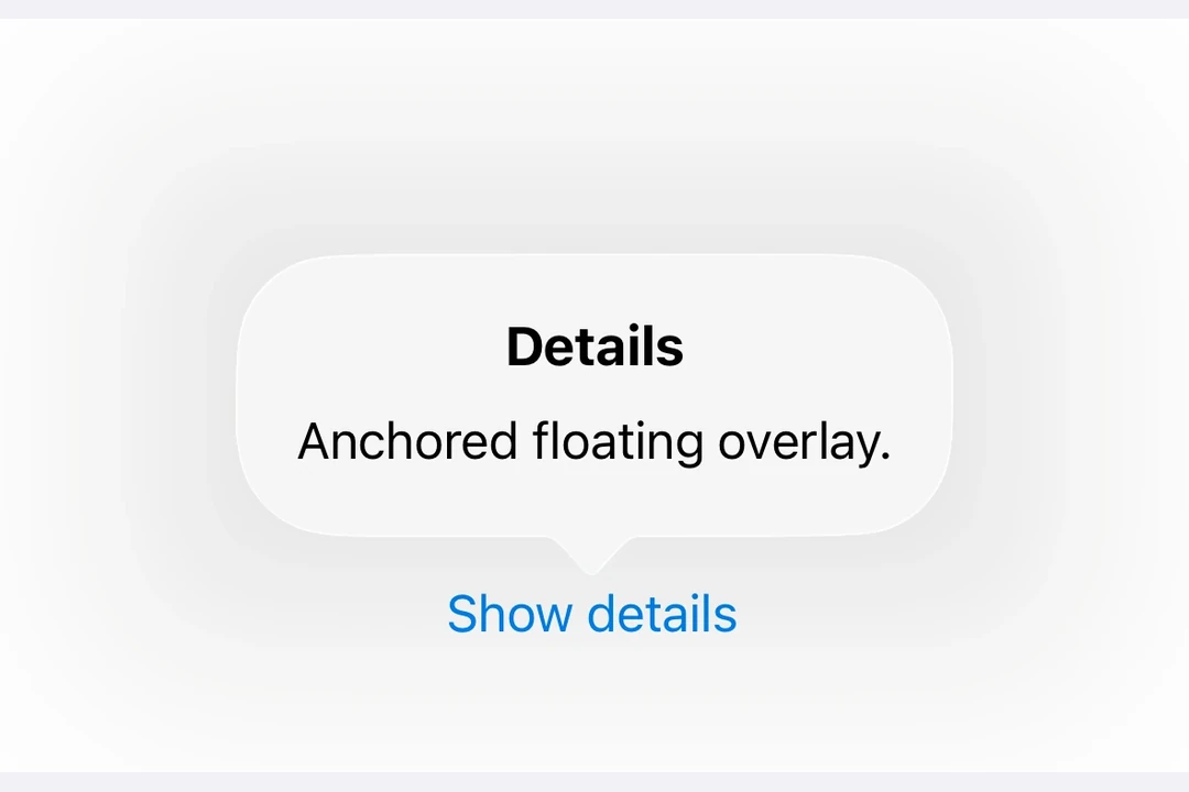
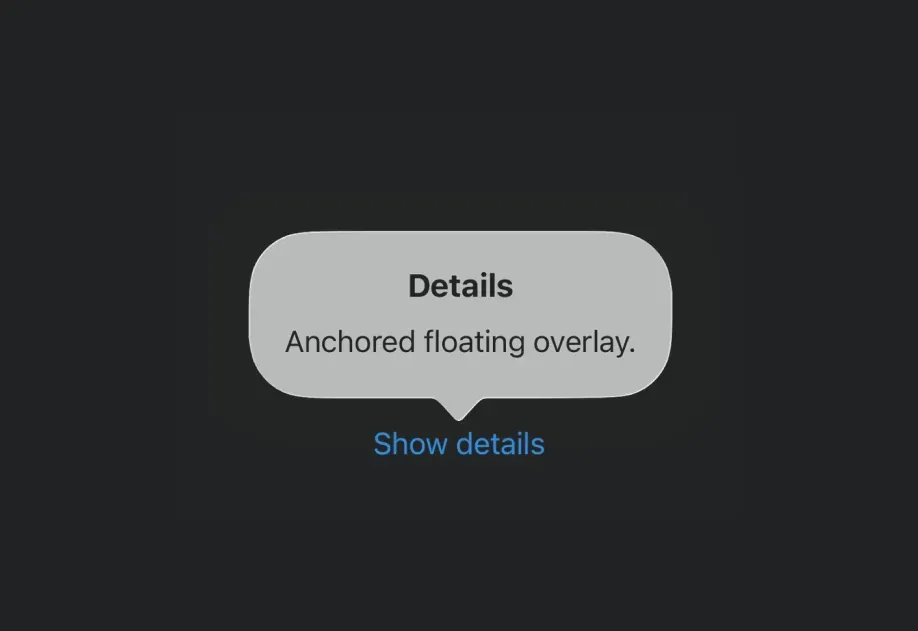
一个用于在浮动覆盖层中显示内容的 SwiftUI 弹出层组件。
Expo UI Popover 与官方 SwiftUI Popover API 保持一致,并提供了一种在锚定到触发元素的浮层中展示内容的方式。
安装
- npx expo install @expo/uiIf you are installing this in an existing React Native app, make sure to install expo in your project.
用法
基础弹出框
import { useState } from 'react'; import { Host, Button, Popover, Text, VStack } from '@expo/ui/swift-ui'; import { padding } from '@expo/ui/swift-ui/modifiers'; export default function BasicPopoverExample() { const [isPresented, setIsPresented] = useState(false); return ( <Host matchContents> <Popover isPresented={isPresented} onStateChange={({ isPresented }) => setIsPresented(isPresented)}> <Popover.Trigger> <Button label="Show Popover" onPress={() => setIsPresented(true)} /> </Popover.Trigger> <Popover.Content> <VStack modifiers={[padding({ all: 16 })]}> <Text>来自弹出框的问候!</Text> </VStack> </Popover.Content> </Popover> </Host> ); }
使用附着锚点
attachmentAnchor 属性控制弹出框附着到触发元素的位置。可选项为:center、leading、trailing、top 和 bottom。
import { useState } from 'react'; import { Host, Button, Popover, Text, VStack } from '@expo/ui/swift-ui'; import { padding } from '@expo/ui/swift-ui/modifiers'; export default function AttachmentAnchorExample() { const [isPresented, setIsPresented] = useState(false); return ( <Host matchContents> <Popover isPresented={isPresented} onStateChange={({ isPresented }) => setIsPresented(isPresented)} attachmentAnchor="trailing"> <Popover.Trigger> <Button label="Show Popover" onPress={() => setIsPresented(true)} /> </Popover.Trigger> <Popover.Content> <VStack modifiers={[padding({ all: 16 })]}> <Text>附着到尾部边缘</Text> </VStack> </Popover.Content> </Popover> </Host> ); }
使用箭头边缘
arrowEdge 属性控制弹出框的哪一侧显示箭头。可选项为:none、leading、trailing、top 和 bottom。
import { useState } from 'react'; import { Host, Button, Popover, Text, VStack } from '@expo/ui/swift-ui'; import { padding } from '@expo/ui/swift-ui/modifiers'; export default function ArrowEdgeExample() { const [isPresented, setIsPresented] = useState(false); return ( <Host matchContents> <Popover isPresented={isPresented} onStateChange={({ isPresented }) => setIsPresented(isPresented)} arrowEdge="top"> <Popover.Trigger> <Button label="Show Popover" onPress={() => setIsPresented(true)} /> </Popover.Trigger> <Popover.Content> <VStack modifiers={[padding({ all: 16 })]}> <Text>箭头位于顶部边缘</Text> </VStack> </Popover.Content> </Popover> </Host> ); }
使用 React Native 内容
你可以使用 RNHostView 在弹出框内容中嵌入 React Native 组件。
import { useState } from 'react'; import { Pressable, Text as RNText, View } from 'react-native'; import { Host, Button, Popover, RNHostView } from '@expo/ui/swift-ui'; export default function RNContentPopoverExample() { const [isPresented, setIsPresented] = useState(false); const [counter, setCounter] = useState(0); return ( <Host matchContents> <Popover isPresented={isPresented} onStateChange={({ isPresented }) => setIsPresented(isPresented)}> <Popover.Trigger> <Button label="Show RN Popover" onPress={() => setIsPresented(true)} /> </Popover.Trigger> <Popover.Content> <RNHostView matchContents> <View style={{ padding: 16 }}> <RNText style={{ fontSize: 16, fontWeight: 'bold' }}>React Native 内容</RNText> <RNText style={{ color: '#666', marginVertical: 8 }}>计数器:{counter}</RNText> <Pressable style={{ backgroundColor: '#007AFF', padding: 12, borderRadius: 8, alignItems: 'center', }} onPress={() => setCounter(counter + 1)}> <RNText style={{ color: 'white' }}>增加</RNText> </Pressable> </View> </RNHostView> </Popover.Content> </Popover> </Host> ); }
API
import { Popover } from '@expo/ui/swift-ui';
Component
Type: React.Element<PopoverViewProps>
Props
string • Default: 'none'The edge of the attachmentAnchor that defines the location of the popover's arrow. The default is none, which results in the system allowing any arrow edge.
Acceptable values are: 'none' | 'top' | 'bottom' | 'leading' | 'trailing'
stringThe positioning anchor that defines the attachment point of the popover.
Acceptable values are: 'center' | 'top' | 'bottom' | 'leading' | 'trailing'
ReactNode(isPresented: boolean) => voidA callback that is called when the isPresented state changes.