表单
一个用于以结构化布局收集用户输入的 SwiftUI 表单组件。
iOS
tvOS
Included in Expo Go
For the complete documentation index, see llms.txt. Use this file to discover all available pages.
Expo UI Form 与官方 SwiftUI Form API 保持一致。它提供了一个用于分组数据输入控件的容器,例如设置页或检查面板中所使用的控件。
安装
Terminal
- npx expo install @expo/uiIf you are installing this in an existing React Native app, make sure to install expo in your project.
用法
基本表单
BasicFormExample.tsx
import { useState } from 'react';
import { Host, Form, TextField } from '@expo/ui/swift-ui';

export default function BasicFormExample() {
  return (
    <Host style={{ flex: 1 }}>
      <Form>
        <TextField placeholder="输入你的姓名" />
      </Form>
    </Host>
  );
}
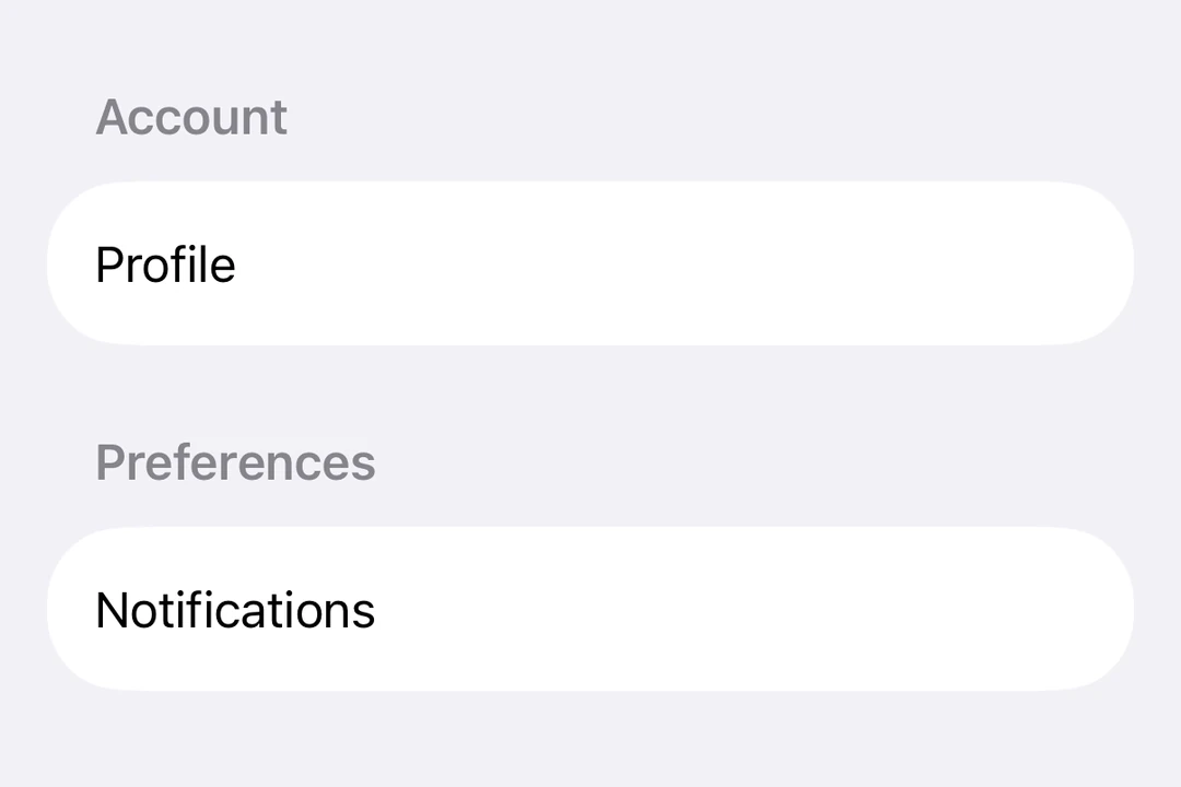
带分区的表单
使用 Section 组件在表单中分组相关控件。
FormWithSectionsExample.tsx
import { useState } from 'react';
import { Host, Form, Section, TextField, Toggle, Button } from '@expo/ui/swift-ui';

export default function FormWithSectionsExample() {
  const [notifications, setNotifications] = useState(false);
  const [darkMode, setDarkMode] = useState(false);

  return (
    <Host style={{ flex: 1 }}>
      <Form>
        <Section title="个人资料">
          <TextField placeholder="姓名" />
          <TextField placeholder="电子邮件" />
        </Section>

        <Section title="偏好设置">
          <Toggle
            label="启用通知"
            isOn={notifications}
            onIsOnChange={setNotifications}
          />
          <Toggle label="深色模式" isOn={darkMode} onIsOnChange={setDarkMode} />
        </Section>

        <Section>
          <Button label="保存更改" onPress={() => console.log('已保存!')} />
        </Section>
      </Form>
    </Host>
  );
}
自定义背景的表单
使用 scrollContentBackground 修饰器来自定义或隐藏表单的背景。
FormBackgroundExample.tsx
import { useState } from 'react';
import { Host, Form, Section, TextField } from '@expo/ui/swift-ui';
import { scrollContentBackground, background } from '@expo/ui/swift-ui/modifiers';

export default function FormBackgroundExample() {
  return (
    <Host style={{ flex: 1 }}>
      <Form modifiers={[scrollContentBackground('hidden'), background('#F0F0F0')]}>
        <Section title="自定义背景">
          <TextField placeholder="输入文本" />
        </Section>
      </Form>
    </Host>
  );
}
不可滚动的表单
使用 scrollDisabled 修饰器来防止表单滚动。
注意:
scrollDisabled修饰器仅适用于 iOS 16+ 和 tvOS 16+。
NonScrollableFormExample.tsx
import { useState } from 'react';
import { Host, Form, Section, TextField, Toggle } from '@expo/ui/swift-ui';
import { scrollDisabled } from '@expo/ui/swift-ui/modifiers';

export default function NonScrollableFormExample() {
  const [isOn, setIsOn] = useState(false);

  return (
    <Host style={{ flex: 1 }}>
      <Form modifiers={[scrollDisabled()]}>
        <Section title="设置">
          <Toggle label="启用功能" isOn={isOn} onIsOnChange={setIsOn} />
        </Section>
      </Form>
    </Host>
  );
}
下拉刷新表单
使用 refreshable 修饰器添加下拉刷新功能。
RefreshableFormExample.tsx
import { useState, useCallback } from 'react';
import { Host, Form, Section, Text } from '@expo/ui/swift-ui';
import { refreshable } from '@expo/ui/swift-ui/modifiers';

export default function RefreshableFormExample() {
  const [lastRefresh, setLastRefresh] = useState(new Date());

  const handleRefresh = useCallback(async () => {
    // 模拟网络请求
    await new Promise(resolve => setTimeout(resolve, 1500));
    setLastRefresh(new Date());
  }, []);

  return (
    <Host style={{ flex: 1 }}>
      <Form modifiers={[refreshable(handleRefresh)]}>
        <Section title="下拉刷新">
          <Text>上次刷新时间:{lastRefresh.toLocaleTimeString()}</Text>
        </Section>
      </Form>
    </Host>
  );
}
API
import { Form } from '@expo/ui/swift-ui';