确认对话框
一个用于显示确认提示的 SwiftUI ConfirmationDialog 组件。
For the complete documentation index, see llms.txt. Use this file to discover all available pages.
Expo UI ConfirmationDialog 与官方 SwiftUI confirmationDialog API 相匹配,并以包含标题、操作项和可选消息的操作表样式对话框呈现。
安装
- npx expo install @expo/uiIf you are installing this in an existing React Native app, make sure to install expo in your project.
用法
基本确认对话框
使用 ConfirmationDialog.Trigger 来定义可见元素,并使用 ConfirmationDialog.Actions 来提供对话框按钮。
import { useState } from 'react';
import { Host, ConfirmationDialog, Button, Text } from '@expo/ui/swift-ui';

export default function BasicConfirmationDialogExample() {
  const [isPresented, setIsPresented] = useState(false);

  return (
    <Host matchContents>
      <ConfirmationDialog
        title="你确定吗?"
        isPresented={isPresented}
        onIsPresentedChange={setIsPresented}
        titleVisibility="visible">
        <ConfirmationDialog.Trigger>
          <Button label="显示对话框" onPress={() => setIsPresented(true)} />
        </ConfirmationDialog.Trigger>
        <ConfirmationDialog.Actions>
          <Button label="确认" onPress={() => setIsPresented(false)} />
          <Button label="取消" role="cancel" />
        </ConfirmationDialog.Actions>
      </ConfirmationDialog>
    </Host>
  );
}
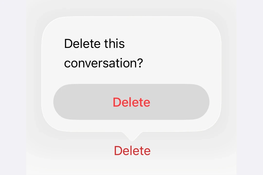
危险操作确认
在 ConfirmationDialog.Actions 内的 Button 上使用 role="destructive",可将其样式设为危险操作。
import { useState } from 'react';
import { Host, ConfirmationDialog, Button, Text } from '@expo/ui/swift-ui';

export default function DestructiveConfirmationDialogExample() {
  const [isPresented, setIsPresented] = useState(false);

  return (
    <Host matchContents>
      <ConfirmationDialog
        title="删除项目?"
        isPresented={isPresented}
        onIsPresentedChange={setIsPresented}
        titleVisibility="visible">
        <ConfirmationDialog.Trigger>
          <Button label="删除" role="destructive" onPress={() => setIsPresented(true)} />
        </ConfirmationDialog.Trigger>
        <ConfirmationDialog.Actions>
          <Button
            label="删除"
            role="destructive"
            onPress={() => {
              console.log('Deleted');
              setIsPresented(false);
            }}
          />
          <Button label="取消" role="cancel" />
        </ConfirmationDialog.Actions>
        <ConfirmationDialog.Message>
          <Text>此操作无法撤销。</Text>
        </ConfirmationDialog.Message>
      </ConfirmationDialog>
    </Host>
  );
}
带消息和多个操作
使用 ConfirmationDialog.Message 在标题下方显示描述性消息,并为不同选择包含多个操作按钮。
import { useState } from 'react';
import { Host, ConfirmationDialog, Button, Text } from '@expo/ui/swift-ui';

export default function MultiActionConfirmationDialogExample() {
  const [isPresented, setIsPresented] = useState(false);

  return (
    <Host matchContents>
      <ConfirmationDialog
        title="保存更改?"
        isPresented={isPresented}
        onIsPresentedChange={setIsPresented}
        titleVisibility="visible">
        <ConfirmationDialog.Trigger>
          <Button label="关闭文档" onPress={() => setIsPresented(true)} />
        </ConfirmationDialog.Trigger>
        <ConfirmationDialog.Actions>
          <Button label="保存" onPress={() => console.log('Saved')} />
          <Button label="放弃" role="destructive" onPress={() => console.log('Discarded')} />
          <Button label="取消" role="cancel" />
        </ConfirmationDialog.Actions>
        <ConfirmationDialog.Message>
          <Text>你有未保存的更改。你想怎么做?</Text>
        </ConfirmationDialog.Message>
      </ConfirmationDialog>
    </Host>
  );
}
隐藏标题
设置 titleVisibility="hidden" 以隐藏对话框标题,同时仍显示操作项和消息。为了可访问性,你仍应提供 title。
import { useState } from 'react';
import { Host, ConfirmationDialog, Button, Text } from '@expo/ui/swift-ui';

export default function HiddenTitleConfirmationDialogExample() {
  const [isPresented, setIsPresented] = useState(false);

  return (
    <Host matchContents>
      <ConfirmationDialog
        title="隐藏标题"
        isPresented={isPresented}
        onIsPresentedChange={setIsPresented}
        titleVisibility="hidden">
        <ConfirmationDialog.Trigger>
          <Button label="显示对话框" onPress={() => setIsPresented(true)} />
        </ConfirmationDialog.Trigger>
        <ConfirmationDialog.Actions>
          <Button label="确定" onPress={() => setIsPresented(false)} />
          <Button label="取消" role="cancel" />
        </ConfirmationDialog.Actions>
        <ConfirmationDialog.Message>
          <Text>仅显示消息和操作项。</Text>
        </ConfirmationDialog.Message>
      </ConfirmationDialog>
    </Host>
  );
}
API
import { ConfirmationDialog } from '@expo/ui/swift-ui';
Component
Type: React.Element<ConfirmationDialogProps>
ConfirmationDialog presents a confirmation dialog with a title, optional message, and action buttons.
React.ReactNodeThe contents of the confirmation dialog.
Should include ConfirmationDialog.Trigger, ConfirmationDialog.Actions, and optionally ConfirmationDialog.Message.
(isPresented: boolean) => voidA callback that is called when the isPresented state changes.
string • Default: 'automatic'The visibility of the dialog title.
Acceptable values are: 'automatic' | 'visible' | 'hidden'