SecureField
用于密码输入的 SwiftUI SecureField 组件。
For the complete documentation index, see llms.txt. Use this file to discover all available pages.
Expo UI SecureField 与官方 SwiftUI SecureField API 保持一致,并提供一个用于密码和其他敏感文本、会对用户输入进行掩码处理的文本字段。
安装
- npx expo install @expo/uiIf you are installing this in an existing React Native app, make sure to install expo in your project.
用法
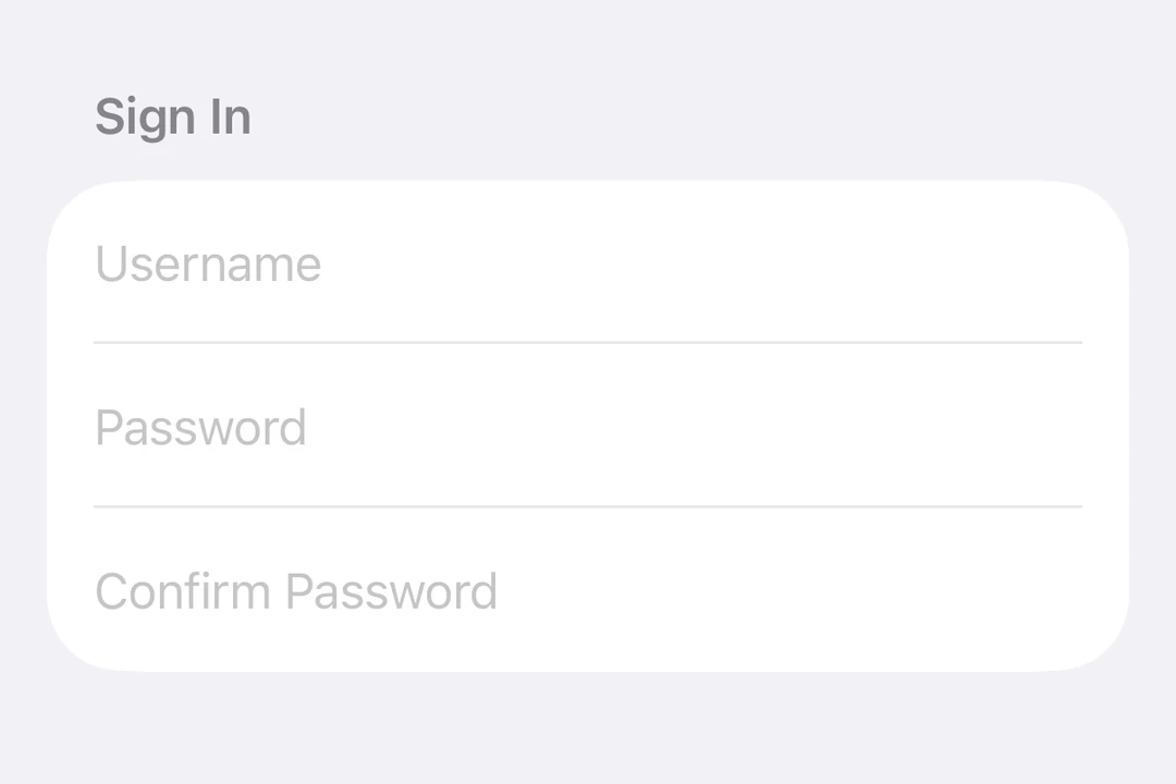
基本安全字段
import { useState } from 'react';
import { Host, SecureField } from '@expo/ui/swift-ui';

export default function BasicSecureFieldExample() {
  const [password, setPassword] = useState('');

  return (
    <Host matchContents>
      <SecureField placeholder="密码" onValueChange={setPassword} />
    </Host>
  );
}
提交处理
使用 submitLabel 和 onSubmit 修饰符来处理来自键盘的表单提交。
import { useState } from 'react';
import { Host, SecureField } from '@expo/ui/swift-ui';
import { submitLabel, onSubmit } from '@expo/ui/swift-ui/modifiers';

export default function SecureFieldSubmitExample() {
  const [password, setPassword] = useState('');

  return (
    <Host matchContents>
      <SecureField
        placeholder="密码"
        onValueChange={setPassword}
        modifiers={[submitLabel('done'), onSubmit(() => console.log('登录已提交'))]}
      />
    </Host>
  );
}
命令式 ref
使用 ref 以命令式方式设置文本、聚焦或取消聚焦安全字段。
import { useRef } from 'react';
import { Host, SecureField, SecureFieldRef, Button, HStack, VStack } from '@expo/ui/swift-ui';
import { buttonStyle } from '@expo/ui/swift-ui/modifiers';

export default function ImperativeSecureFieldExample() {
  const ref = useRef<SecureFieldRef>(null);

  return (
    <Host matchContents>
      <VStack>
        <SecureField ref={ref} placeholder="密码" />
        <HStack spacing={12}>
          <Button
            modifiers={[buttonStyle('bordered')]}
            onPress={() => ref.current?.focus()}
            label="聚焦"
          />
          <Button
            modifiers={[buttonStyle('bordered')]}
            onPress={() => ref.current?.blur()}
            label="失焦"
          />
          <Button
            modifiers={[buttonStyle('bordered')]}
            onPress={() => ref.current?.setText('secret123')}
            label="设置文本"
          />
        </HStack>
      </VStack>
    </Host>
  );
}
API
import { SecureField } from '@expo/ui/swift-ui';
Component
Type: React.Element<SecureFieldProps>
Renders a SwiftUI SecureField for password input.
boolean • Default: falseIf true, the secure field will be focused automatically when mounted.
React.ReactNodeSlot children - supports <SecureField.Placeholder> with a <Text> child
numberMaximum number of characters allowed. Truncates natively as the user types.
(focused: boolean) => voidA callback triggered when the field gains or loses focus.
(text: string) => voidA callback triggered when the text value changes.
If the callback is marked with the 'worklet' directive, it runs synchronously
on the UI thread; otherwise it is delivered asynchronously as a regular JS event.
Ref<SecureFieldRef>ObservableState<string>An observable state that holds the current text.
Create one with useNativeState('') or useNativeState('initial value').
If omitted, the field manages its own internal state.