标签
一个用于显示带图标文本的 SwiftUI Label 组件。
For the complete documentation index, see llms.txt. Use this file to discover all available pages.
Expo UI Label 与官方 SwiftUI Label API 一致,并在图标旁显示标题。
安装
- npx expo install @expo/uiIf you are installing this in an existing React Native app, make sure to install expo in your project.
用法
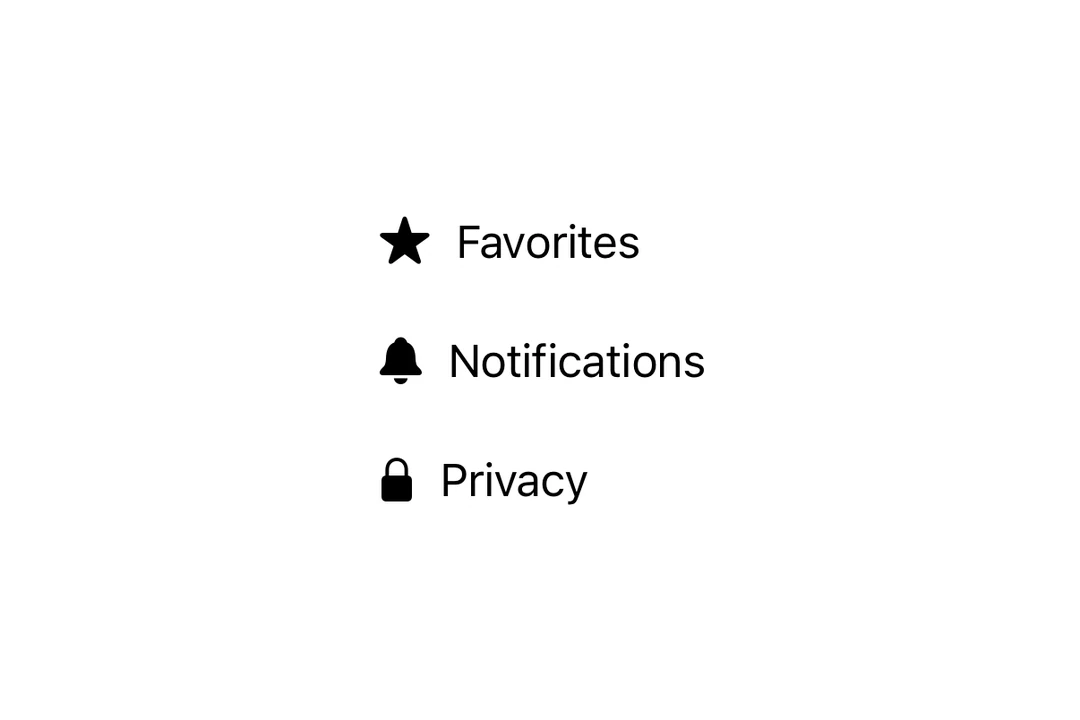
带有 SF Symbol 的基础 Label
import { Host, Label } from '@expo/ui/swift-ui';

export default function BasicLabelExample() {
  return (
    <Host matchContents>
      <Label title="收藏" systemImage="star.fill" />
    </Host>
  );
}
使用自定义图标
使用 icon 属性提供一个自定义 React 节点作为图标,而不是 SF Symbol。
import { Host, Label, Image } from '@expo/ui/swift-ui';

export default function LabelCustomIconExample() {
  return (
    <Host matchContents>
      <Label title="自定义图标" icon={<Image systemName="sparkles" size={20} color="purple" />} />
    </Host>
  );
}
仅图标
使用 labelStyle 修饰符并配合 iconOnly 仅显示图标。即使它不会显示,也始终应提供 title 以便无障碍访问。
import { Host, Label } from '@expo/ui/swift-ui';
import { labelStyle } from '@expo/ui/swift-ui/modifiers';

export default function LabelIconOnlyExample() {
  return (
    <Host matchContents>
      <Label title="设置" systemImage="gear" modifiers={[labelStyle('iconOnly')]} />
    </Host>
  );
}
API
import { Label } from '@expo/ui/swift-ui';
Component
Type: React.Element<LabelProps>
Renders a native label view, which could be used in a list or section.
React.ReactNodeCustom title view. Accepts any React node (for example, a VStack with title and subtitle).
When provided, this takes precedence over title.
Deprecated: Use
foregroundStylemodifier instead.
ColorValueThe color of the label icon.
React.ReactNodeCustom icon view to be displayed in the label.
When provided, this takes precedence over systemImage.