Reference version

This documentation is available as Markdown for AI agents and LLMs. See the full Markdown index or append .md to any documentation URL.

TabView

一个用于分页或选项卡内容的 SwiftUI TabView 组件。

iOS
tvOS
Included in Expo Go
Recommended version:
~57.0.0

Expo UI TabView 与官方 SwiftUI TabView API 保持一致,并通过 tabViewStyle 修饰符在不同样式之间切换。
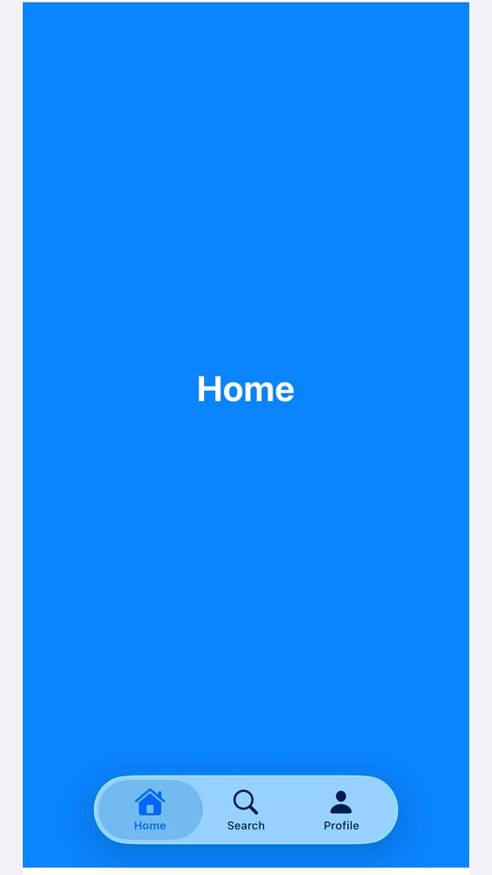
一个 TabView,底部标签栏显示 Home、Search 和 Profile 标签,采用 iOS 26 Liquid Glass 样式

安装

Terminal
npx expo install @expo/ui

If you are installing this in an existing React Native app, make sure to install expo in your project.

用法

每个页面都是一个 <TabView.Tab> 子项,通过 value 属性进行标识。TabView 不会强加自己的高度——请为它设置一个 frame,或将它放在一个会提供高度的父容器中。

页面样式(可滑动分页器)

使用 tabViewStyle({ type: 'page' }) 可创建带可选圆点指示器的水平分页器。传入 defaultSelection 可以在不由 React 控制的情况下,让分页器从指定页面开始。

PagerExample.tsx
import { Host, Spacer, TabView, Text, VStack } from '@expo/ui/swift-ui'; import { background, font, foregroundStyle, frame, tabViewStyle, } from '@expo/ui/swift-ui/modifiers'; const fillFrame = frame({ maxWidth: Infinity, maxHeight: Infinity }); const pageFrame = frame({ minHeight: 320, maxHeight: 320 }); export default function PagerExample() { return ( <Host style={{ flex: 1 }}> <TabView defaultSelection="1" modifiers={[pageFrame, tabViewStyle({ type: 'page' })]}> <TabView.Tab value="0"> <Page label="页面 1" color="#6200EE" /> </TabView.Tab> <TabView.Tab value="1"> <Page label="页面 2" color="#03DAC5" /> </TabView.Tab> <TabView.Tab value="2"> <Page label="页面 3" color="#FF5722" /> </TabView.Tab> </TabView> </Host> ); } function Page({ label, color }: { label: string; color: string }) { return ( <VStack alignment="center" modifiers={[fillFrame, background(color)]}> <Spacer /> <Text modifiers={[font({ size: 28, weight: 'bold' }), foregroundStyle('#FFFFFF')]}> {label} </Text> <Spacer /> </VStack> ); }

受控选择

传入 selectiononSelectionChange,即可通过 React 状态驱动活动标签页。每个 <TabView.Tab>value 会与 selection 进行匹配。当 selection 从 JS 发生变化时,添加 animation 修饰符即可为过渡添加动画效果。

ControlledTabViewExample.tsx
import { useState } from 'react'; import { Button, Host, Spacer, TabView, Text, VStack } from '@expo/ui/swift-ui'; import { animation, Animation, background, font, foregroundStyle, frame, tabViewStyle, } from '@expo/ui/swift-ui/modifiers'; const fillFrame = frame({ maxWidth: Infinity, maxHeight: Infinity }); const pageFrame = frame({ minHeight: 320, maxHeight: 320 }); export default function ControlledTabViewExample() { const [selected, setSelected] = useState('0'); return ( <Host style={{ flex: 1 }}> <VStack> <Text>已选择:{selected}</Text> <Button label="跳转到第 3 页" onPress={() => setSelected('2')} /> <TabView selection={selected} onSelectionChange={setSelected} modifiers={[ pageFrame, tabViewStyle({ type: 'page' }), animation(Animation.default, Number(selected)), ]}> <TabView.Tab value="0"> <Page label="页面 1" color="#6200EE" /> </TabView.Tab> <TabView.Tab value="1"> <Page label="页面 2" color="#03DAC5" /> </TabView.Tab> <TabView.Tab value="2"> <Page label="页面 3" color="#FF5722" /> </TabView.Tab> </TabView> </VStack> </Host> ); } function Page({ label, color }: { label: string; color: string }) { return ( <VStack alignment="center" modifiers={[fillFrame, background(color)]}> <Spacer /> <Text modifiers={[font({ size: 28, weight: 'bold' }), foregroundStyle('#FFFFFF')]}> {label} </Text> <Spacer /> </VStack> ); }

页面指示器圆点

indexViewStyle 修饰符与 tabViewStyle({ type: 'page' }) 结合使用,可控制圆点指示器。将 indexDisplayMode 设为 'always''never''automatic',并使用 backgroundDisplayMode 在圆点后方渲染一个半透明胶囊背景。

PageIndicatorExample.tsx
import { Host, Spacer, TabView, Text, VStack } from '@expo/ui/swift-ui'; import { background, font, foregroundStyle, frame, indexViewStyle, tabViewStyle, } from '@expo/ui/swift-ui/modifiers'; const fillFrame = frame({ maxWidth: Infinity, maxHeight: Infinity }); const pageFrame = frame({ minHeight: 320, maxHeight: 320 }); export default function PageIndicatorExample() { return ( <Host style={{ flex: 1 }}> <TabView modifiers={[ pageFrame, tabViewStyle({ type: 'page', indexDisplayMode: 'always' }), indexViewStyle({ backgroundDisplayMode: 'always' }), ]}> <TabView.Tab value="0"> <Page label="页面 1" color="#4F8DF6" /> </TabView.Tab> <TabView.Tab value="1"> <Page label="页面 2" color="#34C759" /> </TabView.Tab> <TabView.Tab value="2"> <Page label="页面 3" color="#FF9F0A" /> </TabView.Tab> </TabView> </Host> ); } function Page({ label, color }: { label: string; color: string }) { return ( <VStack alignment="center" modifiers={[fillFrame, background(color)]}> <Spacer /> <Text modifiers={[font({ size: 28, weight: 'bold' }), foregroundStyle('#FFFFFF')]}> {label} </Text> <Spacer /> </VStack> ); }

底部标签栏

使用 tabViewStyle({ type: 'automatic' }) 可使用 SwiftUI 默认的标签栏。每个标签页的 labelsystemImage 会填充到栏目的项中。对某个标签页使用 badge 修饰符,可以为其栏项目添加徽标。

BottomTabsExample.tsx
import { useState } from 'react'; import { Host, Spacer, TabView, Text, VStack } from '@expo/ui/swift-ui'; import { background, badge, font, foregroundStyle, frame, tabViewStyle, } from '@expo/ui/swift-ui/modifiers'; const fillFrame = frame({ maxWidth: Infinity, maxHeight: Infinity }); export default function BottomTabsExample() { const [selected, setSelected] = useState('inbox'); return ( <Host style={{ flex: 1 }}> <TabView selection={selected} onSelectionChange={setSelected} modifiers={[tabViewStyle({ type: 'automatic' })]}> <TabView.Tab value="inbox" label="收件箱" systemImage="tray.fill" modifiers={[badge('3')]}> <Page label="收件箱" color="#4F8DF6" /> </TabView.Tab> <TabView.Tab value="sent" label="已发送" systemImage="paperplane.fill"> <Page label="已发送" color="#34C759" /> </TabView.Tab> <TabView.Tab value="drafts" label="草稿" systemImage="square.and.pencil"> <Page label="草稿" color="#FF9F0A" /> </TabView.Tab> </TabView> </Host> ); } function Page({ label, color }: { label: string; color: string }) { return ( <VStack alignment="center" modifiers={[fillFrame, background(color)]}> <Spacer /> <Text modifiers={[font({ size: 28, weight: 'bold' }), foregroundStyle('#FFFFFF')]}> {label} </Text> <Spacer /> </VStack> ); }

API

import { TabView } from '@expo/ui/swift-ui';

Component

TabView

iOS

Type: React.Element<TabViewProps>

A SwiftUI TabView. Pair with modifiers to choose the appearance:

  • tabViewStyle({ type: 'page' }) — swipeable pager.
  • tabViewStyle({ type: 'automatic' }) — bottom tab bar.
  • tabViewStyle({ type: 'sidebarAdaptable' }) — sidebar on iPad, tab bar on iPhone.

Use <TabView.Tab> children to define pages. Each tab is identified by its value prop, which is used for selection.

For routed bottom-tab navigation across full-screen routes, prefer expo-router/unstable-native-tabs.

TabViewProps

children

iOS
Type: ReactNode

The tab's content — rendered when this tab is selected.

label

iOS
Optional • Type: string

Text label shown in the tab bar or sidebar.

systemImage

iOS
Optional • Type: SFSymbols7_0

SF Symbol name shown alongside the label.

value

iOS
Type: string

Identifies this tab. Matched against the parent TabView's selection and defaultSelection props.

children

iOS
Literal type: union

<TabView.Tab> elements defining the pages.

Acceptable values are: ReactElement<unknown, string | JSXElementConstructor<any>> | ReactElement[]

defaultSelection

iOS
Optional • Type: string

The initially selected tab when the component is uncontrolled (no selection prop). Ignored if selection is provided.

onSelectionChange

iOS
Optional • Type: (selection: string) => void

Called when the selected tab changes.

selection

iOS
Optional • Type: string

The selected tab (controlled mode). Pair with onSelectionChange. Pass defaultSelection instead to let the native view manage state.