Reference version

This documentation is available as Markdown for AI agents and LLMs. See the full Markdown index or append .md to any documentation URL.

滑块

一个用于从范围中选择数值的 SwiftUI Slider 组件。

iOS
Included in Expo Go
Recommended version:
~56.0.16

Expo UI Slider 与官方 SwiftUI Slider API 保持一致,允许从有界范围中选择数值。
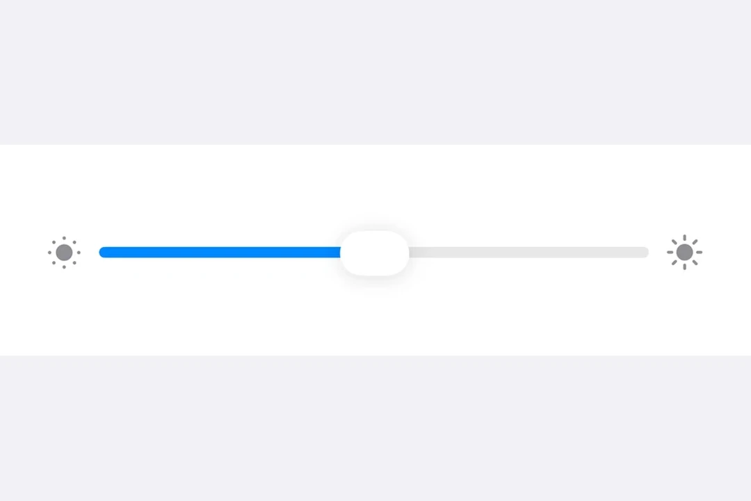
Slider with brightness icons on either side, in a Form section

安装

Terminal
npx expo install @expo/ui

If you are installing this in an existing React Native app, make sure to install expo in your project.

用法

基础滑块

BasicSliderExample.tsx
import { useState } from 'react'; import { Host, Slider } from '@expo/ui/swift-ui'; export default function BasicSliderExample() { const [value, setValue] = useState(0.5); return ( <Host style={{ flex: 1 }}> <Slider value={value} onValueChange={setValue} /> </Host> ); }

自定义范围的滑块

CustomRangeSliderExample.tsx
import { useState } from 'react'; import { Host, Slider } from '@expo/ui/swift-ui'; export default function CustomRangeSliderExample() { const [value, setValue] = useState(50); return ( <Host style={{ flex: 1 }}> <Slider value={value} min={0} max={100} onValueChange={setValue} /> </Host> ); }

带步进的滑块

使用 step 属性来定义离散增量。将 step 设为 0 以表示连续值。

SteppedSliderExample.tsx
import { useState } from 'react'; import { Host, Slider } from '@expo/ui/swift-ui'; export default function SteppedSliderExample() { const [value, setValue] = useState(0); return ( <Host style={{ flex: 1 }}> <Slider value={value} min={0} max={100} step={10} onValueChange={setValue} /> </Host> ); }

带标签的滑块

你可以为滑块添加标签,以描述其用途,并标记最小值和最大值的位置。

LabeledSliderExample.tsx
import { useState } from 'react'; import { Host, Slider, Text } from '@expo/ui/swift-ui'; export default function LabeledSliderExample() { const [value, setValue] = useState(50); return ( <Host style={{ flex: 1 }}> <Slider value={value} min={0} max={100} label={<Text>音量</Text>} minimumValueLabel={<Text>0</Text>} maximumValueLabel={<Text>100</Text>} onValueChange={setValue} /> </Host> ); }

API

import { Slider } from '@expo/ui/swift-ui';

Component

Slider

iOS

Type: React.Element<SliderProps>

SliderProps

label

iOS
Optional • Type: React.ReactNode

A label describing the slider's purpose.

lowerLimit

iOS
Optional • Type: number

Lower limit the user can drag the thumb to. The visible track still spans min..max, but the thumb stops at lowerLimit during drag.

max

iOS
Optional • Type: number

The maximum value of the slider. Updating this value does not trigger callbacks if the current value is above max.

maximumValueLabel

iOS
Optional • Type: React.ReactNode

A label displayed at the maximum value position.

min

iOS
Optional • Type: number

The minimum value of the slider. Updating this value does not trigger callbacks if the current value is below min.

minimumValueLabel

iOS
Optional • Type: React.ReactNode

A label displayed at the minimum value position.

onEditingChanged

iOS
Optional • Type: (isEditing: boolean) => void

Callback triggered when the user starts or ends editing the slider.

onValueChange

iOS
Optional • Type: (value: number) => void

Callback triggered on dragging along the slider.

step

iOS
Optional • Type: number

The step increment for the slider.

upperLimit

iOS
Optional • Type: number

Upper limit the user can drag the thumb to. The visible track still spans min..max, but the thumb stops at upperLimit during drag.

value

iOS
Optional • Type: number

The current value of the slider.