This documentation is available as Markdown for AI agents and LLMs. See the full Markdown index or append .md to any documentation URL.
标签
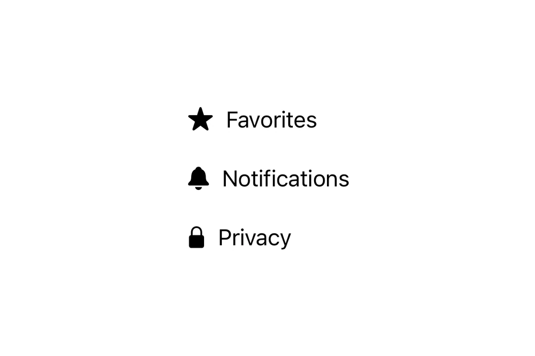
一个用于显示带图标文本的 SwiftUI Label 组件。
Expo UI Label 与官方 SwiftUI Label API 一致,并在图标旁显示标题。

安装
If you are installing this in an existing React Native app, make sure to install expo in your project.
用法
带有 SF Symbol 的基础 Label
使用自定义图标
使用 icon 属性提供一个自定义 React 节点作为图标,而不是 SF Symbol。
仅图标
使用 labelStyle 修饰符和 iconOnly 来仅显示图标。即使图标不可见,也请始终提供 title 以确保可访问性。
API
import { Label } from '@expo/ui/swift-ui';
Component
Type: React.Element<LabelProps>
Renders a native label view, which could be used in a list or section.
React.ReactNodeCustom title view. Accepts any React node (for example, a VStack with title and subtitle).
When provided, this takes precedence over title.
Deprecated: Use
foregroundStylemodifier instead.
ColorValueThe color of the label icon.
React.ReactNodeCustom icon view to be displayed in the label.
When provided, this takes precedence over systemImage.