This documentation is available as Markdown for AI agents and LLMs. See the full Markdown index or append .md to any documentation URL.
列表
一个用于显示可滚动项目列表的 SwiftUI 列表组件。
有关跨平台用法,请参阅通用的List— 它会为每个平台渲染相应的原生组件。
Expo UI List 与官方 SwiftUI List API 保持一致,并支持通过 listStyle 修饰符、各种行/分组修饰符,以及选择、重新排序和编辑功能进行样式定制。

安装
- npx expo install @expo/uiIf you are installing this in an existing React Native app, make sure to install expo in your project.
用法
基础列表
import { Host, List, Text, Section } from '@expo/ui/swift-ui'; export default function BasicListExample() { return ( <Host style={{ flex: 1 }}> <List> <Section title="水果"> <Text>苹果</Text> <Text>香蕉</Text> <Text>橙子</Text> </Section> <Section title="蔬菜"> <Text>胡萝卜</Text> <Text>西兰花</Text> <Text>菠菜</Text> </Section> </List> </Host> ); }
带标签和图标的列表
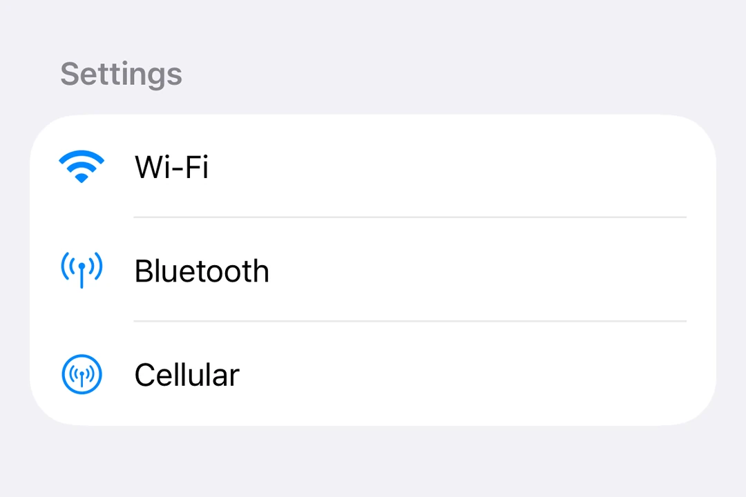
import { Host, List, Label, Section } from '@expo/ui/swift-ui'; export default function ListWithLabelsExample() { return ( <Host style={{ flex: 1 }}> <List> <Section title="设置"> <Label title="Wi-Fi" systemImage="wifi" /> <Label title="蓝牙" systemImage="antenna.radiowaves.left.and.right" /> <Label title="蜂窝网络" systemImage="antenna.radiowaves.left.and.right.circle" /> </Section> </List> </Host> ); }
列表样式
使用 listStyle 修饰符来更改列表的外观。
注意:
inset、insetGrouped和sidebar样式在 tvOS 上不可用。
import { useState } from 'react'; import { Host, List, Text, Section, Picker } from '@expo/ui/swift-ui'; import { listStyle, pickerStyle, tag } from '@expo/ui/swift-ui/modifiers'; const styles = ['automatic', 'plain', 'inset', 'insetGrouped', 'grouped', 'sidebar'] as const; export default function ListStylesExample() { const [styleIndex, setStyleIndex] = useState(0); return ( <Host style={{ flex: 1 }}> <List modifiers={[listStyle(styles[styleIndex])]}> <Section title="样式选择器"> <Picker label="列表样式" selection={styleIndex} onSelectionChange={setStyleIndex} modifiers={[pickerStyle('menu')]}> {styles.map((style, index) => ( <Text key={style} modifiers={[tag(index)]}> {style} </Text> ))} </Picker> </Section> <Section title="示例项目"> <Text>项目 1</Text> <Text>项目 2</Text> <Text>项目 3</Text> </Section> </List> </Host> ); }
选择与编辑模式
使用带有 onDelete 和 onMove 属性的 List.ForEach 复合组件,可启用列表项的选择、删除和重新排序。
- 使用
environment修饰符启用编辑模式 - 使用
tag修饰符标识项目 - 使用
selection属性控制选中的项目 - 使用
moveDisabled和deleteDisabled修饰符,禁用单个项目的移动和删除操作
import { useState } from 'react'; import { Host, List, Label, Section, Button, Toggle } from '@expo/ui/swift-ui'; import { environment, tag } from '@expo/ui/swift-ui/modifiers'; type Task = { id: string; title: string }; const INITIAL_TASKS: Task[] = [ { id: '1', title: '任务 1' }, { id: '2', title: '任务 2' }, { id: '3', title: '任务 3' }, { id: '4', title: '任务 4' }, ]; export default function EditableListExample() { const [tasks, setTasks] = useState<Task[]>(INITIAL_TASKS); const [selectedIds, setSelectedIds] = useState<string[]>([]); const [editMode, setEditMode] = useState(false); const handleDelete = (indices: number[]) => { setTasks(prev => prev.filter((_, i) => !indices.includes(i))); }; const handleMove = (sourceIndices: number[], destination: number) => { setTasks(prev => { const newTasks = [...prev]; const [removed] = newTasks.splice(sourceIndices[0], 1); const adjustedDest = sourceIndices[0] < destination ? destination - 1 : destination; newTasks.splice(adjustedDest, 0, removed); return newTasks; }); }; return ( <Host style={{ flex: 1 }}> <List selection={selectedIds} onSelectionChange={ids => setSelectedIds(ids.map(String))} modifiers={[environment('editMode', editMode ? 'active' : 'inactive')]}> <Section title="设置"> <Toggle label="编辑模式" isOn={editMode} onIsOnChange={setEditMode} /> </Section> <Section title="任务"> <List.ForEach onDelete={handleDelete} onMove={handleMove}> {tasks.map(task => ( <Label key={task.id} title={task.title} modifiers={[tag(task.id)]} /> ))} </List.ForEach> </Section> </List> </Host> ); }
下拉刷新
使用 refreshable 修饰符启用下拉刷新功能。
import { useState } from 'react'; import { Host, List, Text, Section } from '@expo/ui/swift-ui'; import { refreshable } from '@expo/ui/swift-ui/modifiers'; export default function RefreshableListExample() { const [lastRefresh, setLastRefresh] = useState<Date | null>(null); const handleRefresh = async () => { // 模拟异步数据获取 await new Promise(resolve => setTimeout(resolve, 1500)); setLastRefresh(new Date()); }; return ( <Host style={{ flex: 1 }}> <List modifiers={[refreshable(handleRefresh)]}> <Section title="数据"> <Text>下拉以刷新</Text> {lastRefresh && <Text>上次刷新:{lastRefresh.toLocaleTimeString()}</Text>} </Section> </List> </Host> ); }
行样式
使用 listRowBackground、listRowSeparator 和 listRowInsets 修饰符来自定义单独的行。
import { Host, List, Text, Section } from '@expo/ui/swift-ui'; import { listRowBackground, listRowSeparator, listRowInsets } from '@expo/ui/swift-ui/modifiers'; export default function RowStylingExample() { return ( <Host style={{ flex: 1 }}> <List> <Section title="样式化行"> <Text modifiers={[listRowBackground('blue')]}>蓝色背景</Text> <Text modifiers={[listRowSeparator('hidden')]}>隐藏分隔线</Text> <Text modifiers={[listRowInsets({ leading: 40 })]}>额外的前导内边距</Text> <Text modifiers={[listRowInsets({ leading: 0, trailing: 0 })]}>无水平内边距</Text> </Section> </List> </Host> ); }
键盘收起行为
使用 scrollDismissesKeyboard 修饰符控制滚动时键盘的收起方式。
import { Host, List, Section, TextField } from '@expo/ui/swift-ui'; import { scrollDismissesKeyboard } from '@expo/ui/swift-ui/modifiers'; export default function KeyboardDismissExample() { return ( <Host style={{ flex: 1 }}> <List modifiers={[scrollDismissesKeyboard('interactively')]}> <Section title="表单"> <TextField placeholder="姓名" /> <TextField placeholder="邮箱" /> <TextField placeholder="电话" /> </Section> </List> </Host> ); }
标题突出程度
使用 headerProminence 修饰符调整分组标题的视觉突出程度。
import { Host, List, Text, Section } from '@expo/ui/swift-ui'; import { headerProminence } from '@expo/ui/swift-ui/modifiers'; export default function HeaderProminenceExample() { return ( <Host style={{ flex: 1 }}> <List modifiers={[headerProminence('increased')]}> <Section title="重要分组"> <Text>此分组的标题突出程度更高</Text> </Section> <Section title="另一个分组"> <Text>标题更加醒目</Text> </Section> </List> </Host> ); }
API
import { List } from '@expo/ui/swift-ui';
Components
Type: React.Element<ListProps>
A list component that renders its children using a native SwiftUI List.
Type: React.Element<ListForEachProps>
A compound component of List that enables item deletion and reordering.
This component must be used as a child of List (as List.ForEach).
(indices: number[]) => voidCallback triggered when items are deleted. Receives an array of indices that were deleted.
See: Official SwiftUI documentation.
(sourceIndices: number[], destination: number) => voidCallback triggered when items are moved. Receives the source indices and destination index.
See: Official SwiftUI documentation.