This documentation is available as Markdown for AI agents and LLMs. See the full Markdown index or append .md to any documentation URL.
按钮
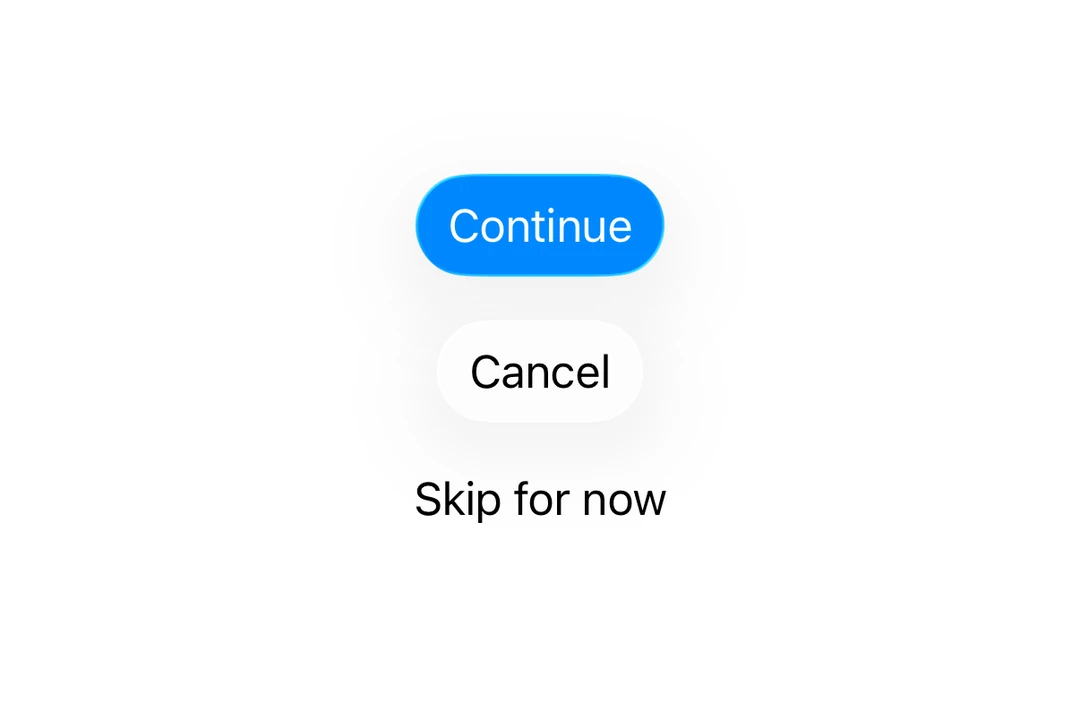
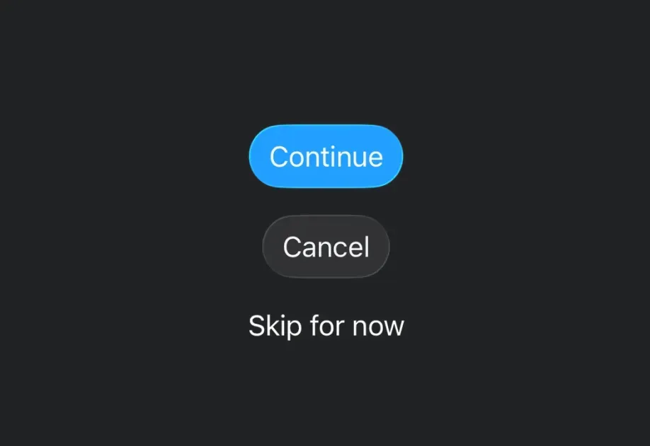
一个用于显示原生按钮的 SwiftUI Button 组件。
有关跨平台用法,请参见通用的
Button—— 它会为每个平台渲染相应的原生组件。
Expo UI Button 与官方 SwiftUI Button API 保持一致,并支持通过 buttonStyle、controlSize 以及其他修饰符进行样式设置。
安装
If you are installing this in an existing React Native app, make sure to install expo in your project.
用法
基础按钮
带系统图标的按钮
仅图标按钮
使用 labelStyle 修饰符只显示图标,同时保留标签以便于辅助功能访问。
按钮样式
使用 buttonStyle 修饰符来更改按钮外观。可用样式有:bordered、borderedProminent、borderless、plain、glass 和 glassProminent。
注意:
glass和glassProminent样式仅在使用 Xcode 26 构建时,iOS 26+ 可用。
按钮边框形状
使用 buttonBorderShape 修饰符来更改样式化按钮的形状。可用形状有:automatic、capsule、roundedRectangle 和 circle(iOS 17+)。
控件尺寸
使用 controlSize 修饰符来调整按钮大小。可用尺寸有:mini、small、regular、large 和 extraLarge。
注意:
extraLarge尺寸仅在 iOS 17+ 可用。
按钮角色
使用 role 属性来指示按钮的语义角色。可用角色有:default、cancel 和 destructive。
带色调的按钮
使用 tint 修饰符来更改按钮的颜色。
禁用按钮
使用 disabled 修饰符来禁用按钮。
自定义标签内容
你可以将自定义组件作为 children 传入,以实现更复杂的按钮标签内容。
API
import { Button } from '@expo/ui/swift-ui';
Component
Type: React.Element<ButtonProps>
Displays a native button component.
Example
import { Button } from '@expo/ui/swift-ui';
import { buttonStyle, controlSize, tint, disabled } from '@expo/ui/swift-ui/modifiers';

<Button
  role="destructive"
  onPress={handlePress}
  label="Delete"
  modifiers={[
    buttonStyle('bordered'),
    controlSize('large'),
    tint('#FF0000'),
    disabled(true)
  ]}
/>
unionCustom content for the button label. Use this for custom label views. Only nested elements are supported, not plain strings.
Acceptable values are: React.ReactElement | React.ReactElement
SFSymbolA string describing the system image to display in the button.
Only used when label is provided.
stringTarget identifier for the button, used for identifying which button was pressed in widgets and live activities.