This documentation is available as Markdown for AI agents and LLMs. See the full Markdown index or append .md to any documentation URL.
SecureField
用于密码输入的 SwiftUI SecureField 组件。
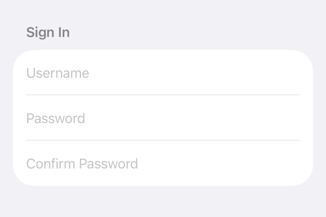
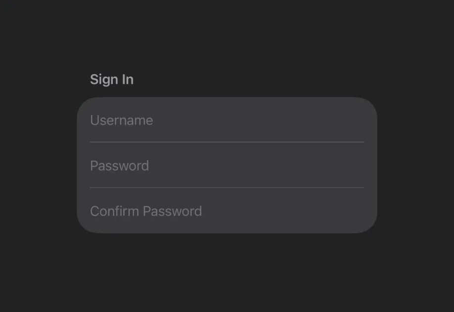
Expo UI SecureField 与官方 SwiftUI SecureField API 保持一致,并提供一个用于密码和其他敏感文本、会对用户输入进行掩码处理的文本字段。
安装
- npx expo install @expo/uiIf you are installing this in an existing React Native app, make sure to install expo in your project.
用法
基本安全字段
import { useState } from 'react'; import { Host, SecureField } from '@expo/ui/swift-ui'; export default function BasicSecureFieldExample() { const [password, setPassword] = useState(''); return ( <Host matchContents> <SecureField placeholder="密码" onTextChange={setPassword} /> </Host> ); }
提交处理
使用 submitLabel 和 onSubmit 修饰符来处理来自键盘的表单提交。
import { useState } from 'react'; import { Host, SecureField } from '@expo/ui/swift-ui'; import { submitLabel, onSubmit } from '@expo/ui/swift-ui/modifiers'; export default function SecureFieldSubmitExample() { const [password, setPassword] = useState(''); return ( <Host matchContents> <SecureField placeholder="密码" onTextChange={setPassword} modifiers={[submitLabel('done'), onSubmit(() => console.log('登录已提交'))]} /> </Host> ); }
命令式 ref
使用 ref 以命令式方式设置文本、聚焦或取消聚焦安全字段。
import { useRef } from 'react'; import { Host, SecureField, SecureFieldRef, Button, HStack, VStack } from '@expo/ui/swift-ui'; import { buttonStyle } from '@expo/ui/swift-ui/modifiers'; export default function ImperativeSecureFieldExample() { const ref = useRef<SecureFieldRef>(null); return ( <Host matchContents> <VStack> <SecureField ref={ref} placeholder="密码" /> <HStack spacing={12}> <Button modifiers={[buttonStyle('bordered')]} onPress={() => ref.current?.focus()} label="聚焦" /> <Button modifiers={[buttonStyle('bordered')]} onPress={() => ref.current?.blur()} label="失焦" /> <Button modifiers={[buttonStyle('bordered')]} onPress={() => ref.current?.setText('secret123')} label="设置文本" /> </HStack> </VStack> </Host> ); }
API
import { SecureField } from '@expo/ui/swift-ui';
Component
Type: React.Element<SecureFieldProps>
Renders a SwiftUI SecureField for password input.
boolean • Default: falseIf true, the secure field will be focused automatically when mounted.
React.ReactNodeSlot children - supports <SecureField.Placeholder> with a <Text> child
numberMaximum number of characters allowed. Truncates natively as the user types.
(focused: boolean) => voidA callback triggered when the field gains or loses focus.
(text: string) => voidA callback triggered when the text value changes.
If the callback is marked with the 'worklet' directive, it runs synchronously
on the UI thread; otherwise it is delivered asynchronously as a regular JS event.
Ref<SecureFieldRef>ObservableState<string>An observable state that holds the current text.
Create one with useNativeState('') or useNativeState('initial value').
If omitted, the field manages its own internal state.