This documentation is available as Markdown for AI agents and LLMs. See the full Markdown index or append .md to any documentation URL.
DatePicker
一个用于选择日期和时间的 SwiftUI DatePicker 组件。
iOS
Included in Expo Go
Expo UI DatePicker 与官方 SwiftUI DatePicker API 保持一致,并支持通过 datePickerStyle 修饰符进行样式设置。
安装
Terminal
If you are installing this in an existing React Native app, make sure to install expo in your project.
日期选择器
DatePickerExample.tsx
时间选择器
TimePickerExample.tsx
日期和时间选择器
DateTimePickerExample.tsx
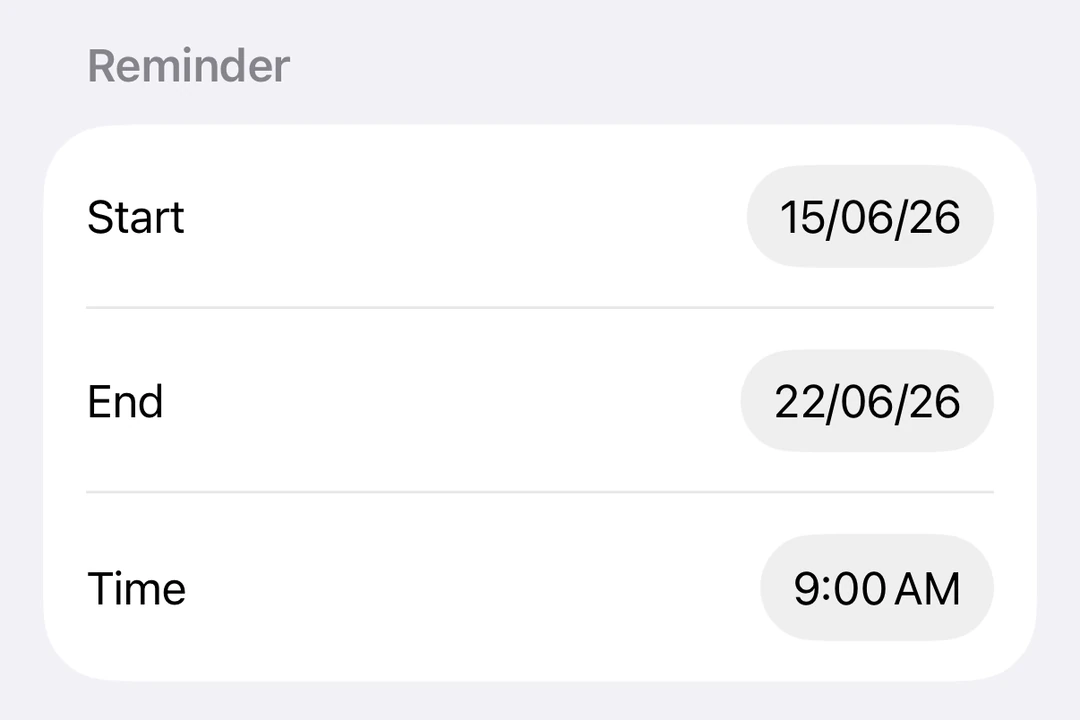
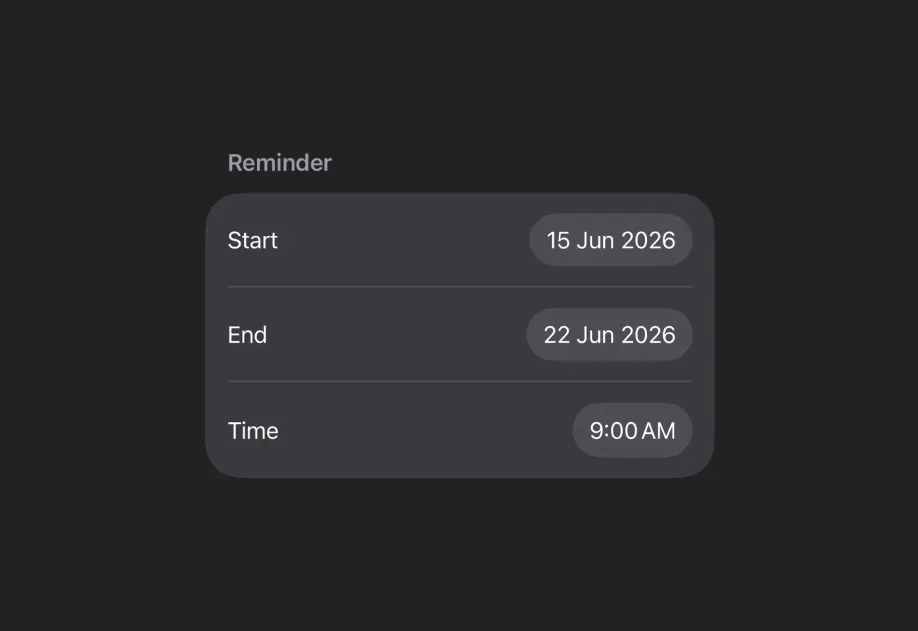
带日期范围
DateRangePickerExample.tsx
使用修饰符进行样式设置
你可以使用 datePickerStyle 修饰符来更改选择器的外观。可用样式有:automatic、compact、graphical 和 wheel。
WheelDatePickerExample.tsx
GraphicalDatePickerExample.tsx
禁用的选择器
你可以使用 disabled 修饰符使选择器不可交互。
DisabledDatePickerExample.tsx
自定义区域设置
使用带有 locale 键的 environment 修饰符,以特定区域设置显示选择器。
LocaleDatePickerExample.tsx
自定义时区
使用带有 timeZone 键的 environment 修饰符,以特定的 IANA 时区显示选择器。
TimeZoneDatePickerExample.tsx
API
import { DatePicker } from '@expo/ui/swift-ui';
Component
Type: React.Element<DatePickerProps>
Renders a SwiftUI DatePicker component.
Optional • Type:
DatePickerComponent[] • Default: ['date']The components to display: 'date' and/or 'hourAndMinute'.