This documentation is available as Markdown for AI agents and LLMs. See the full Markdown index or append .md to any documentation URL.
ToggleButton
用于显示原生 Material3 切换按钮的 Jetpack Compose ToggleButton 组件。
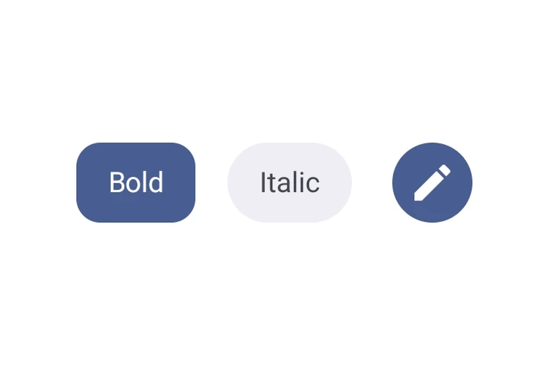
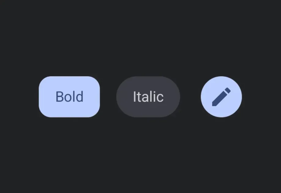
Expo UI 提供四种切换按钮组件,与官方 Jetpack Compose Toggle Button API 保持一致:ToggleButton、IconToggleButton、FilledIconToggleButton 和 OutlinedIconToggleButton。
安装
If you are installing this in an existing React Native app, make sure to install expo in your project.
使用
基本切换按钮
一个带有文本和图标内容的切换按钮。
图标切换按钮变体
使用不同的图标切换按钮组件来传达不同层级的强调。
自定义颜色
使用 colors 属性覆盖选中和未选中的颜色。
禁用的切换按钮
API
import {
  ToggleButton,
  IconToggleButton,
  FilledIconToggleButton,
  OutlinedIconToggleButton,
} from '@expo/ui/jetpack-compose';
Components
Type: React.Element<ToggleButtonProps>
A filled icon toggle button with a solid background.
Type: React.Element<ToggleButtonProps>
An icon toggle button with no background.
Type: React.Element<ToggleButtonProps>
An outlined icon toggle button with a border and no fill.
Type: React.Element<ToggleButtonProps>
A toggle button component that can be toggled on and off.
boolean • Default: trueWhether the button is enabled for user interaction.
Type: React.Element<number>