HorizontalPager
一个用于可滑动页面的 Jetpack Compose HorizontalPager 组件。
For the complete documentation index, see llms.txt. Use this file to discover all available pages.
Expo UI HorizontalPager 与 Jetpack Compose 的 HorizontalPager 匹配——这是一个水平滚动的分页器,会吸附到各个独立页面。
HorizontalPager 不会自行指定高度——请使用 height 修饰符为其设置高度,或者将其放在一个具有有限高度的父容器中。
安装
- npx expo install @expo/uiIf you are installing this in an existing React Native app, make sure to install expo in your project.
用法
非受控
分页器原生管理其滚动位置。使用 initialPage 选择起始页面,并通过 onCurrentPageChange 监听变化(在滑动过程中,当吸附目标切换时触发)或通过 onSettledPageChange 监听变化(仅在滑动停止后触发)。
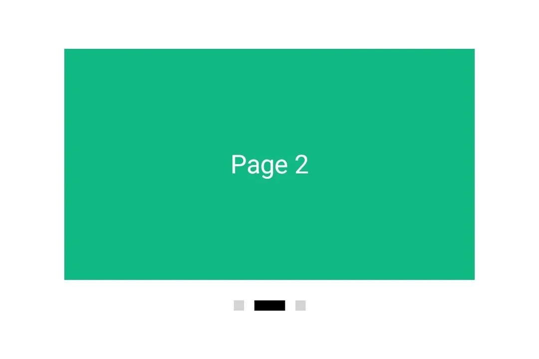
import { Box, Column, Host, HorizontalPager, Text } from '@expo/ui/jetpack-compose';
import { background, fillMaxSize, fillMaxWidth, height } from '@expo/ui/jetpack-compose/modifiers';
import { useState } from 'react';

export default function UncontrolledPagerExample() {
  const [currentPage, setCurrentPage] = useState(1);
  const [settledPage, setSettledPage] = useState(1);

  return (
    <Host matchContents={{ vertical: true }} style={{ width: '100%' }}>
      <Column verticalArrangement={{ spacedBy: 12 }} modifiers={[fillMaxWidth()]}>
        <Text style={{ typography: 'titleLarge' }}>
          currentPage: {currentPage} · settledPage: {settledPage}
        </Text>
        <HorizontalPager
          initialPage={1}
          onCurrentPageChange={setCurrentPage}
          onSettledPageChange={setSettledPage}
          modifiers={[fillMaxWidth(), height(240)]}>
          <Page label="Page 1" color="#6200EE" />
          <Page label="Page 2" color="#03DAC5" />
          <Page label="Page 3" color="#FF5722" />
        </HorizontalPager>
      </Column>
    </Host>
  );
}

function Page({ label, color }: { label: string; color: string }) {
  return (
    <Box modifiers={[fillMaxSize(), background(color)]} contentAlignment="center">
      <Text color="#FFFFFF" style={{ typography: 'headlineLarge' }}>
        {label}
      </Text>
    </Box>
  );
}
程序化导航
附加一个 ref,并在其上调用 animateScrollToPage 或 scrollToPage。这些与 Compose 的 PagerState.animateScrollToPage 和 PagerState.scrollToPage 相对应。
import {
  Box,
  Button,
  Column,
  Host,
  HorizontalPager,
  type HorizontalPagerHandle,
  Row,
  Text,
} from '@expo/ui/jetpack-compose';
import { background, fillMaxSize, fillMaxWidth, height } from '@expo/ui/jetpack-compose/modifiers';
import { useRef, useState } from 'react';

const PAGE_COUNT = 5;

export default function ProgrammaticPagerExample() {
  const pagerRef = useRef<HorizontalPagerHandle>(null);
  const [page, setPage] = useState(0);

  return (
    <Host matchContents={{ vertical: true }} style={{ width: '100%' }}>
      <Column verticalArrangement={{ spacedBy: 12 }} modifiers={[fillMaxWidth()]}>
        <Text style={{ typography: 'titleLarge' }}>
          第 {page + 1} 页 / {PAGE_COUNT}
        </Text>
        <HorizontalPager
          ref={pagerRef}
          onSettledPageChange={setPage}
          modifiers={[fillMaxWidth(), height(200)]}>
          {Array.from({ length: PAGE_COUNT }).map((_, i) => (
            <Page key={i} label={`Page ${i + 1}`} color={COLORS[i]} />
          ))}
        </HorizontalPager>
        <Row horizontalArrangement={{ spacedBy: 8 }}>
          <Button onClick={() => pagerRef.current?.animateScrollToPage(Math.max(0, page - 1))}>
            <Text>上一页</Text>
          </Button>
          <Button
            onClick={() =>
              pagerRef.current?.animateScrollToPage(Math.min(PAGE_COUNT - 1, page + 1))
            }>
            <Text>下一页</Text>
          </Button>
          <Button onClick={() => pagerRef.current?.scrollToPage(0)}>
            <Text>跳转到第一页</Text>
          </Button>
        </Row>
      </Column>
    </Host>
  );
}

const COLORS = ['#6200EE', '#03DAC5', '#FF5722', '#4CAF50', '#2196F3'];

function Page({ label, color }: { label: string; color: string }) {
  return (
    <Box modifiers={[fillMaxSize(), background(color)]} contentAlignment="center">
      <Text color="#FFFFFF" style={{ typography: 'headlineLarge' }}>
        {label}
      </Text>
    </Box>
  );
}
页面间距和内容内边距
使用 pageSpacing 在页面之间添加间距(在滑动时可见),并使用 contentPadding 为分页器设置内边距,以便在静止时让相邻页面露出一部分。
import { Box, Host, HorizontalPager, Text } from '@expo/ui/jetpack-compose';
import { background, fillMaxSize, fillMaxWidth, height } from '@expo/ui/jetpack-compose/modifiers';

export default function PagerLayoutExample() {
  return (
    <Host matchContents={{ vertical: true }} style={{ width: '100%' }}>
      <HorizontalPager
        pageSpacing={12}
        contentPadding={{ start: 32, end: 32 }}
        modifiers={[fillMaxWidth(), height(180)]}>
        <Page label="Page 1" color="#6200EE" />
        <Page label="Page 2" color="#03DAC5" />
        <Page label="Page 3" color="#FF5722" />
      </HorizontalPager>
    </Host>
  );
}

function Page({ label, color }: { label: string; color: string }) {
  return (
    <Box modifiers={[fillMaxSize(), background(color)]} contentAlignment="center">
      <Text color="#FFFFFF" style={{ typography: 'headlineLarge' }}>
        {label}
      </Text>
    </Box>
  );
}
API
import { HorizontalPager } from '@expo/ui/jetpack-compose';
Component
Type: React.Element<HorizontalPagerProps>
A horizontally scrolling pager that snaps to individual pages,
matching Compose's HorizontalPager.
number • Default: 0Number of pages to compose and keep beyond the visible viewport.
union • Default: 0Padding for pager content (dp or per-side object).
Acceptable values are: number | PaddingValuesRecord
number • Default: 0Page to mount on. Mirrors rememberPagerState(initialPage = …). Subsequent
changes have no effect — use the ref methods to navigate after mount.
(page: number) => voidFires when Compose's PagerState.currentPage changes — i.e. when the page
closest to the snap position flips, including mid-swipe as the user
crosses between pages.
(page: number) => voidFires when Compose's PagerState.settledPage changes — i.e. after a
swipe or programmatic scroll has fully settled.
Ref<HorizontalPagerHandle>Imperative handle for programmatic navigation. Mirrors the methods on
Compose's PagerState.
boolean • Default: falseWhether to reverse the layout direction.