This documentation is available as Markdown for AI agents and LLMs. See the full Markdown index or append .md to any documentation URL.
ExposedDropdownMenuBox
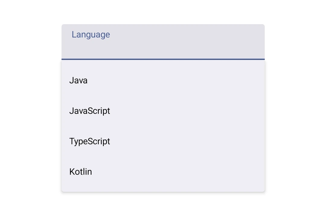
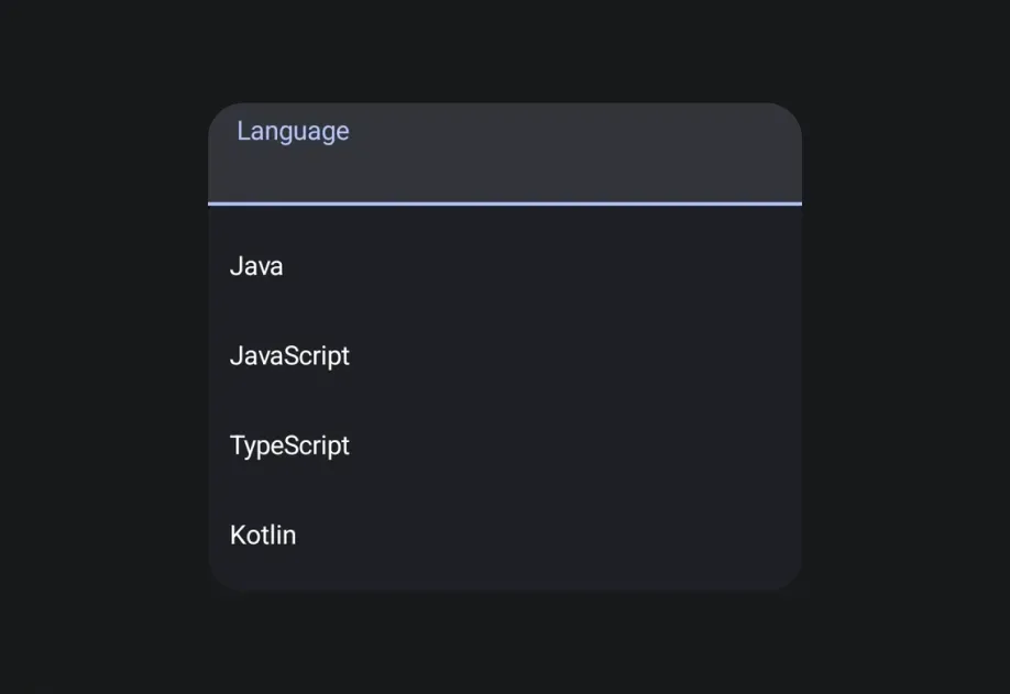
一个 Jetpack Compose ExposedDropdownMenuBox 组件,用于显示一个带有可自定义锚点的下拉菜单。
如需跨平台选择器,请参阅
Picker—— 在 Android 上基于ExposedDropdownMenuBox构建。
Expo UI 的 ExposedDropdownMenuBox 与官方 Jetpack Compose 的 ExposedDropdownMenuBox 保持一致。请在锚点内容(通常是只读的 TextField)上使用 menuAnchor() 修饰符,并使用 ExposedDropdownMenu 来包裹 DropdownMenuItem 子项。
安装
If you are installing this in an existing React Native app, make sure to install expo in your project.
用法
基础
锚点是一个只读的
TextField,绑定到一个useNativeState可观察对象。在每个项目的onClick中更新该可观察对象,以反映所选值。
接口
import { ExposedDropdownMenuBox } from '@expo/ui/jetpack-compose';
Components
Type: React.Element<ExposedDropdownMenuProps>
A Material 3 ExposedDropdownMenu that displays menu items in a dropdown.
Must be used inside an ExposedDropdownMenuBox.
Props for the ExposedDropdownMenu component.
Type: React.Element<ExposedDropdownMenuBoxProps>
A Material 3 ExposedDropdownMenuBox.
Use the menuAnchor() modifier on the anchor content (e.g. a TextField or Text).
Use ExposedDropdownMenu to wrap DropdownMenuItem children.
Example
<ExposedDropdownMenuBox expanded={expanded} onExpandedChange={setExpanded}>
  <TextField modifiers={[menuAnchor()]} defaultValue={value} readOnly />
  <ExposedDropdownMenu expanded={expanded} onDismissRequest={() => setExpanded(false)}>
    <DropdownMenuItem onClick={() => { setSelected('a'); setExpanded(false); }}>
      <DropdownMenuItem.Text><Text>Option A</Text></DropdownMenuItem.Text>
    </DropdownMenuItem>
  </ExposedDropdownMenu>
</ExposedDropdownMenuBox>
ReactNodeChildren — should contain an anchor element with the menuAnchor() modifier
and an ExposedDropdownMenu with DropdownMenuItem children.