This documentation is available as Markdown for AI agents and LLMs. See the full Markdown index or append .md to any documentation URL.
LazyColumn
用于显示可滚动列表的 Jetpack Compose LazyColumn 组件。
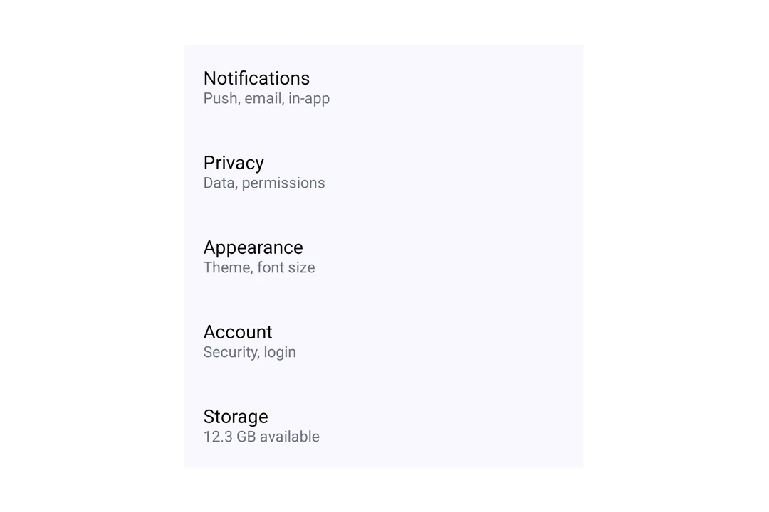
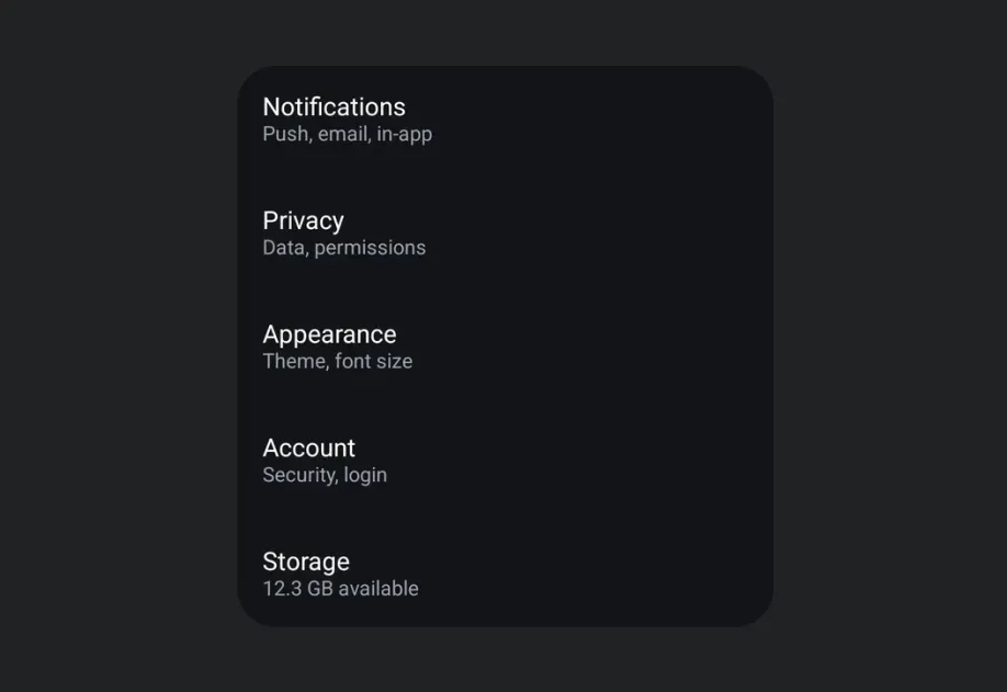
一种懒加载的垂直列表组件,只渲染可见项以实现高效滚动。更多信息请参阅 官方 Jetpack Compose 文档。
信息
LazyColumn目前还不是真正的懒加载:原生端只会组合可见项,但 React 仍然会提前创建所有子项,因此大型列表在挂载时可能会很慢。我们正在改进这一点。对于大型列表,我们建议使用 FlashList 或 Legend List。
安装
- npx expo install @expo/uiIf you are installing this in an existing React Native app, make sure to install expo in your project.
Usage
Basic Lazy Column
import { Host, LazyColumn, ListItem, Text } from '@expo/ui/jetpack-compose'; const items = Array.from({ length: 100 }, (_, i) => `Item ${i + 1}`); export default function BasicLazyColumn() { return ( <Host style={{ height: 400 }}> <LazyColumn> {items.map(item => ( <ListItem key={item}> <ListItem.HeadlineContent> <Text>{item}</Text> </ListItem.HeadlineContent> </ListItem> ))} </LazyColumn> </Host> ); }
With Arrangement
Use the verticalArrangement property to control the spacing between items in the list. Pass a string value like 'spaceBetween', or an object like { spacedBy: 8 }, to set fixed spacing in dp.
import { Host, LazyColumn, ListItem, Text } from '@expo/ui/jetpack-compose'; export default function LazyColumnArrangement() { return ( <Host style={{ height: 400 }}> <LazyColumn verticalArrangement={{ spacedBy: 8 }} horizontalAlignment="center"> <ListItem> <ListItem.HeadlineContent> <Text>Item with spacing 1</Text> </ListItem.HeadlineContent> </ListItem> <ListItem> <ListItem.HeadlineContent> <Text>Item with spacing 2</Text> </ListItem.HeadlineContent> </ListItem> <ListItem> <ListItem.HeadlineContent> <Text>Item with spacing 3</Text> </ListItem.HeadlineContent> </ListItem> </LazyColumn> </Host> ); }
With Content Padding
Use the contentPadding property to add dp padding around the list content.
import { Host, LazyColumn, ListItem } from '@expo/ui/jetpack-compose'; export default function LazyColumnPadding() { return ( <Host style={{ height: 400 }}> <LazyColumn contentPadding={{ start: 16, top: 8, end: 16, bottom: 8 }}> <ListItem> <ListItem.HeadlineContent>Padded item 1</ListItem.HeadlineContent> </ListItem> <ListItem> <ListItem.HeadlineContent>Padded item 2</ListItem.HeadlineContent> </ListItem> <ListItem> <ListItem.HeadlineContent>Padded item 3</ListItem.HeadlineContent> </ListItem> </LazyColumn> </Host> ); }
API
import { LazyColumn } from '@expo/ui/jetpack-compose';
Component
Type: React.Element<LazyColumnProps>
A lazy column component that efficiently displays a vertically scrolling list.
stringThe horizontal alignment of items.
Acceptable values are: 'start' | 'end' | 'center'