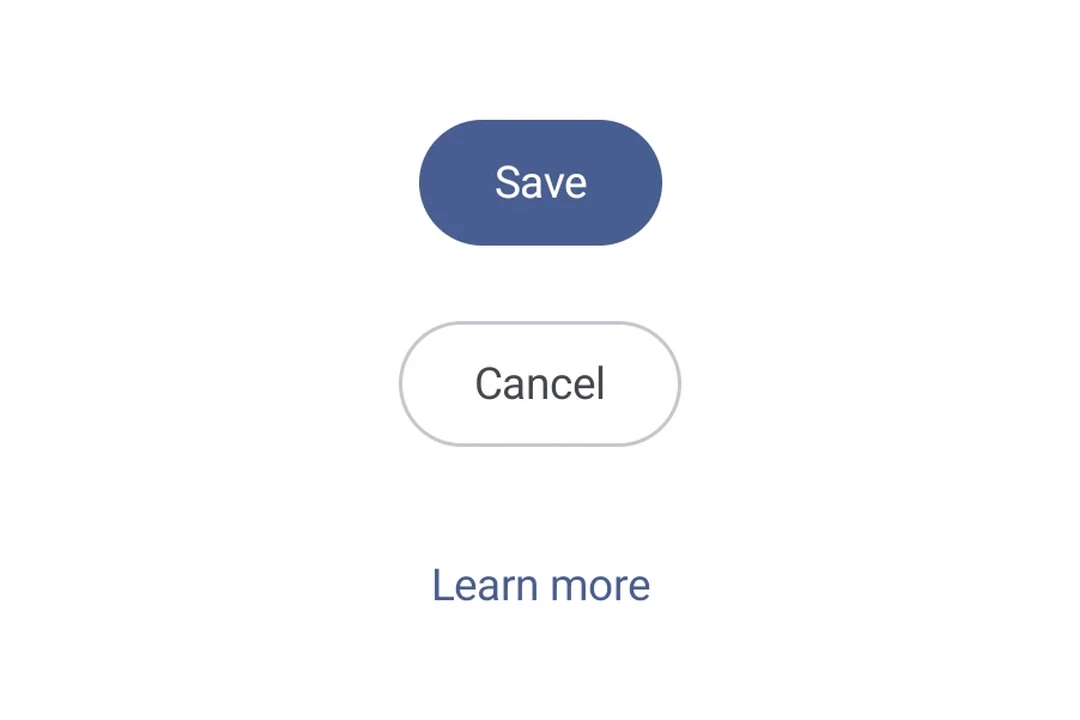
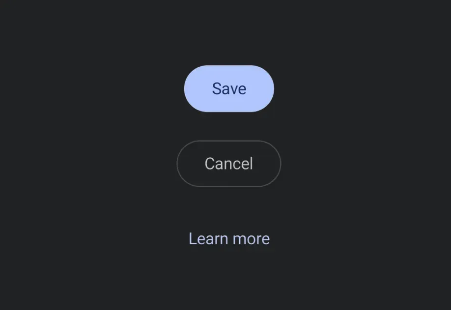
信息 关于跨平台用法,请参见通用的 Button — 它会针对每个平台渲染相应的原生组件。
ButtonVariantsExample.tsx import {
Host,
Button,
FilledTonalButton,
OutlinedButton,
ElevatedButton,
TextButton,
Column,
Text,
} from '@expo/ui/jetpack-compose';
export default function ButtonVariantsExample() {
return (
<Host matchContents>
<Column verticalArrangement={{ spacedBy: 8 }}>
<Button onClick={() => {}}>
<Text>填充</Text>
</Button>
<FilledTonalButton onClick={() => {}}>
<Text>填充色调</Text>
</FilledTonalButton>
<OutlinedButton onClick={() => {}}>
<Text>轮廓</Text>
</OutlinedButton>
<ElevatedButton onClick={() => {}}>
<Text>高架</Text>
</ElevatedButton>
<TextButton onClick={() => {}}>
<Text>文本</Text>
</TextButton>
</Column>
</Host>
);
}
ButtonWithIconsExample.tsx import {
Host,
Button,
OutlinedButton,
FilledTonalButton,
Icon,
Spacer,
Text,
} from '@expo/ui/jetpack-compose';
import { width } from '@expo/ui/jetpack-compose/modifiers';
const addIcon = require('./assets/add.png');
const sendIcon = require('./assets/send.png');
export default function ButtonWithIconsExample() {
return (
<Host matchContents>
{}
<Button onClick={() => {}}>
<Icon source={addIcon} size={18} tint="#FFFFFF" />
<Spacer modifiers={[width(8)]} />
<Text>添加项目</Text>
</Button>
{}
<OutlinedButton onClick={() => {}}>
<Text>发送</Text>
<Spacer modifiers={[width(8)]} />
<Icon source={sendIcon} size={18} />
</OutlinedButton>
{}
<FilledTonalButton onClick={() => {}}>
<Icon source={addIcon} size={18} />
<Spacer modifiers={[width(8)]} />
<Text>创建并发送</Text>
<Spacer modifiers={[width(8)]} />
<Icon source={sendIcon} size={18} />
</FilledTonalButton>
</Host>
);
}
import {
  Button,
  FilledTonalButton,
  OutlinedButton,
  ElevatedButton,
  TextButton,
} from '@expo/ui/jetpack-compose';
Type: React.Element<ButtonProps>
A filled button component.
Type: React.ReactNode
Content to display inside the button.
The padding between the button container and its content.
Use this to adjust internal spacing, for example when adding a leading icon
Optional • Type: boolean • Default: true
Whether the button is enabled for user interaction.
Optional • Type: ModifierConfig[]
Modifiers for the component.
Optional • Type: () => void
Callback that is called when the button is clicked.
Type: React.Element<ButtonProps>
An elevated button component.
Type: React.Element<ButtonProps>
A filled tonal button component.
Type: React.Element<ButtonProps>
An outlined button component.
Colors for button elements.
Content padding for the button's inner content.
All values are in density-independent pixels (dp).