This documentation is available as Markdown for AI agents and LLMs. See the full Markdown index or append .md to any documentation URL.
分割线
用于创建视觉分隔符的 Jetpack Compose 分割线组件。
Expo UI 提供 HorizontalDivider 和 VerticalDivider,与官方 Jetpack Compose Divider API 保持一致。
安装
- npx expo install @expo/uiIf you are installing this in an existing React Native app, make sure to install expo in your project.
用法
水平分隔线
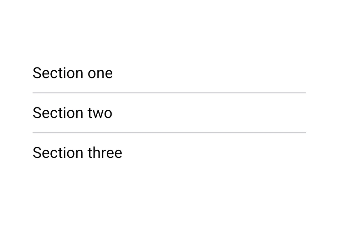
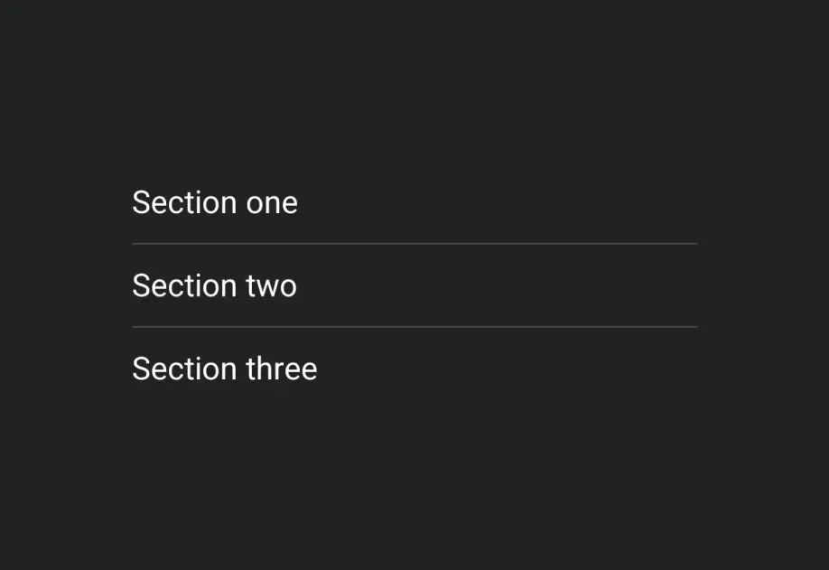
用于在列表和布局中以视觉方式分隔内容的细水平线。
import { Host, HorizontalDivider, Column, Text } from '@expo/ui/jetpack-compose'; export default function HorizontalDividerExample() { return ( <Host matchContents> <Column> <Text>第一部分</Text> <HorizontalDivider /> <Text>第二部分</Text> </Column> </Host> ); }
自定义粗细和颜色
HorizontalDivider 和 VerticalDivider 都接受 thickness 和 color 属性。使用 StyleSheet.hairlineWidth 可创建 1 像素的线,或者设置自定义的粗细和颜色。
import { Host, HorizontalDivider, Column, Text } from '@expo/ui/jetpack-compose'; import { StyleSheet } from 'react-native'; export default function CustomDividerExample() { return ( <Host matchContents> <Column> <Text>发丝线分隔线(1 像素)</Text> <HorizontalDivider thickness={StyleSheet.hairlineWidth} /> <Text>粗的彩色分隔线</Text> <HorizontalDivider thickness={4} color="#E91E63" /> <Text>下方</Text> </Column> </Host> ); }
垂直分隔线
用于在行布局中左右并排分隔项目的竖线。
import { Host, VerticalDivider, Row, Text } from '@expo/ui/jetpack-compose'; import { height } from '@expo/ui/jetpack-compose/modifiers'; export default function VerticalDividerExample() { return ( <Host matchContents> <Row verticalAlignment="center" modifiers={[height(48)]}> <Text>左侧</Text> <VerticalDivider /> <Text>右侧</Text> </Row> </Host> ); }
API
import { HorizontalDivider, VerticalDivider } from '@expo/ui/jetpack-compose';
Components
Type: React.Element<ComponentType<DividerCommonConfig>>
A horizontal divider line that groups content in lists and layouts,
matching Compose's HorizontalDivider.
Type: React.Element<ComponentType<DividerCommonConfig>>
A vertical divider line that groups content in layouts,
matching Compose's VerticalDivider.
Types
| Property | Type | Description |
|---|---|---|
| color(optional) | ColorValue | Color of the divider line. |
| modifiers(optional) | ModifierConfig[] | Modifiers for the component. |
| thickness(optional) | number | Thickness of the divider line. Accepts dp values; use |