Reference version

This documentation is available as Markdown for AI agents and LLMs. See the full Markdown index or append .md to any documentation URL.

切换

一个用于显示原生切换开关的 SwiftUI Toggle 组件。

iOS
tvOS
Included in Expo Go
Recommended version:
~57.0.0

Expo UI Toggle 与官方 SwiftUI Toggle API 保持一致,并支持通过 toggleStyle 修饰符进行样式设置。
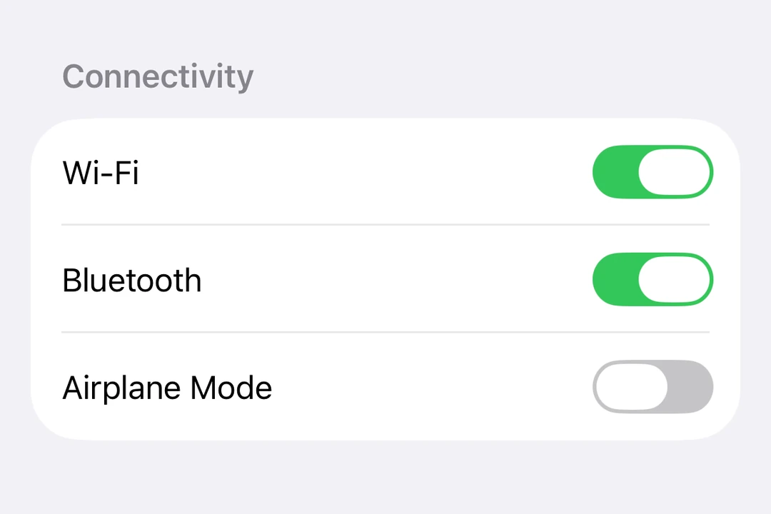
表单中的 Toggle 行

安装

Terminal
npx expo install @expo/ui

If you are installing this in an existing React Native app, make sure to install expo in your project.

用法

基本切换

BasicToggleExample.tsx
import { useState } from 'react'; import { Host, Toggle } from '@expo/ui/swift-ui'; export default function BasicToggleExample() { const [isOn, setIsOn] = useState(false); return ( <Host matchContents> <Toggle isOn={isOn} onIsOnChange={setIsOn} label="启用功能" /> </Host> ); }

带系统图像的切换

ToggleWithImageExample.tsx
import { useState } from 'react'; import { Host, Toggle } from '@expo/ui/swift-ui'; export default function ToggleWithImageExample() { const [airplaneMode, setAirplaneMode] = useState(false); return ( <Host matchContents> <Toggle isOn={airplaneMode} onIsOnChange={setAirplaneMode} label="飞行模式" systemImage="airplane" /> </Host> ); }

切换样式

使用 toggleStyle 修饰器来更改切换的外观。可用样式有:automaticswitchbutton

ToggleStylesExample.tsx
import { useState } from 'react'; import { Host, Toggle, VStack } from '@expo/ui/swift-ui'; import { toggleStyle } from '@expo/ui/swift-ui/modifiers'; export default function ToggleStylesExample() { const [isOn, setIsOn] = useState(false); return ( <Host matchContents> <VStack spacing={8}> <Toggle isOn={isOn} onIsOnChange={setIsOn} label="切换样式" modifiers={[toggleStyle('switch')]} /> <Toggle isOn={isOn} onIsOnChange={setIsOn} label="按钮样式" modifiers={[toggleStyle('button')]} /> </VStack> </Host> ); }

着色切换

使用 tint 修饰器来更改切换的颜色。

TintedToggleExample.tsx
import { useState } from 'react'; import { Host, Toggle } from '@expo/ui/swift-ui'; import { tint } from '@expo/ui/swift-ui/modifiers'; export default function TintedToggleExample() { const [isOn, setIsOn] = useState(true); return ( <Host matchContents> <Toggle isOn={isOn} onIsOnChange={setIsOn} label="自定义颜色" modifiers={[tint('#FF9500')]} /> </Host> ); }

自定义标签内容

你可以将自定义组件作为 children 传入,以创建更复杂的切换标签。使用多个 Text 视图,其中第一个表示标题,第二个表示副标题。

CustomLabelExample.tsx
import { useState } from 'react'; import { Host, Toggle, Text } from '@expo/ui/swift-ui'; export default function CustomLabelExample() { const [vibrateOnRing, setVibrateOnRing] = useState(false); return ( <Host matchContents> <Toggle isOn={vibrateOnRing} onIsOnChange={setVibrateOnRing}> <Text>响铃时振动</Text> <Text>手机响铃时启用振动</Text> </Toggle> </Host> ); }

隐藏标签

使用 labelsHidden 修饰器来隐藏标签,同时保留其无障碍访问用途。

HiddenLabelExample.tsx
import { useState } from 'react'; import { Host, Toggle } from '@expo/ui/swift-ui'; import { labelsHidden } from '@expo/ui/swift-ui/modifiers'; export default function HiddenLabelExample() { const [isOn, setIsOn] = useState(false); return ( <Host matchContents> <Toggle isOn={isOn} onIsOnChange={setIsOn} label="隐藏标签" modifiers={[labelsHidden()]} /> </Host> ); }

API

import { Toggle } from '@expo/ui/swift-ui';

Component

Toggle

Type: React.Element<ToggleProps>

A control that toggles between on and off states.

ToggleProps

children

Optional • Type: ReactNode

Custom content for the toggle label. Use multiple Text views where the first represents the title and the second represents the subtitle.

isOn

Optional • Type: boolean

A Boolean value that determines the on/off state of the toggle.

label

Optional • Type: string

A string that describes the purpose of the toggle.

onIsOnChange

Optional • Type: (isOn: boolean) => void

A callback that is called when the toggle's state changes.

isOn: boolean

The new state of the toggle.

systemImage

Optional • Type: SFSymbols7_0

The name of the SF Symbol to display alongside the label.