Reference version

This documentation is available as Markdown for AI agents and LLMs. See the full Markdown index or append .md to any documentation URL.

BottomSheet

一个 SwiftUI BottomSheet 组件,从屏幕底部展示内容。

iOS
tvOS
Included in Expo Go
Recommended version:
~57.0.0

Expo UI BottomSheet 与官方 SwiftUI sheet API 保持一致,并从屏幕底部呈现内容。
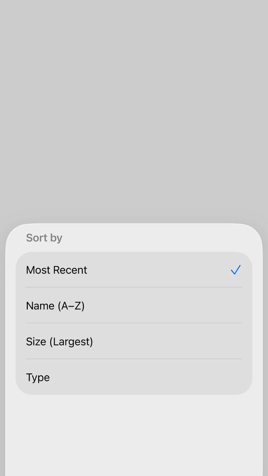
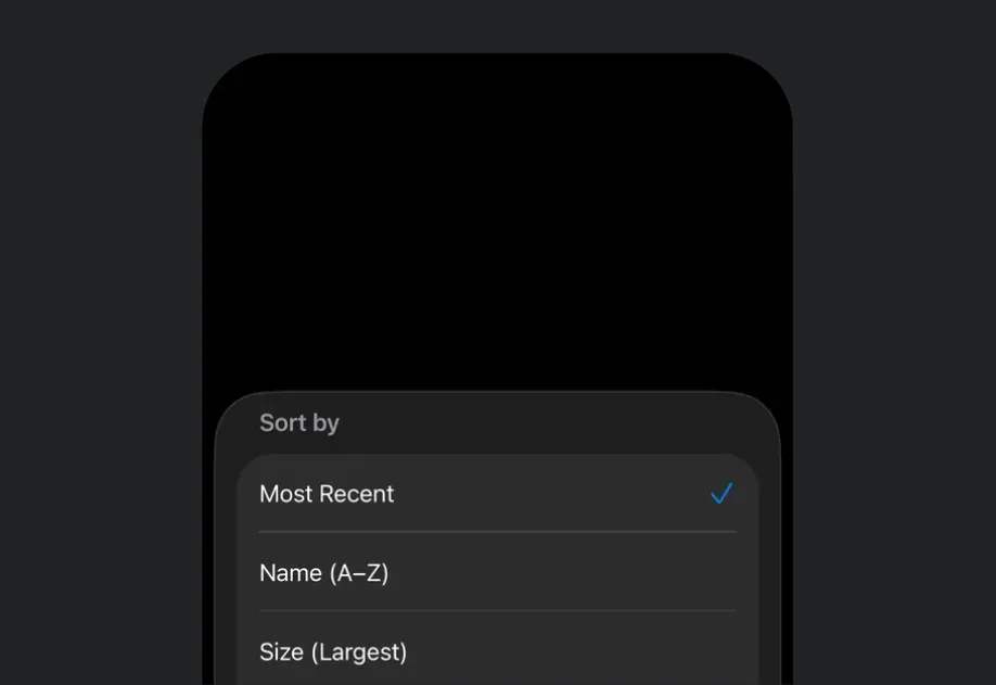
一个处于中等 detent 的 BottomSheet,显示一个“按以下方式排序”列表,并已选中“最新”

安装

Terminal
npx expo install @expo/ui

If you are installing this in an existing React Native app, make sure to install expo in your project.

用法

基础底部弹窗

将打开弹窗的控件作为 anchor 属性传入。子元素是弹窗的内容。

BasicBottomSheetExample.tsx
import { useState } from 'react'; import { Host, BottomSheet, Button, Text, VStack } from '@expo/ui/swift-ui'; export default function BasicBottomSheetExample() { const [isPresented, setIsPresented] = useState(false); return ( <Host style={{ flex: 1 }}> <VStack> <BottomSheet isPresented={isPresented} onIsPresentedChange={setIsPresented} anchor={<Button label="打开弹窗" onPress={() => setIsPresented(true)} />}> <Text>你好,世界!</Text> </BottomSheet> </VStack> </Host> ); }

作为锚点的 React Native 视图

锚点可以是 React Native 视图。将其包裹在 RNHostView 中。

BottomSheetRNAnchorExample.tsx
import { useState } from 'react'; import { Pressable, Text as RNText } from 'react-native'; import { Host, BottomSheet, Button, RNHostView, Text, VStack } from '@expo/ui/swift-ui'; export default function BottomSheetRNAnchorExample() { const [isPresented, setIsPresented] = useState(false); return ( <Host style={{ flex: 1 }}> <VStack> <BottomSheet isPresented={isPresented} onIsPresentedChange={setIsPresented} fitToContents anchor={ <RNHostView matchContents> <Pressable onPress={() => setIsPresented(true)} style={{ backgroundColor: '#007AFF', padding: 12, borderRadius: 8, alignSelf: 'flex-start', }}> <RNText style={{ color: 'white', fontWeight: '600' }}>打开底部表单</RNText> </Pressable> </RNHostView> }> <VStack> <Text>从 React Native 锚点打开。</Text> <Button label="关闭" onPress={() => setIsPresented(false)} /> </VStack> </BottomSheet> </VStack> </Host> ); }

适配内容的底部弹窗

使用 fitToContents 属性可自动调整弹窗大小以适配其内容。

BottomSheetFitsContentExample.tsx
import { useState } from 'react'; import { Host, BottomSheet, Button, Text, VStack } from '@expo/ui/swift-ui'; export default function BottomSheetFitsContentExample() { const [isPresented, setIsPresented] = useState(false); return ( <Host style={{ flex: 1 }}> <VStack> <BottomSheet isPresented={isPresented} onIsPresentedChange={setIsPresented} fitToContents anchor={<Button label="打开弹窗" onPress={() => setIsPresented(true)} />}> <VStack> <Text>此弹窗会自动调整大小以适配其内容。</Text> <Button label="关闭" onPress={() => setIsPresented(false)} /> </VStack> </BottomSheet> </VStack> </Host> ); }

自定义背景颜色

默认情况下,sheet 使用系统的半透明材质背景(iOS 26 上为 Liquid Glass)。可以在 Group 上使用 presentationBackground 修饰符,将 sheet 改为纯色背景,这样也会让 sheet 不再使用这种半透明材质。

BottomSheetBackgroundColorExample.tsx
import { useState } from 'react'; import { Host, BottomSheet, Button, Group, Text, VStack } from '@expo/ui/swift-ui'; import { presentationBackground, presentationDetents, padding, foregroundStyle, } from '@expo/ui/swift-ui/modifiers'; export default function BottomSheetBackgroundColorExample() { const [isPresented, setIsPresented] = useState(false); return ( <Host style={{ flex: 1 }}> <VStack> <BottomSheet isPresented={isPresented} onIsPresentedChange={setIsPresented} anchor={<Button label="打开 sheet" onPress={() => setIsPresented(true)} />}> <Group modifiers={[ presentationDetents(['medium', 'large']), presentationBackground('#ffffff'), ]}> <VStack modifiers={[padding({ all: 20 })]}> <Text modifiers={[foregroundStyle('#000000')]}>纯白色 sheet 背景。</Text> <Button label="关闭" onPress={() => setIsPresented(false)} /> </VStack> </Group> </BottomSheet> </VStack> </Host> ); }

带有展示停靠点的底部面板

Group 上使用 presentationDetents 修饰器来控制可用高度。你可以使用:

  • 'medium':系统中等高度(约半屏)
  • 'large':系统大高度(全屏)
  • { fraction: number }:屏幕高度的比例(0-1)
  • { height: number }:以点为单位的固定高度
BottomSheetWithDetentsExample.tsx
import { useState } from 'react'; import { Host, BottomSheet, Button, Group, Text, VStack } from '@expo/ui/swift-ui'; import { presentationDetents } from '@expo/ui/swift-ui/modifiers'; export default function BottomSheetWithDetentsExample() { const [isPresented, setIsPresented] = useState(false); return ( <Host style={{ flex: 1 }}> <VStack> <BottomSheet isPresented={isPresented} onIsPresentedChange={setIsPresented} anchor={<Button label="打开面板" onPress={() => setIsPresented(true)} />}> <Group modifiers={[ presentationDetents(['medium', 'large', { fraction: 0.3 }, { height: 200 }]), ]}> <Text>这个面板可以吸附到多个高度。</Text> </Group> </BottomSheet> </VStack> </Host> ); }

带锚点选择跟踪的底部弹窗

selectiononSelectionChange 选项传给 presentationDetents,即可通过编程方式控制弹窗吸附到哪个锚点。

BottomSheetWithDetentSelectionExample.tsx
import { useState } from 'react'; import { Host, BottomSheet, Button, List, Section, Text, VStack, Group } from '@expo/ui/swift-ui'; import { presentationDetents, presentationDragIndicator, foregroundStyle, } from '@expo/ui/swift-ui/modifiers'; import type { PresentationDetent } from '@expo/ui/swift-ui/modifiers'; export default function BottomSheetWithDetentSelectionExample() { const [isPresented, setIsPresented] = useState(false); const detents: PresentationDetent[] = [{ height: 300 }, { fraction: 0.3 }, 'medium', 'large']; const [selectedDetent, setSelectedDetent] = useState<PresentationDetent>('medium'); const formatDetent = (detent: PresentationDetent): string => { if (typeof detent === 'string') return detent; if ('fraction' in detent) return `分数 ${detent.fraction}`; return `高度 ${detent.height}`; }; return ( <Host style={{ flex: 1 }}> <VStack> <BottomSheet isPresented={isPresented} onIsPresentedChange={setIsPresented} anchor={<Button label="显示弹窗" onPress={() => setIsPresented(true)} />}> <Group modifiers={[ presentationDetents(detents, { selection: selectedDetent, onSelectionChange: setSelectedDetent, }), presentationDragIndicator('visible'), ]}> <List> <Section title="更改锚点"> <Button label="高度 300" onPress={() => setSelectedDetent({ height: 300 })} /> <Button label="分数 0.3" onPress={() => setSelectedDetent({ fraction: 0.3 })} /> <Button label="中等" onPress={() => setSelectedDetent('medium')} /> <Button label="大型" onPress={() => setSelectedDetent('large')} /> </Section> <Section title="当前"> <Text modifiers={[foregroundStyle('secondaryLabel')]}> {formatDetent(selectedDetent)} </Text> </Section> </List> </Group> </BottomSheet> </VStack> </Host> ); }

带背景交互的底部弹窗

使用 presentationBackgroundInteraction 修饰器,允许与弹窗后面的内容进行交互。

BottomSheetWithBackgroundInteractionExample.tsx
import { useState } from 'react'; import { Host, BottomSheet, Button, Group, Text, VStack } from '@expo/ui/swift-ui'; import { presentationDetents, presentationBackgroundInteraction, } from '@expo/ui/swift-ui/modifiers'; export default function BottomSheetWithBackgroundInteractionExample() { const [isPresented, setIsPresented] = useState(false); return ( <Host style={{ flex: 1 }}> <VStack> <BottomSheet isPresented={isPresented} onIsPresentedChange={setIsPresented} anchor={<Button label="打开弹窗" onPress={() => setIsPresented(true)} />}> <Group modifiers={[ presentationDetents(['medium', 'large']), presentationBackgroundInteraction({ type: 'enabledUpThrough', detent: 'medium' }), ]}> <Text>在中等高度时可与背后的内容交互。</Text> </Group> </BottomSheet> </VStack> </Host> ); }

不可通过手势关闭的底部弹窗

使用 interactiveDismissDisabled 修饰器,防止用户通过滑动来关闭弹窗。

NonDismissibleBottomSheetExample.tsx
import { useState } from 'react'; import { Host, BottomSheet, Button, Group, Text, VStack } from '@expo/ui/swift-ui'; import { interactiveDismissDisabled } from '@expo/ui/swift-ui/modifiers'; export default function NonDismissibleBottomSheetExample() { const [isPresented, setIsPresented] = useState(false); return ( <Host style={{ flex: 1 }}> <VStack> <BottomSheet isPresented={isPresented} onIsPresentedChange={setIsPresented} anchor={<Button label="打开弹窗" onPress={() => setIsPresented(true)} />}> <Group modifiers={[interactiveDismissDisabled()]}> <VStack> <Text>这个弹窗不能通过滑动关闭。</Text> <Button label="关闭" onPress={() => setIsPresented(false)} /> </VStack> </Group> </BottomSheet> </VStack> </Host> ); }

带 React Native 内容的底部弹窗

使用 RNHostView 在底部弹窗中嵌入 React Native 组件。设置 matchContents 可自动调整宿主视图大小以适配其内容。

BottomSheetWithRNContentExample.tsx
import { useState } from 'react'; import { Pressable, Text as RNText, View } from 'react-native'; import { Host, BottomSheet, Button, Group, RNHostView, VStack } from '@expo/ui/swift-ui'; import { presentationDragIndicator } from '@expo/ui/swift-ui/modifiers'; export default function BottomSheetWithRNContentExample() { const [isPresented, setIsPresented] = useState(false); const [counter, setCounter] = useState(0); return ( <Host style={{ flex: 1 }}> <VStack> <BottomSheet isPresented={isPresented} onIsPresentedChange={setIsPresented} fitToContents anchor={<Button label="打开弹窗" onPress={() => setIsPresented(true)} />}> <Group modifiers={[presentationDragIndicator('visible')]}> <RNHostView matchContents> <View style={{ padding: 24 }}> <RNText style={{ fontSize: 18, fontWeight: 'bold', marginBottom: 8 }}> React Native 内容 </RNText> <RNText style={{ color: '#666', marginBottom: 16 }}>计数器:{counter}</RNText> <Pressable style={{ backgroundColor: '#007AFF', padding: 12, borderRadius: 8, alignItems: 'center', marginBottom: 12, }} onPress={() => setCounter(counter + 1)}> <RNText style={{ color: 'white', fontWeight: '600' }}>增加</RNText> </Pressable> <Pressable style={{ backgroundColor: '#FF3B30', padding: 12, borderRadius: 8, alignItems: 'center', }} onPress={() => setIsPresented(false)}> <RNText style={{ color: 'white', fontWeight: '600' }}>关闭</RNText> </Pressable> </View> </RNHostView> </Group> </BottomSheet> </VStack> </Host> ); }

带灵活 React Native 内容的底部弹窗

当使用带有 flex: 1 的 React Native 内容时,省略 RNHostView 上的 matchContents 属性,并使用 presentationDetents 来控制弹窗高度。

BottomSheetWithFlexRNContentExample.tsx
import { useState } from 'react'; import { Text as RNText, View } from 'react-native'; import { Host, BottomSheet, Button, Group, RNHostView, VStack } from '@expo/ui/swift-ui'; import { presentationDetents, presentationDragIndicator } from '@expo/ui/swift-ui/modifiers'; export default function BottomSheetWithFlexRNContentExample() { const [isPresented, setIsPresented] = useState(false); return ( <Host style={{ flex: 1 }}> <VStack> <BottomSheet isPresented={isPresented} onIsPresentedChange={setIsPresented} anchor={<Button label="打开弹窗" onPress={() => setIsPresented(true)} />}> <Group modifiers={[ presentationDetents(['medium', 'large']), presentationDragIndicator('visible'), ]}> <RNHostView> <View style={{ flex: 1, backgroundColor: '#007AFF', padding: 24 }}> <RNText style={{ fontSize: 18, fontWeight: 'bold', color: 'white' }}> 灵活的 React Native 内容 </RNText> <RNText style={{ color: 'white', marginTop: 8 }}> 此内容会填满弹窗内可用空间。 </RNText> </View> </RNHostView> </Group> </BottomSheet> </VStack> </Host> ); }

可滚动的 React Native 内容

将可滚动的 React Native 列表(如 FlatListScrollView,或像 FlashListLegend List 这样的高性能列表)嵌套在带有 RNHostView 的弹窗中。使用 presentationDetents 设置弹窗高度,列表会在该高度内滚动。

BottomSheetWithScrollableContentExample.tsx
import { useState } from 'react'; import { FlatList, Text as RNText, View } from 'react-native'; import { Host, BottomSheet, Button, Group, RNHostView, VStack } from '@expo/ui/swift-ui'; import { presentationDetents, presentationDragIndicator } from '@expo/ui/swift-ui/modifiers'; const DATA = Array.from({ length: 50 }, (_, i) => `项目 ${i + 1}`); export default function BottomSheetWithScrollableContentExample() { const [isPresented, setIsPresented] = useState(false); return ( <Host matchContents> <VStack> <BottomSheet isPresented={isPresented} onIsPresentedChange={setIsPresented} anchor={<Button label="打开弹窗" onPress={() => setIsPresented(true)} />}> <Group modifiers={[ presentationDetents(['medium', 'large']), presentationDragIndicator('visible'), ]}> <RNHostView> <View style={{ padding: 16 }}> <FlatList data={DATA} keyExtractor={item => item} renderItem={({ item }) => <RNText style={{ paddingVertical: 16 }}>{item}</RNText>} /> </View> </RNHostView> </Group> </BottomSheet> </VStack> </Host> ); }

API

import { BottomSheet } from '@expo/ui/swift-ui';

Component

BottomSheet

Type: React.Element<BottomSheetProps>

BottomSheet presents content from the bottom of the screen.

BottomSheetProps

anchor

Optional • Type: ReactNode

A view the sheet is anchored to, for example the Button that opens it. Rendered in place and kept mounted, so presenting the sheet doesn't shift surrounding layout. Optional.

children

Type: ReactNode

The sheet's content, mounted while presented and unmounted after dismiss. Wrap it in Group to apply presentation modifiers.

fitToContents

Optional • Type: boolean • Default: false

When true, the sheet will automatically size itself to fit its content. This sets the presentation detent to match the height of the children.

isPresented

Type: boolean

Whether the BottomSheet is presented.

onDismiss

Optional • Type: () => void

Callback function that is called after the BottomSheet has been fully dismissed.

onIsPresentedChange

Type: (isPresented: boolean) => void

Callback function that is called when the BottomSheet presented state changes.