Reference version

This documentation is available as Markdown for AI agents and LLMs. See the full Markdown index or append .md to any documentation URL.

SecureField

用于密码输入的 SwiftUI SecureField 组件。

iOS
tvOS
Included in Expo Go
Recommended version:
~57.0.0

Expo UI SecureField 与官方 SwiftUI SecureField API 保持一致,并提供一个可屏蔽用户输入内容的文本字段,适用于密码和其他敏感文本。
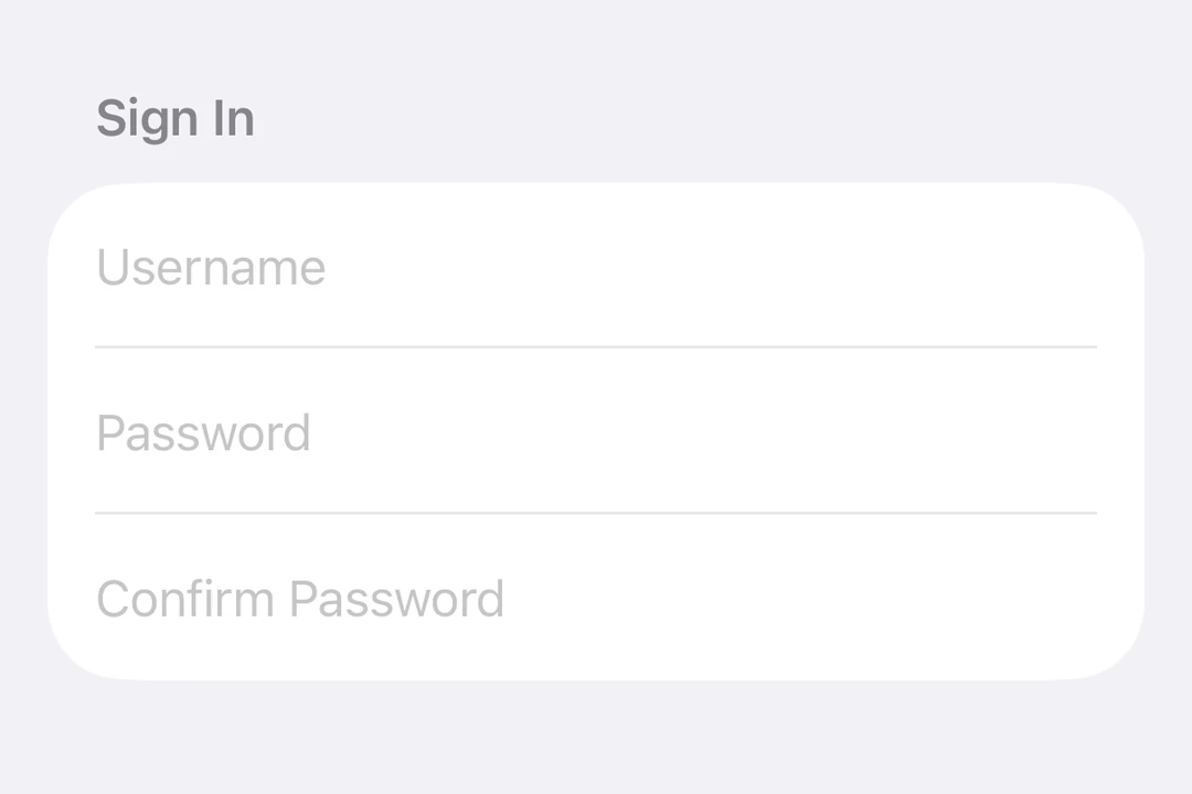
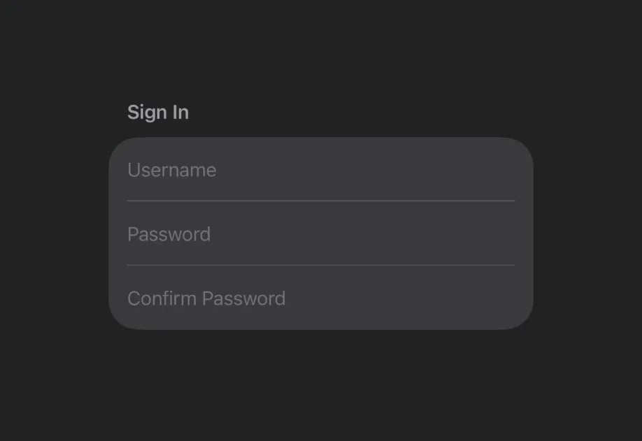
用于更改密码的三个 SecureField 行

安装

Terminal
npx expo install @expo/ui

If you are installing this in an existing React Native app, make sure to install expo in your project.

用法

基础安全字段

BasicSecureFieldExample.tsx
import { useState } from 'react'; import { Host, SecureField } from '@expo/ui/swift-ui'; export default function BasicSecureFieldExample() { const [password, setPassword] = useState(''); return ( <Host matchContents> <SecureField placeholder="密码" onTextChange={setPassword} /> </Host> ); }

提交处理

使用 submitLabelonSubmit 修饰器来处理从键盘发起的表单提交。

SecureFieldSubmitExample.tsx
import { useState } from 'react'; import { Host, SecureField } from '@expo/ui/swift-ui'; import { submitLabel, onSubmit } from '@expo/ui/swift-ui/modifiers'; export default function SecureFieldSubmitExample() { const [password, setPassword] = useState(''); return ( <Host matchContents> <SecureField placeholder="密码" onTextChange={setPassword} modifiers={[submitLabel('done'), onSubmit(() => console.log('Login submitted'))]} /> </Host> ); }

命令式 ref

使用 ref 以命令式方式设置安全字段的文本、聚焦或失焦。

ImperativeSecureFieldExample.tsx
import { useRef } from 'react'; import { Host, SecureField, SecureFieldRef, Button, HStack, VStack } from '@expo/ui/swift-ui'; import { buttonStyle } from '@expo/ui/swift-ui/modifiers'; export default function ImperativeSecureFieldExample() { const ref = useRef<SecureFieldRef>(null); return ( <Host matchContents> <VStack> <SecureField ref={ref} placeholder="密码" /> <HStack spacing={12}> <Button modifiers={[buttonStyle('bordered')]} onPress={() => ref.current?.focus()} label="聚焦" /> <Button modifiers={[buttonStyle('bordered')]} onPress={() => ref.current?.blur()} label="失焦" /> <Button modifiers={[buttonStyle('bordered')]} onPress={() => ref.current?.setText('secret123')} label="Set text" /> </HStack> </VStack> </Host> ); }

API

import { SecureField } from '@expo/ui/swift-ui';

Component

SecureField

Type: React.Element<SecureFieldProps>

Renders a SwiftUI SecureField for password input.

SecureFieldProps

autoFocus

Optional • Type: boolean • Default: false

If true, the secure field will be focused automatically when mounted.

children

Optional • Type: ReactNode

Slot children - supports <SecureField.Placeholder> with a <Text> child

maxLength

Optional • Type: number

Maximum number of characters allowed. Truncates natively as the user types.

onFocusChange

Optional • Type: (focused: boolean) => void

A callback triggered when the field gains or loses focus.

onTextChange

Optional • Type: (text: string) => void

A callback triggered when the text value changes.

If the callback is marked with the 'worklet' directive, it runs synchronously on the UI thread; otherwise it is delivered asynchronously as a regular JS event.

placeholder

Optional • Type: string

A text that is displayed when the field is empty.

ref

Optional • Type: Ref<SecureFieldRef>

text

Optional • Type: ObservableState<string>

An observable state that holds the current text. Create one with useNativeState('') or useNativeState('initial value'). If omitted, the field manages its own internal state.

Types

SecureFieldRef

Can be used for imperatively setting text and focus on the SecureField component.

PropertyTypeDescription
blur() => Promise<void>
-
clear() => Promise<void>

Clear the current text.

focus() => Promise<void>
-
setText(newText: string) => Promise<void>
-