This documentation is available as Markdown for AI agents and LLMs. See the full Markdown index or append .md to any documentation URL.
This is documentation for the next SDK version. For up-to-date documentation, see the latest version (SDK 57).
选择器
与 @react-native-picker/picker 兼容的选择器。
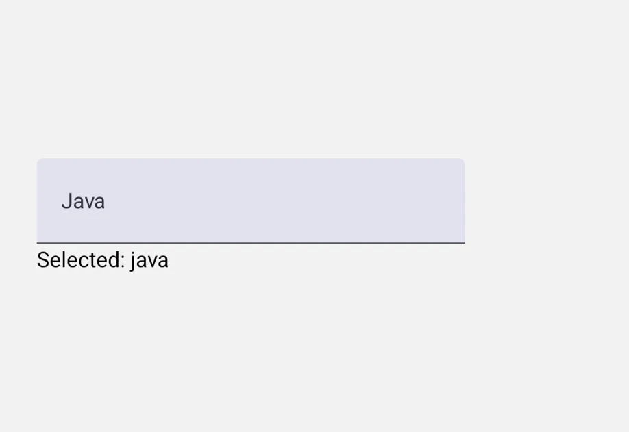
一个与 @react-native-picker/picker API 兼容的 Picker 组件。它在 iOS 上使用 SwiftUI 的轮式 Picker,在 Android 上使用 Material 3 的 ExposedDropdownMenuBox,在 web 上使用原生 <select> 元素。
在底层,该组件封装了平台特定的 @expo/ui 原语:
- Android: Jetpack Compose ExposedDropdownMenuBox
- iOS: SwiftUI Picker 并使用
pickerStyle('wheel')
如果你需要更低层级的控制,请直接使用这些原语。

安装
If you are installing this in an existing React Native app, make sure to install expo in your project.
从 @react-native-picker/picker 迁移
- 将导入从
import { Picker } from '@react-native-picker/picker'更新为import { Picker } from '@expo/ui/community/picker'。 - 不支持
mode、prompt、dropdownIconColor、dropdownIconRippleColor、numberOfLines、selectionColor、itemStyle和accessibilityLabel属性。 - 在
Picker.Item上,style属性仅适用于color、backgroundColor、fontFamily和fontSize。顶层的color和fontFamily属性仍然受支持,并作为对应style值的别名。 Picker.Item上的enabled仅适用于 Android。ref的focus()和blur()方法仅在 Android 上生效(打开/关闭下拉菜单)。在 iOS 上,轮式选择器始终可见。
基本用法
单项样式与状态
向 Picker.Item 传递一个 style,可以分别控制每一项的 color、backgroundColor、fontFamily 和 fontSize,并可使用 enabled={false} 在 Android 上禁用特定项。
fontFamily 在 iOS 上接受 iOS 字体名称(例如 'Menlo'),在 Android 上接受 Compose 通用字体族('monospace'、'serif'、'sansSerif'、'cursive')或使用 expo-font 加载的字体。
命令式聚焦与失焦(Android)
使用 ref 可以在 Android 上以编程方式打开和关闭下拉菜单。在 iOS 上,这些方法没有效果,因为轮式选择器始终可见。
API
import { Picker } from '@expo/ui/community/picker';
Components
Type: React.Element<PickerProps<T>>
A drop-in replacement for @react-native-picker/picker on web.
Renders a native <select> element.
ReactNodePicker.Item children that define the available options.
(itemValue: T, itemIndex: number) => voidCallback when an item is selected. Called with (itemValue, itemIndex).
TThe currently selected value. Must match the value of one of the Picker.Item children.
Type: React.Element<ComponentType<PickerItemProps>>
stringText color for the item. Equivalent to setting color in the style prop.
stringCustom font family for the item. Equivalent to setting fontFamily in the style prop.
StyleProp<TextStyle>Style applied to the item label. Only the following values take effect:
color, backgroundColor, fontFamily, and fontSize. When also set
via the top-level color or fontFamily props, values from style win.