构建一个屏幕
编辑页面
在本教程中,学习如何使用诸如 React Native 的 Pressable 和 Expo Image 等组件来构建一个屏幕。
For the complete documentation index, see llms.txt. Use this file to discover all available pages.
在本章中,我们将创建 StickerSmash 应用的第一个屏幕。
上面的屏幕显示了一张图片和两个按钮。应用用户可以使用这两个按钮中的任意一个来选择图片。第一个按钮允许用户从设备中选择图片。第二个按钮允许用户继续使用应用提供的默认图片。
一旦用户选择了图片,他们就可以为其添加贴纸。所以,让我们开始创建这个屏幕。
使用 Pressable、Expo Image 和其他核心组件构建 StickerSmash 应用的第一个屏幕,创建一个图片选择器布局。
1
2
显示图片
我们将使用 expo-image 库在应用中显示图片。它提供了一个跨平台的 <Image> 组件来加载和渲染图片。它已经包含在我们正在使用的默认项目模板中。
Image 组件会将图片的 source 作为其值。source 可以是 静态资源 或 URL。例如,来自 assets/images 目录的 source 是静态的。它也可以通过 网络 以 uri 属性的形式提供。
要在 app/(tabs)/index.tsx 文件中使用 Image 组件:
- 从
expo-image库中导入Image。 - 创建一个
PlaceholderImage变量,将 assets/images/background-image.png 文件作为Image组件的source属性使用。
import { View, StyleSheet } from 'react-native';
import { Image } from 'expo-image';

const PlaceholderImage = require('@/assets/images/background-image.png');

export default function Index() {
  return (
    <View style={styles.container}>
      <View style={styles.imageContainer}>
        <Image source={PlaceholderImage} style={styles.image} />
      </View>
    </View>
  );
}

const styles = StyleSheet.create({
  container: {
    flex: 1,
    backgroundColor: '#25292e',
    alignItems: 'center',
  },
  imageContainer: {
    flex: 1,
  },
  image: {
    width: 320,
    height: 440,
    borderRadius: 18,
  },
});
3
将组件拆分到不同文件中
随着我们向这个屏幕添加更多组件,让我们把代码拆分到多个文件中。在整个教程中,我们将使用 components 目录来创建自定义组件。
- 创建一个顶层 components 目录,并在其中创建 ImageViewer.tsx 文件。
- 将显示图片的代码以及
image样式移到这个文件中。
import { ImageSourcePropType, StyleSheet } from 'react-native';
import { Image } from 'expo-image';

type Props = {
  imgSource: ImageSourcePropType;
};

export default function ImageViewer({ imgSource }: Props) {
  return <Image source={imgSource} style={styles.image} />;
}

const styles = StyleSheet.create({
  image: {
    width: 320,
    height: 440,
    borderRadius: 18,
  },
});
信息 由于 ImageViewer 是一个自定义组件,我们将它放在单独的目录中,而不是 app 目录。app 目录中的每个文件要么是布局文件,要么是路由文件。更多信息请参见 非导航组件应放在 app 目录之外。
导入 ImageViewer 并在 app/(tabs)/index.tsx 中使用它:
import { StyleSheet, View } from 'react-native';

import ImageViewer from '@/components/ImageViewer';

const PlaceholderImage = require('@/assets/images/background-image.png');

export default function Index() {
  return (
    <View style={styles.container}>
      <View style={styles.imageContainer}>
        <ImageViewer imgSource={PlaceholderImage} />
      </View>
    </View>
  );
}

const styles = StyleSheet.create({
  container: {
    flex: 1,
    backgroundColor: '#25292e',
    alignItems: 'center',
  },
  imageContainer: {
    flex: 1,
  },
});
导入语句中的 @ 是什么?
@ 符号是一个自定义的 路径别名,用于导入自定义组件和其他模块,而不是使用相对路径。Expo CLI 会在 tsconfig.json 中自动为其配置。
4
使用 Pressable 创建按钮
React Native 包含一些用于处理触摸事件的不同组件,但由于 <Pressable> 的灵活性,它是推荐使用的。它可以检测单次点击、长按,在按钮按下和释放时触发不同的事件,等等。
在设计中,我们需要创建两个按钮。每个按钮都有不同的样式和标签。让我们先创建一个可复用的按钮组件。在 components 目录中创建一个 Button.tsx 文件,并使用以下代码:
import { StyleSheet, View, Pressable, Text } from 'react-native';

type Props = {
  label: string;
};

export default function Button({ label }: Props) {
  return (
    <View style={styles.buttonContainer}>
      <Pressable style={styles.button} onPress={() => alert('You pressed a button.')}>
        <Text style={styles.buttonLabel}>{label}</Text>
      </Pressable>
    </View>
  );
}

const styles = StyleSheet.create({
  buttonContainer: {
    width: 320,
    height: 68,
    marginHorizontal: 20,
    alignItems: 'center',
    justifyContent: 'center',
    padding: 3,
  },
  button: {
    borderRadius: 10,
    width: '100%',
    height: '100%',
    alignItems: 'center',
    justifyContent: 'center',
    flexDirection: 'row',
  },
  buttonLabel: {
    color: '#fff',
    fontSize: 16,
  },
});
当用户点击屏幕上的任意按钮时,应用会显示一个提醒。这是因为 <Pressable> 在其 onPress 属性中调用了 alert()。让我们将这个组件导入到 app/(tabs)/index.tsx 文件中,并为包裹这些按钮的 <View> 添加样式:
import { View, StyleSheet } from 'react-native';

import Button from '@/components/Button';
import ImageViewer from '@/components/ImageViewer';

const PlaceholderImage = require("@/assets/images/background-image.png");

export default function Index() {
  return (
    <View style={styles.container}>
      <View style={styles.imageContainer}>
        <ImageViewer imgSource={PlaceholderImage} />
      </View>
      <View style={styles.footerContainer}>
        <Button label="Choose a photo" />
        <Button label="Use this photo" />
      </View>
    </View>
  );
}

const styles = StyleSheet.create({
  container: {
    flex: 1,
    backgroundColor: '#25292e',
    alignItems: 'center',
  },
  imageContainer: {
    flex: 1,
    paddingTop: 28,
  },
  footerContainer: {
    flex: 1 / 3,
    alignItems: 'center',
  },
});
让我们在 Android、iOS 和 Web 上看看我们的应用:
带有“Use this photo”标签的第二个按钮与设计中的实际按钮相似。不过,第一个按钮还需要更多样式才能匹配设计。
5
增强可复用按钮组件
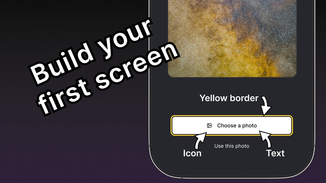
“Choose a photo” 按钮所需的样式与“Use this photo” 按钮不同,因此我们将添加一个新的 button theme 属性,使我们能够应用 primary 主题。这个按钮在标签前面还有一个图标。我们将使用 @expo/vector-icons 库中的图标。
要在按钮上加载并显示图标,让我们使用库中的 FontAwesome。修改 components/Button.tsx,添加以下代码片段:
import { StyleSheet, View, Pressable, Text } from 'react-native';
import FontAwesome from '@expo/vector-icons/FontAwesome';

type Props = {
  label: string;
  theme?: 'primary';
};

export default function Button({ label, theme }: Props) {
  if (theme === 'primary') {
  return (
      <View
        style={[
          styles.buttonContainer,
          { borderWidth: 4, borderColor: '#ffd33d', borderRadius: 18 },
        ]}>
        <Pressable
          style={[styles.button, { backgroundColor: '#fff' }]}
          onPress={() => alert('You pressed a button.')}>
          <FontAwesome name="picture-o" size={18} color="#25292e" style={styles.buttonIcon} />
          <Text style={[styles.buttonLabel, { color: '#25292e' }]}>{label}</Text>
        </Pressable>
      </View>
    );
  }

  return (
    <View style={styles.buttonContainer}>
      <Pressable style={styles.button} onPress={() => alert('You pressed a button.')}>
        <Text style={styles.buttonLabel}>{label}</Text>
      </Pressable>
    </View>
  );
}

const styles = StyleSheet.create({
  buttonContainer: {
    width: 320,
    height: 68,
    marginHorizontal: 20,
    alignItems: 'center',
    justifyContent: 'center',
    padding: 3,
  },
  button: {
    borderRadius: 10,
    width: '100%',
    height: '100%',
    alignItems: 'center',
    justifyContent: 'center',
    flexDirection: 'row',
  },
  buttonIcon: {
    paddingRight: 8,
  },
  buttonLabel: {
    color: '#fff',
    fontSize: 16,
  },
});
让我们了解一下上面的代码做了什么:
- primary 主题按钮使用 内联样式,它会覆盖在
StyleSheet.create()中定义的样式,因为对象直接传入了style属性。 - primary 主题中的
<Pressable>组件使用backgroundColor属性,值为#fff,将按钮背景设置为白色。如果我们把这个属性加到styles.button中,那么这个背景色值将同时应用于 primary 主题和未设置样式的按钮。 - 内联样式使用 JavaScript,并会覆盖特定值的默认样式。
现在,修改 app/(tabs)/index.tsx 文件,为第一个按钮使用 theme="primary" 属性。
import { View, StyleSheet } from 'react-native';

import Button from '@/components/Button';
import ImageViewer from '@/components/ImageViewer';

const PlaceholderImage = require('@/assets/images/background-image.png');

export default function Index() {
  return (
    <View style={styles.container}>
      <View style={styles.imageContainer}>
        <ImageViewer imgSource={PlaceholderImage} />
      </View>
      <View style={styles.footerContainer}>
        <Button theme="primary" label="Choose a photo" />
        <Button label="Use this photo" />
      </View>
    </View>
  );
}

const styles = StyleSheet.create({
  container: {
    flex: 1,
    backgroundColor: '#25292e',
    alignItems: 'center',
  },
  imageContainer: {
    flex: 1,
  },
  footerContainer: {
    flex: 1 / 3,
    alignItems: 'center',
  },
});
让我们在 Android、iOS 和 Web 上看看我们的应用:
摘要
Chapter 3: Build a screen
We have successfully implemented the initial design and begun building the first screen of the app.
In the next chapter, we will add the ability to select images from the device media library.