This documentation is available as Markdown for AI agents and LLMs. See the full Markdown index or append .md to any documentation URL.

添加导航

编辑页面

在本章中,学习如何向 Expo 应用添加导航。


在本章中,我们将学习 Expo Router 的基础知识,创建堆栈导航和一个包含两个标签页的底部标签栏。
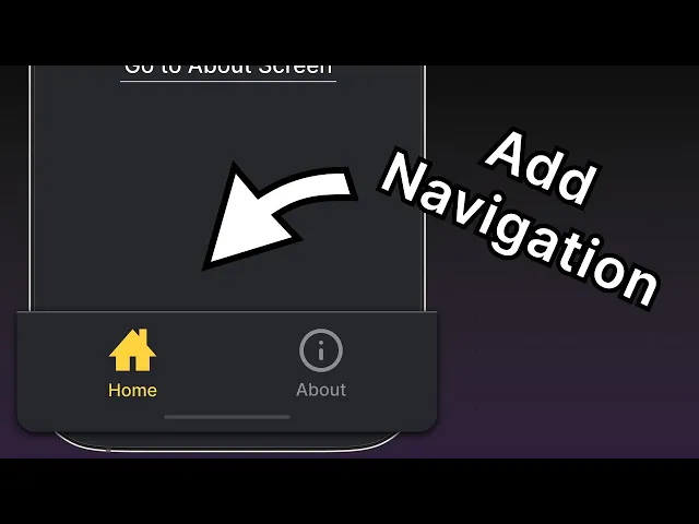
观看:在你的通用 Expo 应用中添加导航

使用 Expo Router 设置基于文件的路由,在屏幕之间创建堆栈导航,并构建一个底部标签栏。

Expo 路由基础

Expo Router 是一个面向 React Native 和 Web 应用的基于文件的路由框架。它负责管理屏幕之间的导航,并在多个平台上使用相同的组件。要开始使用,我们需要了解以下约定:

  • app 目录:一个特殊目录,只包含路由及其布局。添加到该目录中的任何文件都会成为原生应用中的一个屏幕,以及 Web 上的一个页面。
  • 根布局app/_layout.tsx 文件。它定义了共享 UI 元素,例如标题和标签栏,从而使不同路由之间保持一致。
  • 文件名约定:像 index.tsx 这样的 Index 文件名会与其父目录匹配,不会新增路径段。例如,app 目录中的 index.tsx 文件匹配 / 路由。
  • 一个 路由 文件会将 React 组件作为默认导出。它可以使用 .js.jsx.ts.tsx 扩展名。
  • Android、iOS 和 web 共享统一的导航结构。

1

向堆栈中添加新屏幕

让我们在 app 目录中创建一个名为 about.tsx 的新文件。当用户导航到 /about 路由时,它会显示该屏幕的名称。

app/about.tsx
import { Text, View, StyleSheet } from 'react-native'; export default function AboutScreen() { return ( <View style={styles.container}> <Text style={styles.text}>关于页面</Text> </View> ); } const styles = StyleSheet.create({ container: { flex: 1, backgroundColor: '#25292e', justifyContent: 'center', alignItems: 'center', }, text: { color: '#fff', }, });

app/_layout.tsx 中:

  1. 添加一个 <Stack.Screen /> 组件和一个 options 属性,以更新 /about 路由的标题。
  2. 通过添加 options 属性,将 /index 路由的标题更新为 Home
app/_layout.tsx
import { Stack } from 'expo-router'; export default function RootLayout() { return ( <Stack> <Stack.Screen name="index" options={{ title: 'Home' }} /> <Stack.Screen name="about" options={{ title: 'About' }} /> </Stack> ); }
什么是 Stack

堆栈导航器是应用中不同屏幕之间导航的基础。在 Android 上,堆栈路由会在当前屏幕之上进行动画切换。在 iOS 上,堆栈路由会从右侧滑入。Expo Router 提供了一个 Stack 组件,用于创建导航堆栈并添加新路由。

2

在屏幕之间导航

我们将使用 Expo Router 的 Link 组件从 /index 路由导航到 /about 路由。它是一个 React 组件,会根据给定的 href 属性渲染一个 <Text>

  1. index.tsx 中从 expo-router 导入 Link 组件。
  2. <Text> 组件后添加一个 Link 组件,并传入指向 /about 路由的 href 属性。
  3. Link 组件添加 fontSizetextDecorationLinecolor 样式。它接受与 <Text> 组件相同的属性。
app/index.tsx
import { Text, View, StyleSheet } from 'react-native'; import { Link } from 'expo-router'; export default function Index() { return ( <View style={styles.container}> <Text style={styles.text}>Home screen</Text> <Link href="/about" style={styles.button}> 前往关于页面 </Link> </View> ); } const styles = StyleSheet.create({ container: { flex: 1, backgroundColor: '#25292e', alignItems: 'center', justifyContent: 'center', }, text: { color: '#fff', }, button: { fontSize: 20, textDecorationLine: 'underline', color: '#fff', }, });

让我们看看应用中的变化。点击 Link 即可导航到 /about 路由:

3

添加一个找不到页面路由

当路由不存在时,我们可以使用 +not-found 路由来显示一个回退屏幕。这在我们希望在移动端导航到无效路由时显示自定义屏幕,而不是让应用崩溃,或者在 Web 上显示 404 错误时非常有用。Expo Router 使用一个特殊的 +not-found.tsx 文件来处理这种情况。

  1. 在 app 目录中创建一个名为 +not-found.tsx 的新文件,以添加 NotFoundScreen 组件。
  2. Stack.Screen 添加 options 属性,为该路由显示自定义屏幕标题。
  3. 添加一个 Link 组件,用于导航到 / 路由,它是我们的回退路由。
app/+not-found.tsx
import { View, StyleSheet } from 'react-native'; import { Link, Stack } from 'expo-router'; export default function NotFoundScreen() { return ( <> <Stack.Screen options={{ title: 'Oops! Not Found' }} /> <View style={styles.container}> <Link href="/" style={styles.button}> 返回主页! </Link> </View> </> ); } const styles = StyleSheet.create({ container: { flex: 1, backgroundColor: '#25292e', justifyContent: 'center', alignItems: 'center', }, button: { fontSize: 20, textDecorationLine: 'underline', color: '#fff', }, });

要测试这一点,请在 Web 浏览器中访问 http:localhost:8081/123 URL,因为在那里更容易更改 URL 路径。应用应该会显示 NotFoundScreen 组件:

4

添加底部标签导航器

此时,我们 app 目录的文件结构如下所示:

app
_layout.tsx根布局
index.tsx匹配路由 '/'
about.tsx匹配路由 '/about'
+not-found.tsx匹配任意 404 路由

我们将为应用添加一个底部标签导航器,并复用现有的 Home 和 About 屏幕来创建一个标签布局(这是许多社交媒体应用中常见的导航模式,例如 X 或 BlueSky)。我们还会在根布局中继续使用堆栈导航器,这样 +not-found 路由就会显示在任何其他嵌套导航器之上。

  1. app 目录中,添加一个 (tabs) 子目录。这个特殊目录用于将路由分组并在底部标签栏中显示它们。
  2. 在该目录中创建一个 (tabs)/_layout.tsx 文件。它将用于定义标签布局,且独立于根布局。
  3. 将现有的 index.tsxabout.tsx 文件移动到 (tabs) 目录中。app 目录结构将如下所示:
app
_layout.tsx根布局
+not-found.tsx匹配任意 404 路由
(tabs)
  _layout.tsx标签布局
  index.tsx匹配路由 '/'
  about.tsx匹配路由 '/about'

更新根布局文件,添加一个 (tabs) 路由:

app/_layout.tsx
import { Stack } from 'expo-router'; export default function RootLayout() { return ( <Stack> <Stack.Screen name="(tabs)" options={{ headerShown: false }} /> </Stack> ); }

(tabs)/_layout.tsx 中,添加一个 Tabs 组件来定义底部标签布局:

app/(tabs)/_layout.tsx
import { Tabs } from 'expo-router'; export default function TabLayout() { return ( <Tabs> <Tabs.Screen name="index" options={{ title: 'Home' }} /> <Tabs.Screen name="about" options={{ title: 'About' }} /> </Tabs> ); }

让我们现在看看应用,看看新的底部标签:

5

更新底部标签导航器的外观

现在,底部标签导航器在所有平台上的外观都相同,但并不符合我们应用的风格。例如,标签栏或标题没有显示自定义图标,底部标签栏背景颜色也与应用的背景颜色不一致。

修改 (tabs)/_layout.tsx 文件以添加标签栏图标:

  1. @expo/vector-icons 导入 Ionicons 图标集——这是一个包含常用图标集的库。
  2. indexabout 两个路由都添加 tabBarIcon。这个函数接收 focusedcolor 作为参数,并渲染图标组件。通过图标集,我们可以指定自定义的图标名称。
  3. Tabs 组件添加 screenOptions.tabBarActiveTintColor,并将其值设为 #ffd33d。这样会在标签处于激活状态时更改其图标和标签的颜色。
app/(tabs)/_layout.tsx
import { Tabs } from 'expo-router'; import Ionicons from '@expo/vector-icons/Ionicons'; export default function TabLayout() { return ( <Tabs screenOptions={{ tabBarActiveTintColor: '#ffd33d', }} > <Tabs.Screen name="index" options={{ title: 'Home', tabBarIcon: ({ color, focused }) => ( <Ionicons name={focused ? 'home-sharp' : 'home-outline'} color={color} size={24} /> ), }} /> <Tabs.Screen name="about" options={{ title: 'About', tabBarIcon: ({ color, focused }) => ( <Ionicons name={focused ? 'information-circle' : 'information-circle-outline'} color={color} size={24}/> ), }} /> </Tabs> ); }

我们再通过 screenOptions 属性更改标签栏和标题的背景颜色:

app/(tabs)/_layout.tsx
<Tabs screenOptions={{ tabBarActiveTintColor: '#ffd33d', headerStyle: { backgroundColor: '#25292e', }, headerShadowVisible: false, headerTintColor: '#fff', tabBarStyle: { backgroundColor: '#25292e', }, }} >

在上面的代码中:

  • 使用 headerStyle 属性将标题背景设置为 #25292e。我们还使用 headerShadowVisible 禁用了标题阴影。
  • headerTintColor#fff 应用于标题文字
  • tabBarStyle.backgroundColor#25292e 应用于标签栏

现在,我们的应用已经有了一个自定义的底部标签导航器:

概要

Chapter 2: Add navigation

We've successfully added a stack and a tab navigator to our app.

In the next chapter, we'll learn how to build the app's first screen.

Next: Chapter 3: Build a screen