Reference version

This documentation is available as Markdown for AI agents and LLMs. See the full Markdown index or append .md to any documentation URL.

底部弹出页

与 @gorhom/bottom-sheet 兼容的底部弹出页。

Android
iOS
Web
Included in Expo Go
Recommended version:
~57.0.0

一个与 @gorhom/bottom-sheet API 兼容的 BottomSheet 组件。它封装了平台特定的 @expo/ui 原语:Android 上使用 Jetpack Compose ModalBottomSheet,iOS 上使用 SwiftUI BottomSheet。在 web 上,它使用 vaul 抽屉。

如果你需要对平台特定的样式、修饰器或布局行为进行更底层的控制,请直接使用原生原语。
安装

Terminal
npx expo install @expo/ui

If you are installing this in an existing React Native app, make sure to install expo in your project.

@gorhom/bottom-sheet 迁移

  • 将导入从以下内容更新:

    import BottomSheet, { BottomSheetView } from '@gorhom/bottom-sheet';

    改为使用 @expo/ui/community/bottom-sheet

    import BottomSheet, { BottomSheetView } from '@expo/ui/community/bottom-sheet';
  • 此实现不需要来自 react-native-gesture-handlerGestureHandlerRootView。如果应用的其他部分需要它,你可以保留不变。

  • 不支持诸如 BottomSheetBackdropBottomSheetHandleBottomSheetFooterBottomSheetDraggableViewBottomSheetVirtualizedListBottomSheetFlashListuseBottomSheetModaluseBottomSheetSpringConfigsuseBottomSheetTimingConfigs 等组件和 hook 导出。为兼容 API,导出了一些相关的 prop 类型。

基本用法

BottomSheetExample.tsx
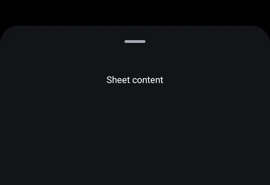
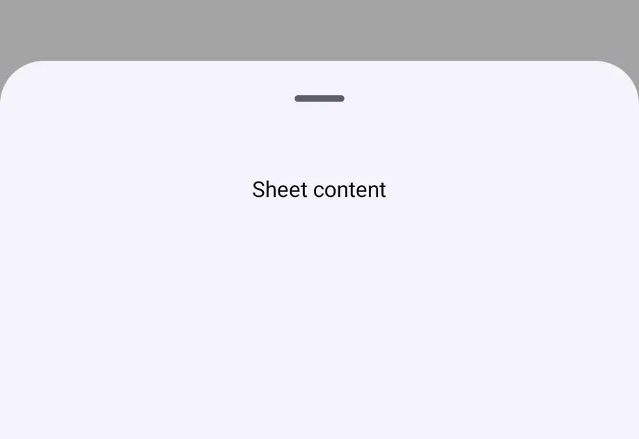
import { useRef } from 'react'; import { Button, Text, View } from 'react-native'; import BottomSheet, { BottomSheetView } from '@expo/ui/community/bottom-sheet'; export default function BottomSheetExample() { const sheetRef = useRef<BottomSheet>(null); return ( <View style={{ flex: 1 }}> <Button title="Open" onPress={() => sheetRef.current?.snapToIndex(0)} /> <BottomSheet ref={sheetRef} snapPoints={['25%', '50%', '90%']} index={-1} onChange={index => { console.log('onChange', index); }} onClose={() => { console.log('closed'); }} enablePanDownToClose> <BottomSheetView style={{ flex: 1, padding: 24, alignItems: 'center' }}> <Text>Sheet 内容</Text> </BottomSheetView> </BottomSheet> </View> ); }

BottomSheetModal

@gorhom/bottom-sheet 的 modal API 迁移时,请使用 BottomSheetModal。它默认处于关闭状态,并通过 present() 打开。

BottomSheetModalExample.tsx
import { useRef } from 'react'; import { Button, Text, View } from 'react-native'; import { BottomSheetModal, BottomSheetView } from '@expo/ui/community/bottom-sheet'; export default function BottomSheetModalExample() { const modalRef = useRef<BottomSheetModal>(null); return ( <View style={{ flex: 1 }}> <Button title="Present" onPress={() => modalRef.current?.present()} /> <BottomSheetModal ref={modalRef} snapPoints={['50%', '90%']} enablePanDownToClose> <BottomSheetView style={{ padding: 24 }}> <Text>Modal 内容</Text> <Button title="Dismiss" onPress={() => modalRef.current?.dismiss()} /> </BottomSheetView> </BottomSheetModal> </View> ); }

动态尺寸

当未提供 snapPoints 时,底部弹窗默认会根据其内容自动调整大小。请使用 BottomSheetView 作为底部弹窗内容的包装组件。

DynamicBottomSheetExample.tsx
import { useRef } from 'react'; import { Button, Text, View } from 'react-native'; import BottomSheet, { BottomSheetView } from '@expo/ui/community/bottom-sheet'; export default function DynamicBottomSheetExample() { const sheetRef = useRef<BottomSheet>(null); return ( <View style={{ flex: 1 }}> <Button title="打开" onPress={() => sheetRef.current?.present()} /> <BottomSheet ref={sheetRef} index={-1} enablePanDownToClose> <BottomSheetView style={{ padding: 24 }}> <Text>此底部弹窗会根据其内容自动调整大小。</Text> </BottomSheetView> </BottomSheet> </View> ); }

平台行为

@gorhom/bottom-sheet 会以内联方式渲染在其父视图底部。此组件在 Android 和 iOS 上使用原生模态展示,在 web 上使用抽屉覆盖层。

这种差异是有意为之。@gorhom/bottom-sheet 通过 react-native-gesture-handlerreact-native-reanimated 自主管理手势和动画层,而 @expo/ui/community/bottom-sheet 则将这些行为委托给 Jetpack Compose、SwiftUI 以及 web 抽屉原语。因此,此组件最适合模态底部弹窗流程,包括使用 BottomSheet API 而不是 BottomSheetModal 的调用场景。

功能AndroidiOSWeb
展示方式Jetpack Compose 模态底部弹窗SwiftUI sheetvaul 抽屉
吸附点映射为部分展开和完全展开状态支持所提供的吸附点支持所提供的吸附点
snapPoints适配内容适配内容适配内容
向下拖动关闭同时启用返回按钮和遮罩点击关闭同时启用背景层点击关闭启用抽屉关闭
持久内联预览不支持不支持不支持

支持的导出

导出项支持情况备注
BottomSheetAndroid 和 iOS 上为模态框,web 上为抽屉
BottomSheetModal初始为关闭状态,并通过 present() 打开
BottomSheetModalProvider为了兼容性直接渲染子组件
BottomSheetView包裹底部 sheet 内容
BottomSheetScrollViewReact Native ScrollView 的重新导出
BottomSheetFlatListReact Native FlatList 的重新导出
BottomSheetSectionListReact Native SectionList 的重新导出
BottomSheetTextInputReact Native TextInput 的重新导出
useBottomSheet从上下文返回 sheet ref 方法
BottomSheetBackdrop原生 sheet 或 web 抽屉会处理背景遮罩
BottomSheetHandle原生 sheet 或 web 抽屉会处理拖拽指示器
BottomSheetFooter此实现中没有对应项

兼容性说明

  • 支持 snapPointsindexonChangeonCloseonDismissenablePanDownToCloseenableDynamicSizing
  • handleComponent={null} 会隐藏原生或 Web 的拖拽指示器。自定义的 handle 组件不会在原生平台上渲染。
  • backgroundStyle 在 Web 上完全生效。在 Android 上,backgroundColor 用于原生容器颜色。在 iOS 上,使用系统 sheet 背景。
  • 动画、过度拖拽、内容拖动、handle 拖动、键盘行为、自定义背景遮罩、自定义背景、自定义页脚、动画值和 detached 属性会为兼容 API 而被接受,但不会改变行为。

API

import BottomSheet from '@expo/ui/community/bottom-sheet';

Components

BottomSheet

Type: React.Element<BottomSheetProps>

Bottom sheet component. Defaults to index={0} and opens at the first snap point on mount.

Props for the BottomSheet component. API-compatible with @gorhom/bottom-sheet where native platform behavior allows.

BottomSheetProps

children

Type: React.ReactNode

The content to render inside the bottom sheet.

enableDynamicSizing

Optional • Type: boolean • Default: true

Whether the sheet should automatically size to fit its content.

enablePanDownToClose

Optional • Type: boolean • Default: false

Whether the sheet can be dismissed by panning down.

index

Optional • Type: number • Default: 0

Initial snap point index. Set to -1 to start closed.

onChange

Optional • Type: (index: number) => void

Called when the current snap point index changes.

onClose

Optional • Type: () => void

Called when the bottom sheet is fully closed.

onDismiss

Optional • Type: () => void

Alias for onClose for BottomSheetModal compatibility.

snapPoints

Optional • Type: (string | number)[]

Points for the bottom sheet to snap to, ordered from bottom to top.

BottomSheetModal

Type: React.Element<BottomSheetProps>

Modal variant of BottomSheet. Starts closed and opens with present().

BottomSheetModalProvider

Type: React.Element<{ children: React.ReactNode }>

Provider for BottomSheetModal. It renders children directly for API compatibility.

BottomSheetView

Type: React.Element<BottomSheetViewProps>

A wrapper for content inside a BottomSheet.

Props for the BottomSheetView content wrapper.

BottomSheetViewProps

children

Type: React.ReactNode

The content to render inside the bottom sheet.

enableDynamicSizing

Optional • Type: boolean • Default: true

Whether the sheet should automatically size to fit its content.

enablePanDownToClose

Optional • Type: boolean • Default: false

Whether the sheet can be dismissed by panning down.

index

Optional • Type: number • Default: 0

Initial snap point index. Set to -1 to start closed.

onChange

Optional • Type: (index: number) => void

Called when the current snap point index changes.

onClose

Optional • Type: () => void

Called when the bottom sheet is fully closed.

onDismiss

Optional • Type: () => void

Alias for onClose for BottomSheetModal compatibility.

snapPoints

Optional • Type: (string | number)[]

Points for the bottom sheet to snap to, ordered from bottom to top.

children

Type: React.ReactNode

Hooks

useBottomSheet()

Returns the imperative methods for the nearest BottomSheet.

Types

BottomSheetMethods

Imperative methods exposed by BottomSheet and BottomSheetModal refs.

PropertyTypeDescription
close() => void

Close the bottom sheet.

collapse() => void

Snap to the minimum snap point.

dismiss() => void

Dismiss the bottom sheet.

expand() => void

Snap to the maximum snap point.

forceClose() => void

Force close the bottom sheet.

present() => void

Present the bottom sheet at the first snap point.

snapToIndex(index: number) => void

Snap to a snap point by index.

snapToPosition(position: string | number) => void

Snap to a pixel value or percentage position.