Reference version

This documentation is available as Markdown for AI agents and LLMs. See the full Markdown index or append .md to any documentation URL.

Toolbar

将项目放入所包装视图工具栏中的 SwiftUI Toolbar 组件。

iOS
tvOS
Included in Expo Go

Expo UI Toolbar 与官方 SwiftUI toolbar(content:) API 一致,并为所包装的视图添加工具栏。
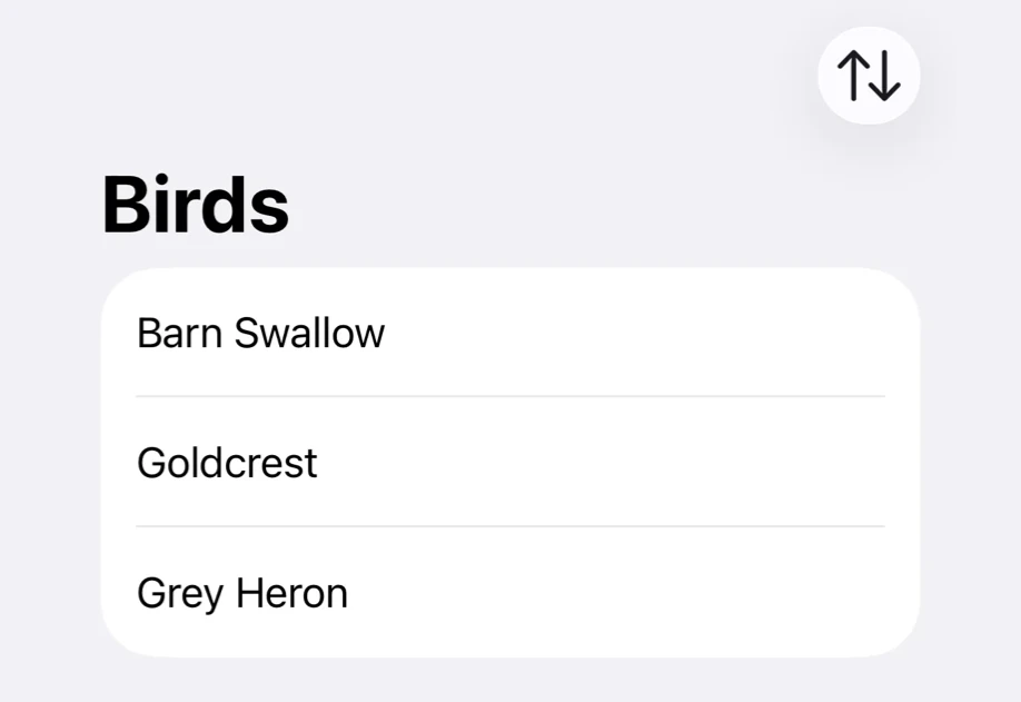
一个鸟类列表,导航栏中有排序按钮一个鸟类列表,导航栏中有排序按钮

将工具栏项目放入 Toolbar.Content。Toolbar 中的其他内容就是工具栏所属的视图。在 NavigationStack 中,项目会显示在导航栏中。

安装

Terminal
- npx expo install @expo/ui
- yarn expo install @expo/ui
- pnpm expo install @expo/ui
- bun expo install @expo/ui

If you are installing this in an existing React Native app, make sure to install expo in your project.

用法

导航栏中的按钮

在 Toolbar 上使用 navigationTitle 修饰符设置标题。

ToolbarExample.tsx
import { Button, Host, List, NavigationStack, Text, Toolbar, } from '@expo/ui/swift-ui'; import { navigationTitle } from '@expo/ui/swift-ui/modifiers'; import { useState } from 'react'; const BIRDS = ['Goldcrest', 'Barn Swallow', 'Grey Heron']; export default function ToolbarExample() { const [descending, setDescending] = useState(false); const sorted = [...BIRDS].sort((a, b) => descending ? b.localeCompare(a) : a.localeCompare(b) ); return ( <Host style={{ flex: 1 }}> <NavigationStack> <Toolbar modifiers={[navigationTitle('Birds')]}> <List> {sorted.map(bird => ( <Text key={bird}>{bird}</Text> ))} </List> <Toolbar.Content> <Button systemImage="arrow.up.arrow.down" label={descending ? 'Sort Z to A' : 'Sort A to Z'} onPress={() => setDescending(value => !value)} /> </Toolbar.Content> </Toolbar> </NavigationStack> </Host> ); }

工具栏项目位置

使用 ToolbarItem 包装项目并设置其 placement。未使用 ToolbarItem 的项目使用 automatic 位置。

ToolbarItemExample.tsx
import { Button, Host, List, NavigationStack, Text, Toolbar, ToolbarItem, } from '@expo/ui/swift-ui'; import { navigationTitle } from '@expo/ui/swift-ui/modifiers'; const BIRDS = ['Goldcrest', 'Barn Swallow', 'Grey Heron']; export default function ToolbarItemExample() { return ( <Host style={{ flex: 1 }}> <NavigationStack> <Toolbar modifiers={[navigationTitle('Birds')]}> <List> {BIRDS.map(bird => ( <Text key={bird}>{bird}</Text> ))} </List> <Toolbar.Content> <ToolbarItem placement="topBarTrailing"> <Button systemImage="square.and.arrow.up" label="Share" onPress={() => {}} /> </ToolbarItem> <ToolbarItem placement="bottomBar"> <Button systemImage="plus" label="Add bird" onPress={() => {}} /> </ToolbarItem> </Toolbar.Content> </Toolbar> </NavigationStack> </Host> ); }

ToolbarItem 必须位于 Toolbar.Content 内。如果当前平台或操作系统版本不提供某个位置,项目会使用 automatic。

弹窗中的关闭按钮

底部弹窗没有自己的导航栏,因此请为其内容添加 NavigationStack。在 iOS 26 及更高版本中,不带 label 或子项且 role="close" 的 Button 会显示为关闭(X)图标。在更早的版本中,请改为设置 label 和 systemImage="xmark"。

ToolbarCloseButtonExample.tsx
import { BottomSheet, Button, Host, NavigationStack, Text, Toolbar, VStack, } from '@expo/ui/swift-ui'; import { navigationTitle, padding, presentationDetents, } from '@expo/ui/swift-ui/modifiers'; import { useState } from 'react'; export default function ToolbarCloseButtonExample() { const [isPresented, setIsPresented] = useState(false); return ( <Host style={{ flex: 1 }}> <BottomSheet isPresented={isPresented} onIsPresentedChange={setIsPresented} anchor={ <Button label="Show details" onPress={() => setIsPresented(true)} /> }> <NavigationStack modifiers={[presentationDetents(['medium'])]}> <Toolbar modifiers={[navigationTitle('Grey Heron')]}> <VStack alignment="leading" spacing={12} modifiers={[padding({ all: 20 })]}> <Text> Stands still at the water's edge for long spells, then strikes at fish with its dagger bill. </Text> </VStack> <Toolbar.Content> <Button role="close" onPress={() => setIsPresented(false)} /> </Toolbar.Content> </Toolbar> </NavigationStack> </BottomSheet> </Host> ); }

API

import { Toolbar, ToolbarItem } from '@expo/ui/swift-ui';

Components

Toolbar

iOS
tvOS

Type: React.Element<ToolbarProps>

Adds a toolbar to the view it wraps, matching SwiftUI's toolbar(content:).

Example

<NavigationStack> <Toolbar> <Text>Bird description</Text> <Toolbar.Content> <Button role="close" onPress={() => setIsPresented(false)} /> </Toolbar.Content> </Toolbar> </NavigationStack>

ToolbarProps

children

iOS
tvOS
Type: ReactNode

The view the toolbar belongs to, together with the Toolbar.Content that fills it.

ToolbarItem

iOS
tvOS

Type: React.Element<ToolbarItemProps>

A single item in a toolbar, matching SwiftUI's ToolbarItem. Place it inside Toolbar.Content to control where the item appears.

Example

<Toolbar> <Text>Bird description</Text> <Toolbar.Content> <ToolbarItem placement="topBarTrailing"> <Button systemImage="square.and.arrow.up" onPress={share} /> </ToolbarItem> </Toolbar.Content> </Toolbar>

ToolbarItemProps

children

iOS
tvOS
Type: ReactNode

The content of the item.

placement

iOS
tvOS
Optional • Type: ToolbarItemPlacement • Default: 'automatic'

The semantic placement of the item within the toolbar.

visibilityPriority

iOS 27.0+
Optional • Type: ToolbarItemVisibilityPriority • Default: 'automatic'

How readily the item gives up its place. Items overflow lowest priority first. low and high apply on iOS and macOS.

Toolbar.Content

iOS
tvOS

Type: React.Element<ToolbarContentProps>

The items placed in the toolbar of the view Toolbar wraps.

ToolbarContentProps

children

iOS
tvOS
Type: ReactNode

The items to place in the toolbar.

Types

ToolbarItemPlacement

iOS
tvOS

Literal type: string

Where an item sits in the toolbar. A placement the current platform or OS version does not offer falls back to automatic.

Acceptable values are: 'automatic' | 'principal' | 'navigation' | 'primaryAction' | 'secondaryAction' | 'status' | 'confirmationAction' | 'cancellationAction' | 'destructiveAction' | 'keyboard' | 'topBarLeading' | 'topBarTrailing' | 'topBarPinnedTrailing' | 'largeTitle' | 'bottomBar'

ToolbarItemVisibilityPriority

iOS
tvOS

Literal type: string

How readily a toolbar item gives up its place when the toolbar runs out of room.

Acceptable values are: 'automatic' | 'low' | 'high'