Reference version

This documentation is available as Markdown for AI agents and LLMs. See the full Markdown index or append .md to any documentation URL.

LazyColumn

用于显示可滚动列表的 Jetpack Compose LazyColumn 组件。

Android
Included in Expo Go
Recommended version:
~58.0.27

Expo UI LazyColumn 与官方 Jetpack Compose LazyColumn API 一致,并显示垂直滚动列表。
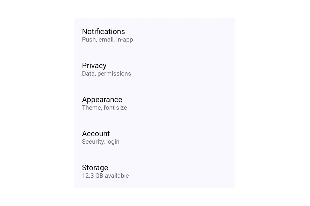
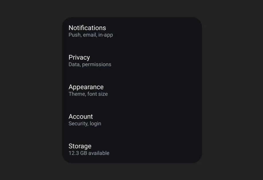
LazyColumn 正在渲染包含五个 Material 3 列表项的设置列表LazyColumn 正在渲染包含五个 Material 3 列表项的设置列表

安装

Terminal
- npx expo install @expo/ui
- yarn expo install @expo/ui
- pnpm expo install @expo/ui
- bun expo install @expo/ui

If you are installing this in an existing React Native app, make sure to install expo in your project.

用法

基本延迟加载列

LazyColumn 的每个子项都是一行。使用 verticalArrangement 属性设置行之间的间距,使用 contentPadding 属性为列表内容添加内边距。

BasicLazyColumn.tsx
import { Host, LazyColumn, ListItem, Text, } from '@expo/ui/jetpack-compose'; export default function BasicLazyColumn() { return ( <Host style={{ height: 400 }}> <LazyColumn verticalArrangement={{ spacedBy: 8 }}> <ListItem> <ListItem.HeadlineContent> <Text>Wi-Fi</Text> </ListItem.HeadlineContent> <ListItem.SupportingContent> <Text>Connected to Home</Text> </ListItem.SupportingContent> </ListItem> <ListItem> <ListItem.HeadlineContent> <Text>Bluetooth</Text> </ListItem.HeadlineContent> <ListItem.SupportingContent> <Text>On</Text> </ListItem.SupportingContent> </ListItem> <ListItem> <ListItem.HeadlineContent> <Text>Notifications</Text> </ListItem.HeadlineContent> <ListItem.SupportingContent> <Text>Allowed for all apps</Text> </ListItem.SupportingContent> </ListItem> </LazyColumn> </Host> ); }

大型列表

使用 LazyColumn.Items 从数组渲染行。将项目作为 data 传入,使用 keyExtractor 为每个项目提供唯一键,并传入一个返回项目行的 children 函数。LazyColumn.Items 只渲染可见区域附近的行,并在滚动时复用这些行。

LargeLazyColumn.tsx
import { Host, LazyColumn, ListItem, Text, } from '@expo/ui/jetpack-compose'; type Contact = { id: string; name: string }; const contacts: Contact[] = Array.from( { length: 10000 }, (_, i) => ({ id: String(i), name: `Contact ${i + 1}`, }) ); function renderContact({ item }: { item: Contact }) { return ( <ListItem> <ListItem.HeadlineContent> <Text>{item.name}</Text> </ListItem.HeadlineContent> </ListItem> ); } export default function LargeLazyColumn() { return ( <Host style={{ height: 400 }}> <LazyColumn> <LazyColumn.Items data={contacts} keyExtractor={contact => contact.id}> {renderContact} </LazyColumn.Items> </LazyColumn> </Host> ); }

设置排列方式

使用 verticalArrangement 属性控制列表中各项之间的间距。传入 'spaceBetween' 这样的字符串值,或传入 { spacedBy: 8 } 这样的对象,以设置固定的 dp 间距。

LazyColumnArrangement.tsx
import { Host, LazyColumn, ListItem, Text, } from '@expo/ui/jetpack-compose'; export default function LazyColumnArrangement() { return ( <Host style={{ height: 400 }}> <LazyColumn verticalArrangement={{ spacedBy: 8 }} horizontalAlignment="center"> <ListItem> <ListItem.HeadlineContent> <Text>Spaced Item 1</Text> </ListItem.HeadlineContent> </ListItem> <ListItem> <ListItem.HeadlineContent> <Text>Spaced Item 2</Text> </ListItem.HeadlineContent> </ListItem> <ListItem> <ListItem.HeadlineContent> <Text>Spaced Item 3</Text> </ListItem.HeadlineContent> </ListItem> </LazyColumn> </Host> ); }

设置内容内边距

使用 contentPadding 属性为列表内容添加 dp 单位的内边距。

LazyColumnPadding.tsx
import { Host, LazyColumn, ListItem, Text, } from '@expo/ui/jetpack-compose'; export default function LazyColumnPadding() { return ( <Host style={{ height: 400 }}> <LazyColumn contentPadding={{ start: 16, top: 8, end: 16, bottom: 8 }}> <ListItem> <ListItem.HeadlineContent> <Text>Padded item 1</Text> </ListItem.HeadlineContent> </ListItem> <ListItem> <ListItem.HeadlineContent> <Text>Padded item 2</Text> </ListItem.HeadlineContent> </ListItem> <ListItem> <ListItem.HeadlineContent> <Text>Padded item 3</Text> </ListItem.HeadlineContent> </ListItem> </LazyColumn> </Host> ); }

渲染行时请遵循以下规则:

  • 在组件外定义 children 函数,或使用 useCallback 包装它。否则,每次组件渲染时,可见区域附近的行都会重新渲染。
  • 复用的行会保留之前显示项目的本地状态(useState)。项目变化时重置状态,或将状态保存在行外部。
  • 尚未准备好的行会显示空占位符。将 estimatedItemSize 设置为接近行高的值,单位为密度无关像素(dp)。
  • 使用 overscanCount 在可见行的上方和下方预先准备更多行。
  • 要更新行,请传入新的 data 数组。不要原地修改数组。
  • 设置 recycling={false} 可预先渲染每一行。

API

import { LazyColumn } from '@expo/ui/jetpack-compose';

Components

LazyItems

Android

Type: React.Element<LazyItemsProps<T>>

A block of recycled rows inside LazyColumn or LazyRow, mirroring the Compose items(count, key) builder. Only a small pool of rows around the visible range is mounted, so large data sets stay cheap. Rows that are not ready yet show a placeholder of estimatedItemSize, or of the size last measured for that item.

Mount it as a direct child of LazyColumn or LazyRow.

LazyItemsProps

children

Android
Type: (info: { index: number, item: T }) => ReactElement

Renders an item. Wrap it in useCallback, or every item re-renders on each parent render. Recycled views are reused for other items, so their local state (useState) carries over. Reset it when the item changes, or keep the state outside the view.

data

Android
Type: readonly T[]

Items to display. Replace the array when updating data.

estimatedItemSize

Android
Optional • Type: number • Default: 64

Placeholder size in dp along the scroll axis, until an item is measured. Must be positive. Ignored when recycling is false.

keyExtractor

Android
Type: (item: T, index: number) => string

Returns a stable, unique string key, also used as the lazy list item key.

overscanCount

Android
Optional • Type: number • Default: 10

Extra items to prepare on each side of the visible items. Must be a non-negative integer. Ignored when recycling is false.

recycling

Android
Optional • Type: boolean • Default: true

Renders only the items near the visible range and reuses them while scrolling. Set to false to render every item at once. Set it once; changing it remounts the items.

LazyColumn

Android

Type: React.Element<LazyColumnProps>

A lazy column component that efficiently displays a vertically scrolling list.

LazyColumnProps

children

Android
Optional • Type: ReactNode

The content to display inside the lazy column.

contentPadding

Android
Optional • Type: ContentPadding

Content padding in dp.

horizontalAlignment

Android
Optional • Literal type: string

The horizontal alignment of items.

Acceptable values are: 'center' | 'start' | 'end'

modifiers

Android
Optional • Type: ModifierConfig[]

Modifiers for the component.

verticalArrangement

Android
Optional • Literal type: union

The vertical arrangement of items. Can be a preset string or an object with spacedBy to specify spacing in dp.

Acceptable values are: 'center' | 'top' | 'spaceBetween' | 'spaceAround' | 'spaceEvenly' | 'bottom' | { spacedBy: number }

Types

ContentPadding

Android

Content padding values for LazyColumn.

PropertyTypeDescription
bottom(optional)number

Bottom padding in dp.

end(optional)number

End padding in dp.

start(optional)number

Start padding in dp.

top(optional)number

Top padding in dp.